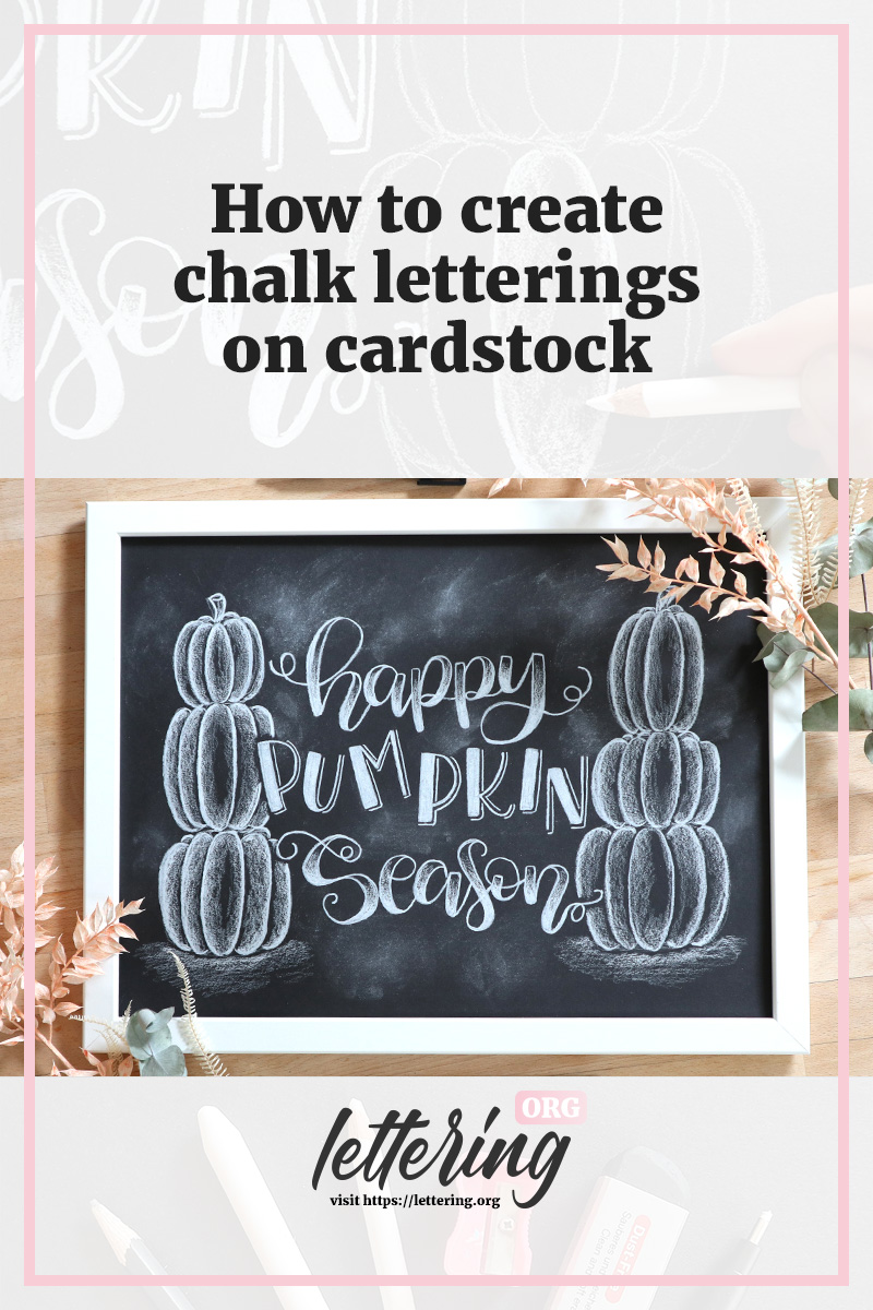
Contents
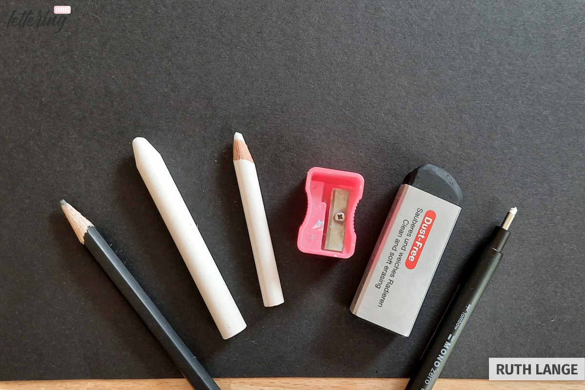
What you need
For this project you will need:
- Some black cardstock
- A white colouring pencil or chalk
- A pencil sharpener, an eraser, a pencil and a frame (optional).
Start by cutting your cardstock to your desired landscape size (to fit your frame e.g.). Now you are ready to start chalk lettering!
Sketch out your layout
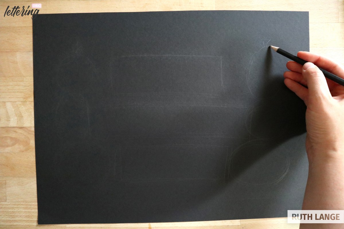
Before you start drawing the design in white, it is best to draw your layout using a pencil. These lines can be erased later.
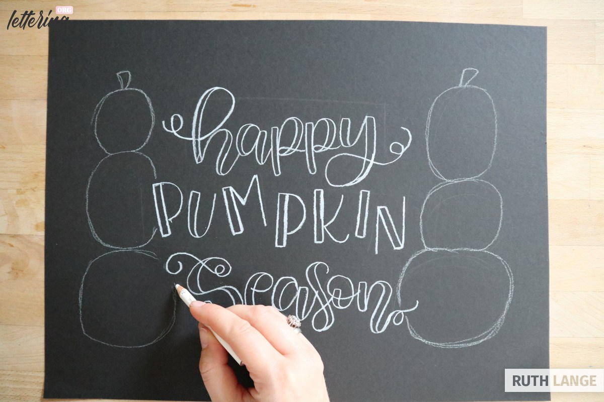
Start in the center and draw three long boxes for the lettering (the middle one being slightly longer than the upper and lower box).
Then add some circles on either side of the boxes where you want to place your pumpkins. Let these vary in size for more visual interest.
Sketch out your lettering
Still using the pencil, sketch out your lettering:
- “happy” (upper box)
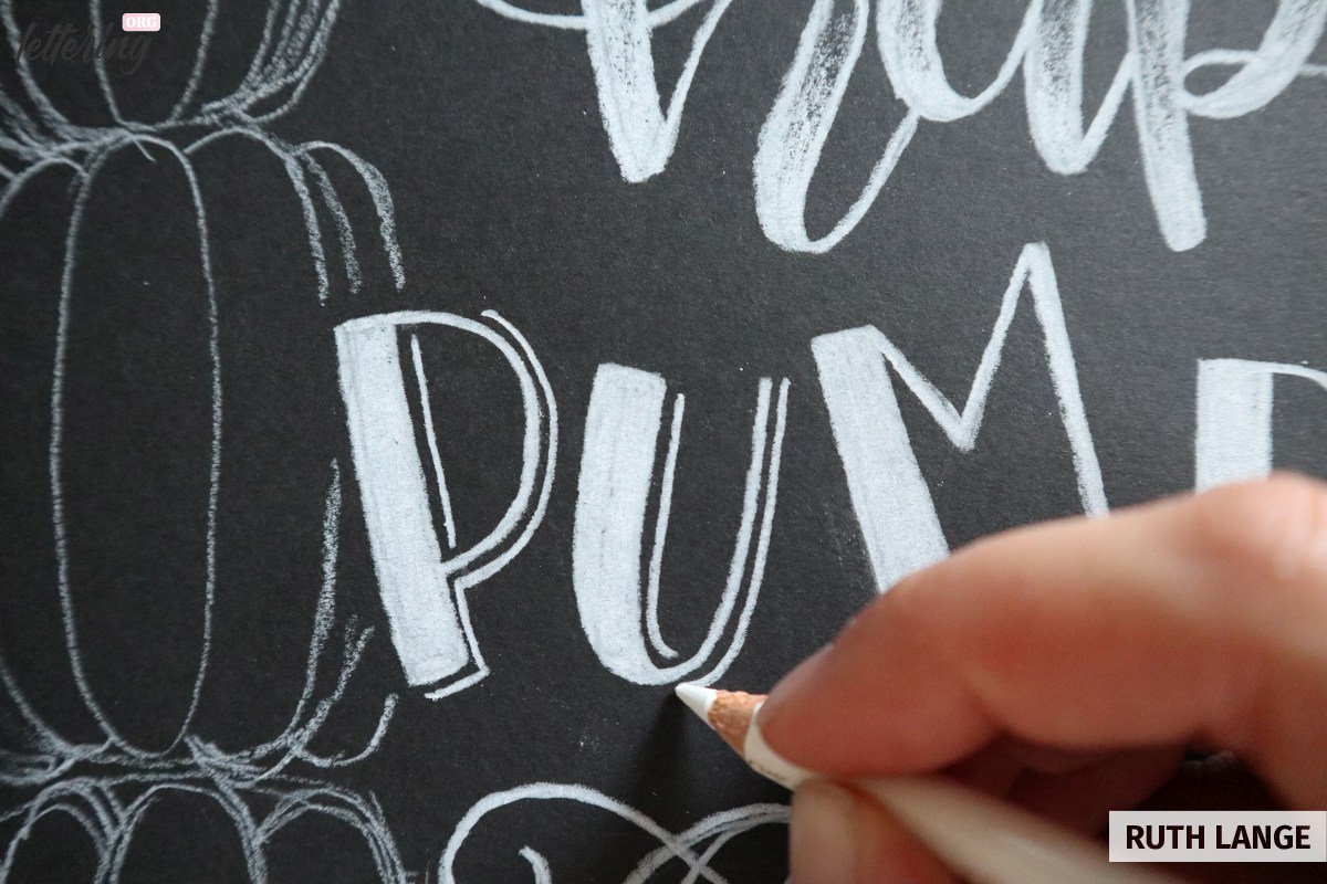
- “PUMPKIN” (middle box)
- “season” (lower box).
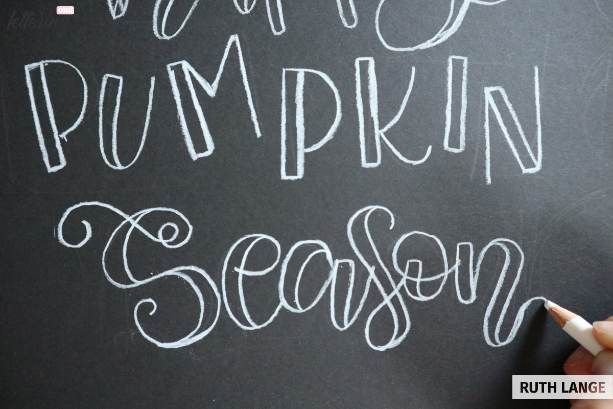
Both “happy” and “season” are lettered in cursive and lower-case letters, whereas “PUMPKIN” is written in bouncing upper-case letters.
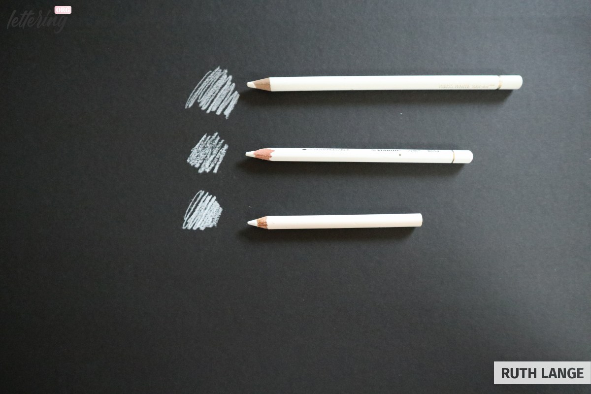
White, white or white
If you have a few different white pencils, try them out on the back side of the card stock to see which pencil or chalk has the brightest colour.
The great thing about using a white colouring pencil, in contrast to chalk, is that it doesn’t smudge as much.
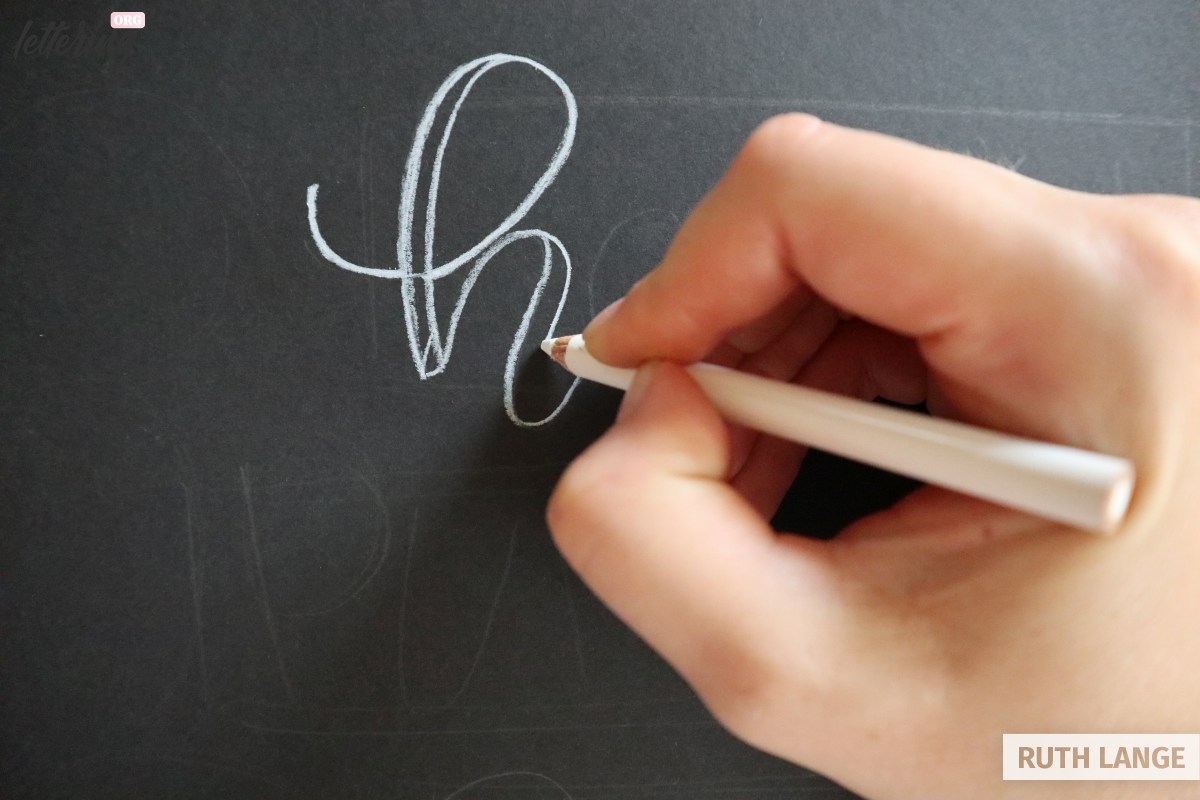
Let’s start lettering
Now the fun begins! Use your white pencil to follow your pencil sketch with crisp clean white lines.
Add a parallel line to the downstrokes to create faux-lettering. Don’t worry if some lines are slightly thicker than others. We’ll take care of little flaws later.
The next word is a little simpler to draw. The line furthest to the left is drawn as a thicker rectangle, whereas the rest is a simple thin line.
The exception to this is the letter “N”. It has its thick line in the middle. It looks better that way.
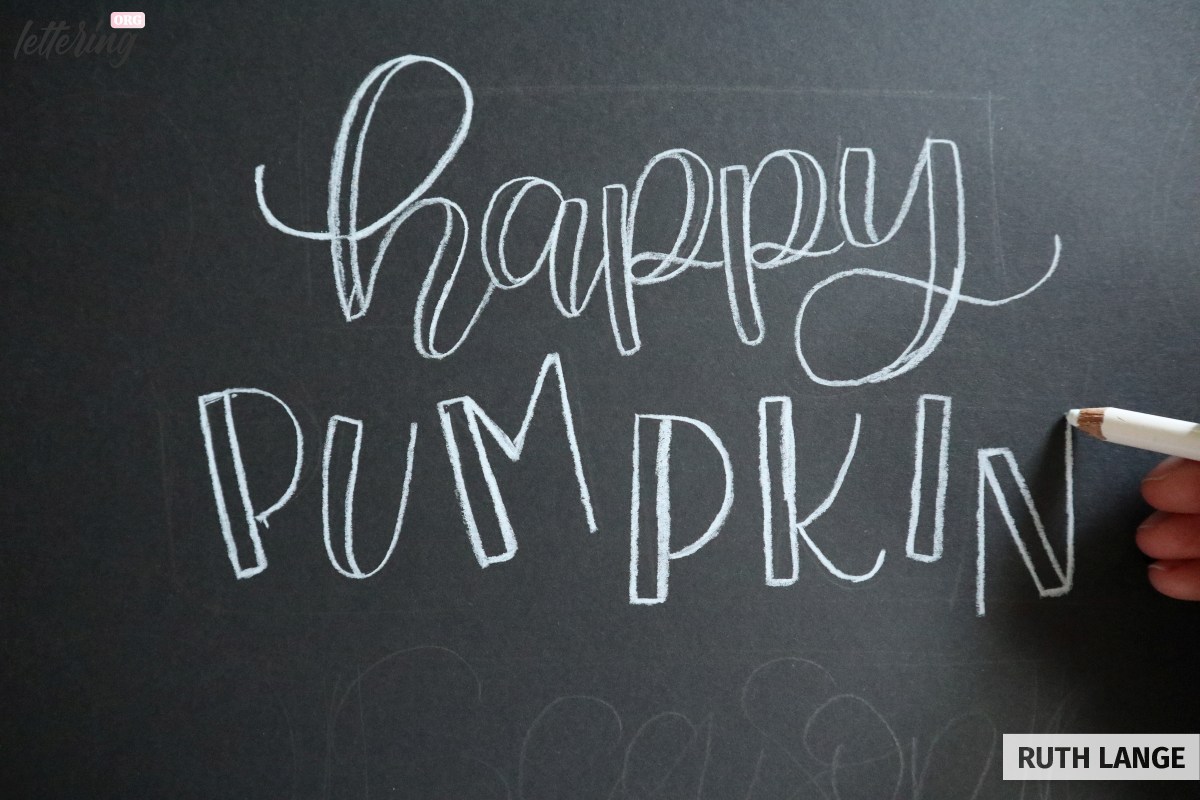
Draw the word “season” in the same style as “happy”. Feel free to add some swirls at the beginning and end-letters of these two words.
Outline the pumpkins
Now we move on to the pumpkins! With little pressure, trace the shape of each of your pumpkins. These should vary a bit and not look too circular.
Since some of the lettering is overlapping the pumpkins, try to give those areas some space.
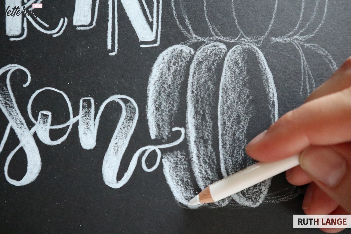
Giving the pumpkins shape
The pumpkins may vary in size and shape, but are all constructed in the same way: Draw an ellipse in the center of the pumpkin and then continue to draw two or three ellipses to either side of the center. Make these shapes look like they are overlapping.
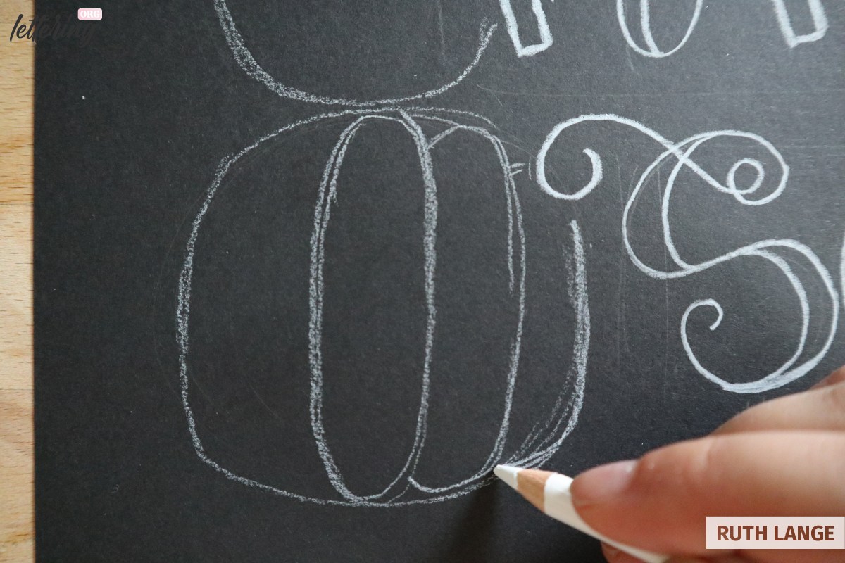
Add a thick stem the top pumpkins, as well as some little rounded lines indicating depth to the upper pumpkin.
Decorate your lettering
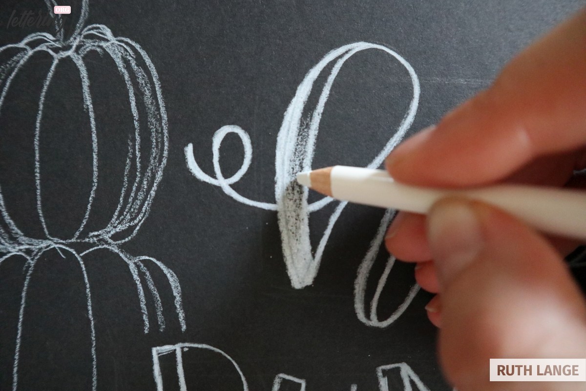
Next, we want to decorate the lettering. Using pressure, thicken up the outlines of the lettering a bit and start shading the inside of the thick downstrokes of the first word.
Let the white fade out into the upper half of the letters.
Since the word “season” is written in the same style as “happy”, it makes sense to use the same type of decoration.
Fill in these letters with white as well, thinning out the color towards the top.
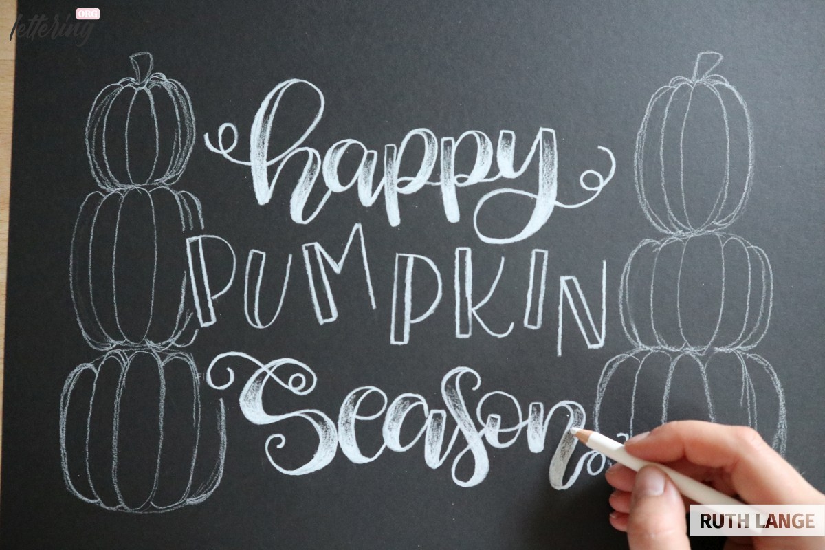
To give some more variety to the lettering, fill in the thick strokes of “pumpkin” completely with white.
Add some shadow lines
Another way of decorating lettering is to give it a simple shadow line.
This makes the letters pop and gives them some depth (for more tricks like this take a look at the 3d lettering techniques).
Draw thin lines to the right-hand side and bottom of each of the lines of each letter.
Shading the pumpkins
Now it’s time to shade the pumpkins. In order to make them more realistic, they need highlight and shadow areas.
Start coloring in the center ellipse, leaving some of the black in the center untouched.
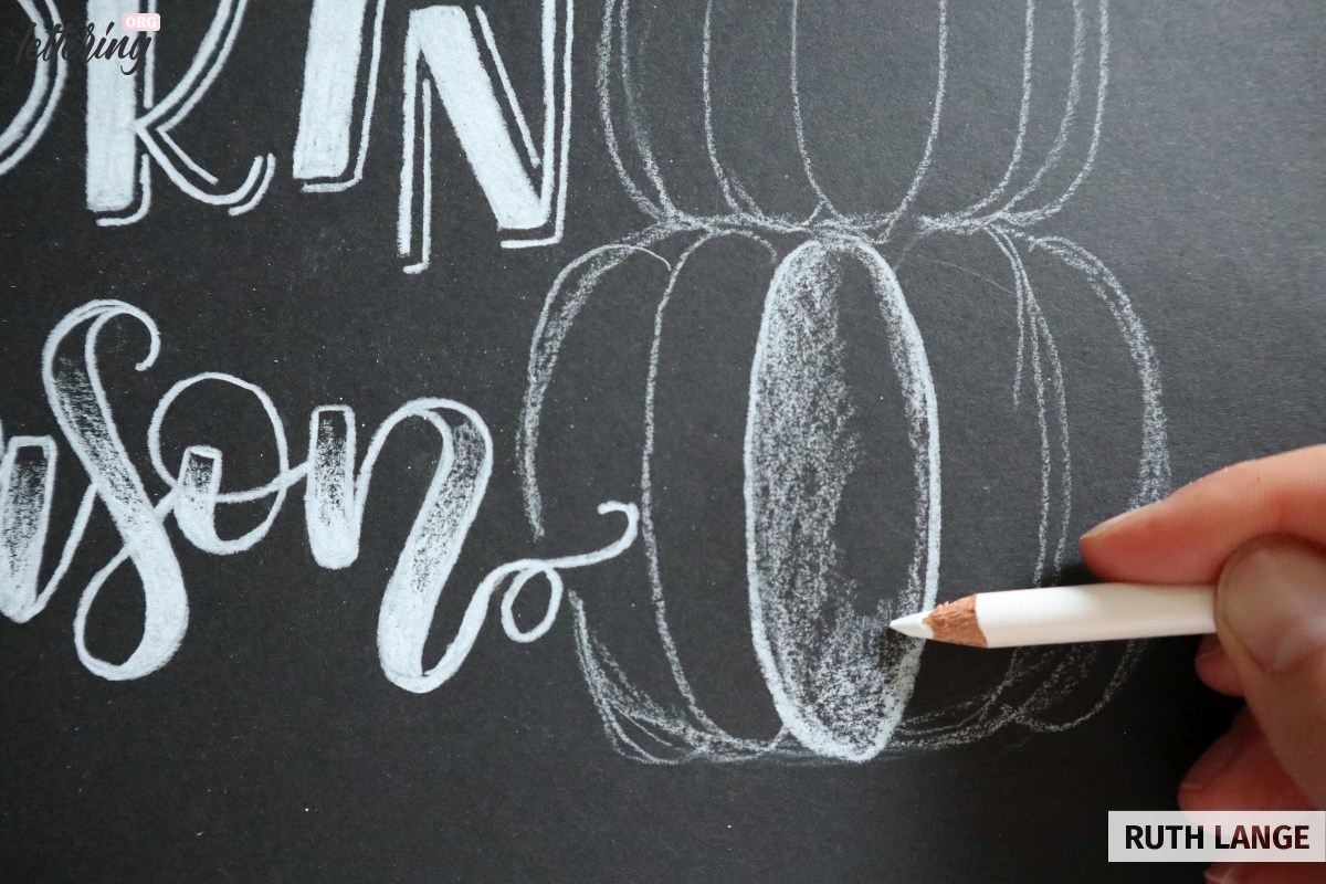
Color the other parts of the pumpkin thinker on the outside and more faded toward the inside of the pumpkin, leaving some black in between the ellipses.
Ground the pumpkins
Add a shadow beneath the bottom pumpkin, which fades toward the bottom of the page.
This grounds them and prevents the pumpkins from looking like they are floating.
Now would also be a great time to carefully erase any pencil lines that are still visible.

Final touches
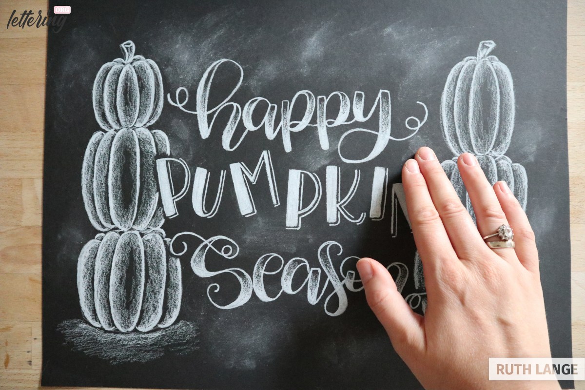
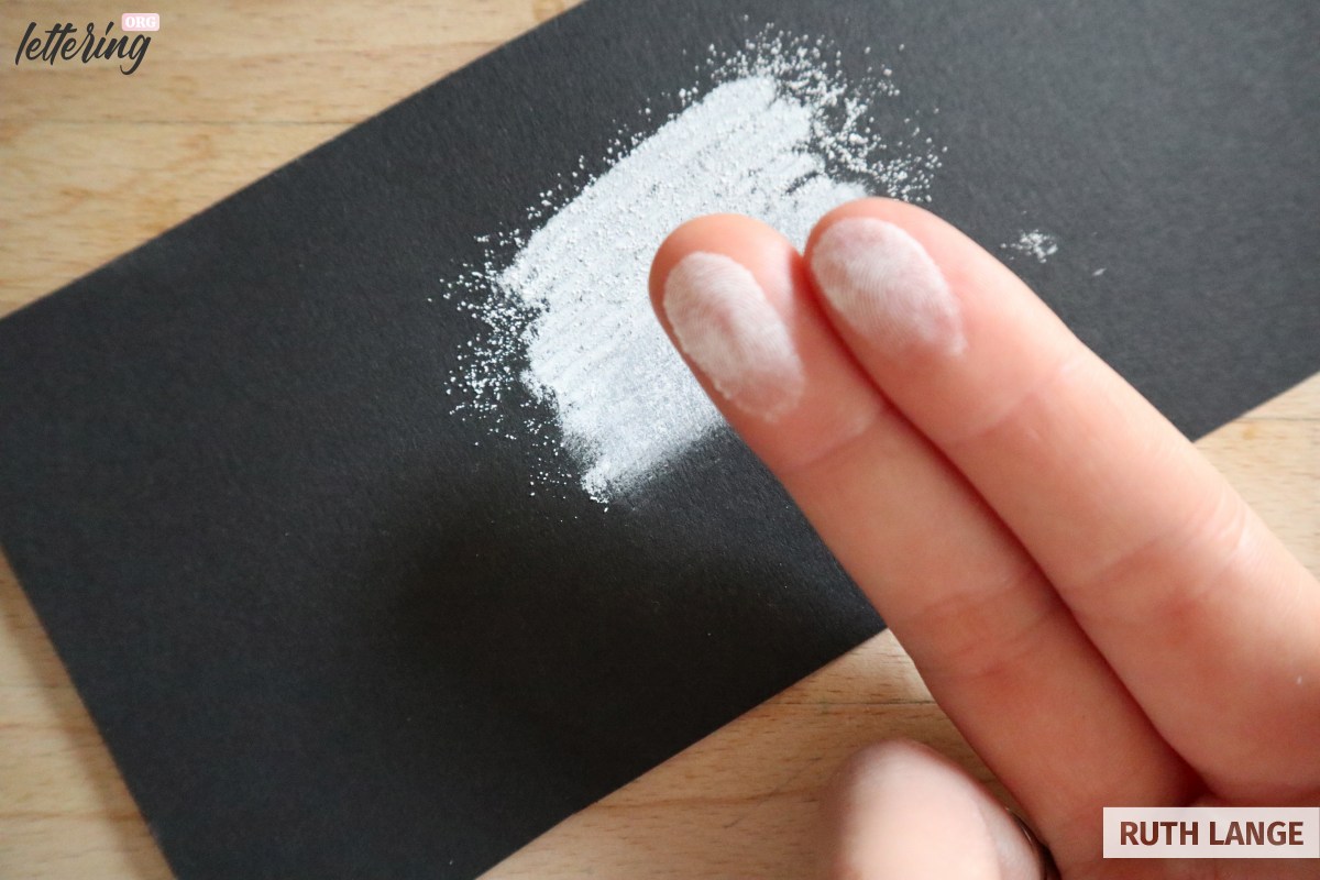
Adding some smudges of real chalk here and there makes your piece look more like chalk art.
So, draw some chalk on a leftover piece of paper, rub your fingers in it and using circular motion, rub the chalk into your drawing here and there.
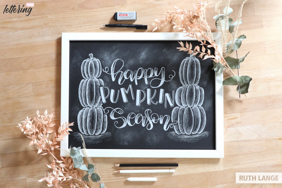
Finally your chalk letterings get’s an awesome look and is ready to be shared on social media. 😉