Bounce lettering – another awesome lettering technique you might heard of.
In bounce lettering you can break some of the most basic rules of typography. And you do it on purpose! In this bounce lettering guide I will show you step by step how to do it.
Contents
What you need
- A simple brush pen
Letterings with character
Straight, clean hand letterings with even distances and proportions look absolutely fascinating. It is a great art to write cleanly and accurately by hand.
The way to get there requires a lot of practice, but it is also super fun!
On the other hand, the almost “perfect” typeface can also look boring.
At this point, techniques such as bounce lettering or additional decoration help to make the typeface more interesting and exciting.
By arranging the individual letters in different heights and in different sizes, a very interesting, somewhat playful typeface is created. In addition, the letters themselves are partly changed to extend into the ascenders or descenders.
There is a clear contrast to “normal” hand letterings and an even greater contrast to normal block letters.
Bounce lettering is therefore especially suitable for writing individual words in a very prominent way.
Even complete texts can be written in a bouncelettering style. However, there is the danger that the legibility suffers and the eye no longer finds a hold or guidance when looking at the text.
Two factors for the right bounce
In order to turn a straightforward lettering into a beautiful bounce lettering, you can work on two basic factors.
Positioning the letters
The first one is about the positioning of the letters. As the word “bounce” already suggests, the letters dance on the baseline.

This means that they are sometimes a little higher and sometimes a little lower. This creates the bouncing effect and the characteristic look.
It is important that both the first and the last letter are on the same level.
Otherwise the whole word will look crooked at the end. You should also try to fill the white space around the word evenly. The letters have to alternate and finally there has to be a balance between upper and lower letters.
Design of the letters
The second factor is the design of the individual letters. By changing the basic shape of the letters, you can further enhance the bounce lettering effect.
For example, you can make some downstrokes down to the descenders or add some flourishings. Because of the sweeping lines, a letter that is actually still on the baseline no longer seems so static.
Finding the right combination
The great art now is to combine these two factors harmoniously. The letters should dance, but the transitions still look beautiful.
In addition, the basic form of a letter must not be lost, because otherwise it may be confused or not recognizable at all.
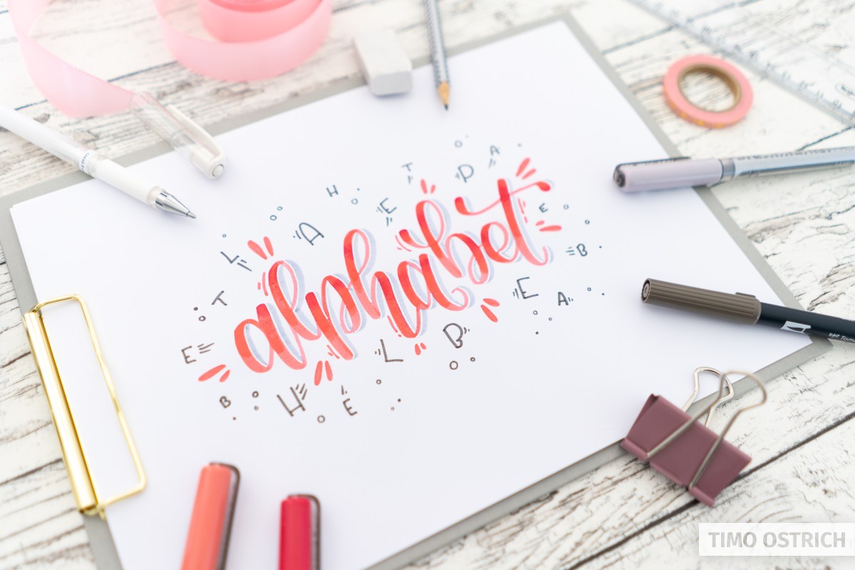
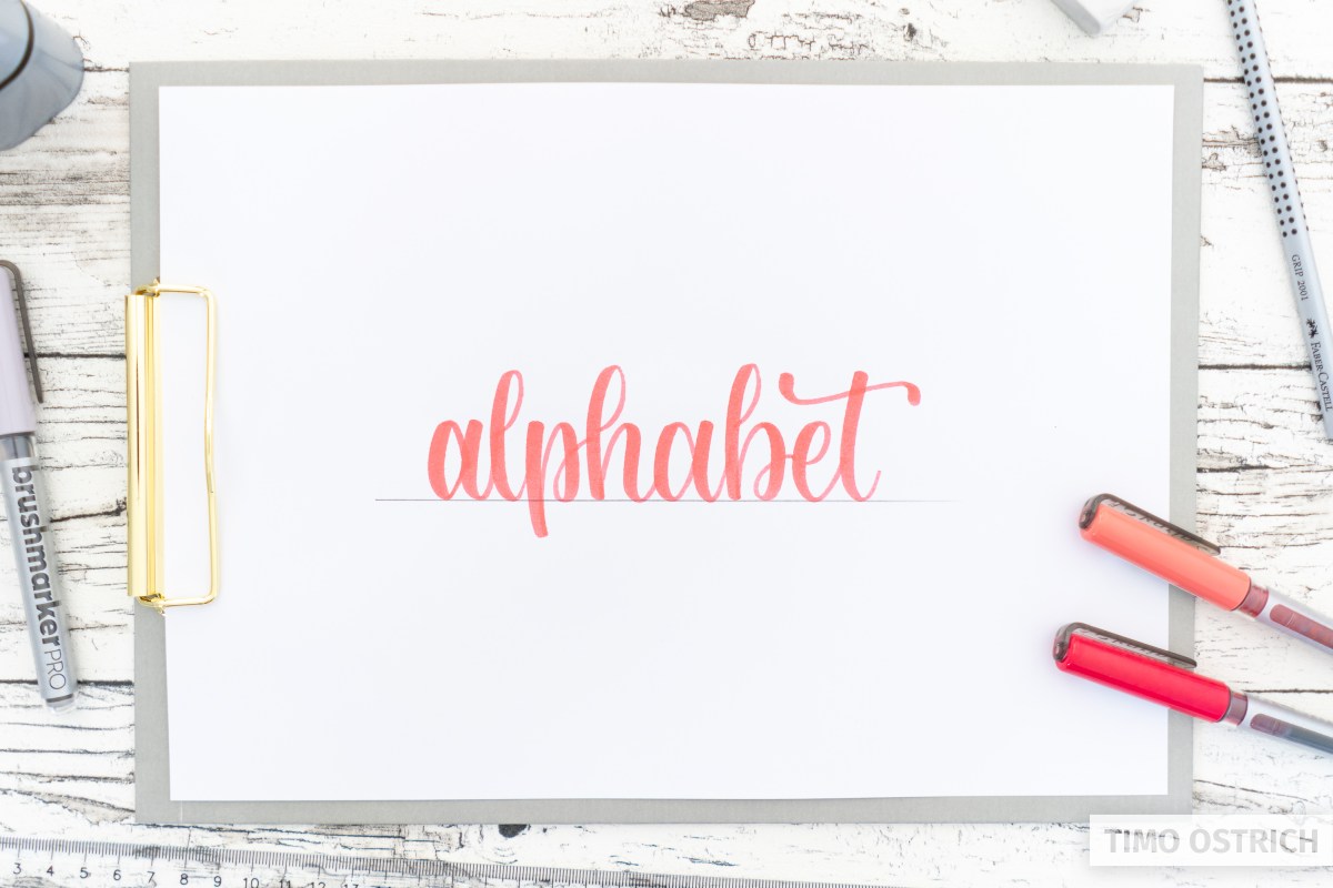
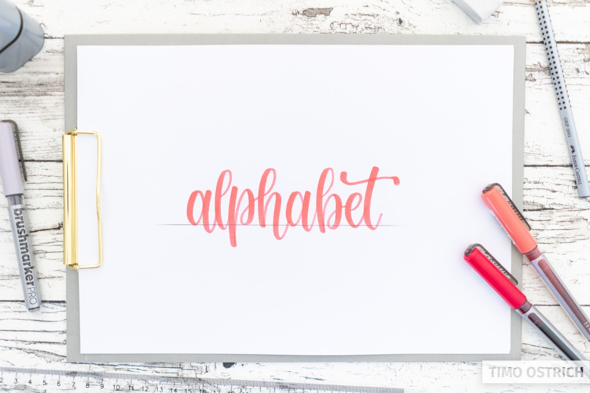
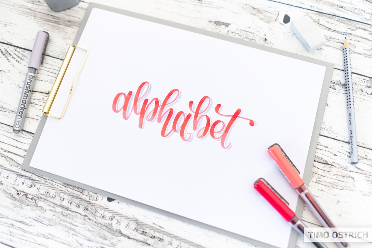
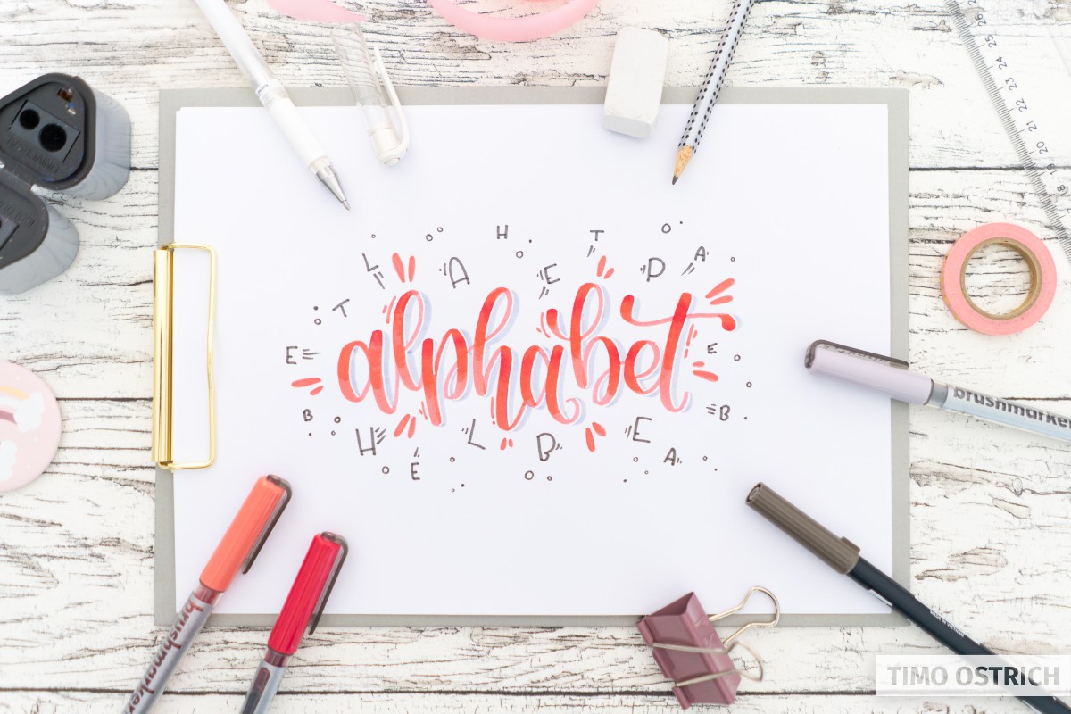
This is my finished bounce lettering for the word “alphabet”:

Sometimes legibility may suffer when the word is still recognizable from its context. In the end, this is also about art and artistic freedom. So it’s up to you whether you want to make extreme changes to your lettering.
Once you have created a beautiful bounce lettering, you can draw it with any pencil, combine it with many other techniques or decorate it additionally.
For my lettering I have finally unpacked a lot of decoration! This way the word looks absolutely exciting.
Making sketches and pre-drawings
Especially for bounce lettering, it helps enormously if you make some sketches or practice on a scratch paper.
Some letters can be written in different heights to each other better than others.
Try out different combinations of your word and the individual letters to find out what is easy to write and looks good.
You can also find a beautiful bounce lettering font in the ultimate hand lettering alphabet. There you will find a matching style for each letter and you can combine them as you like.
And now – go for the brush pens and have fun with some bounce letterings!
Conquista de México