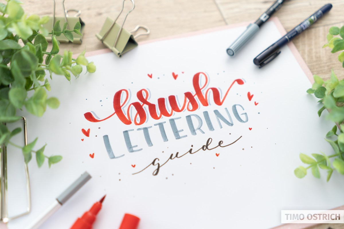
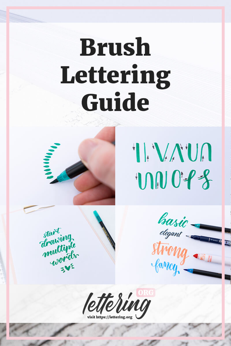
Brush lettering is one of the most beautiful and exciting techniques when it comes to hand lettering. The look of a brush lettering is so characteristic that you just have to learn it.
In this guide I will show you exactly how to learn brush lettering and how to avoid typical mistakes.
Contents
What is brush lettering?
Brush lettering is the awesome art of drawing letters and words with a brush or brush pen. It is not the same as hand lettering, where you can use any pencil to create your words.
It is important to understand that brush lettering is a part of hand lettering.
If you know the hand lettering basics it will be much easier to learn brush lettering, too.
No matter if you already learned to letter with normal pens, this guide will show you everything you need – step by step!
Important: There is not only one special brush lettering font. It’s mostly a modern script style but you can also draw every other style with a brush pen, too.
In this guide I will teach you that modern brush lettering style everybody loves so much. It’s the perfect basis for everything else!
Brush pens & the right paper (important!)
When it comes to brush lettering using the right materials is cruical! That is why I have to start with some tips about the right pens and the right paper.
Please don’t skip these tips – at some point you will regret.
The brush pen
For sure you can use a real brush for brush lettering. But that is way harder than using a brush pen. A real brush ist not easy to handle and you always have to care about the perfect amount of ink on the tip.
If you want to learn brush lettering you should really use a brush pen. It’s a combination of a pen or marker and a brush. The tip is flexible but the ink comes from the ink tank of the pen. This way you can concentrate on your lines and strokes much better!
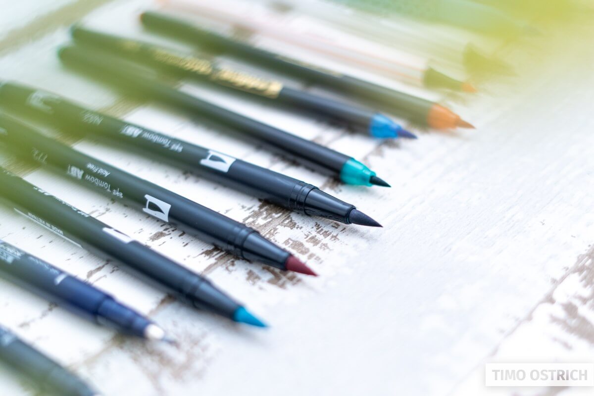
The brush (pen) allows you to draw strokes with different widths, which makes the outcome so characteristic. But more about that later on.
Basically you can say: The smaller the brush pen (tip) the easier it is to control. Brush pens with big and soft brush tips are the hardest to master!
This is why you should start with a small scaled or a medium scaled brush pen!
The right paper
Normal hand lettering works on nearly every paper or even other materials. For brush lettering you absolutely need the right paper.
Using the wrong paper will destroy your brush pens!
Why? Normal paper is way too rough. The sensitive fibers of your brush pen will fray out quite fast, because they get caught up by the paper over and over again. Once that happend you won’t be able to draw clean lines anymore.
Take a look at the following picture. On the left you can see my default printer paper. On the right you can see the smooth lettering paper. It’s whiter and very smooth. You can even feel it when you touch the paper with your finger tips.
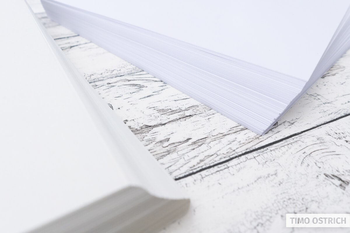
I know that this advice is easy to ignore. But if you want to use your brush pens for a longer time, you should buy smooth lettering paper.
Additional tools
As always it’s good to have some additional tools. For example a simple pencil that can be used to create guides or sketches of your lettering. With some guides it’s way easier to concentrate on the brush lettering itself.
I mostly use the following tools:
- A simple pencil
- A ruler or a triangle
- A rubber and a sharpener

How to hold a brush pen
When using a brush pen it’s important to hold it the right way. As often there is not one perfect solution.
Basically you have to keep in mind that the brush tip has to touch the paper sideways.
So turn your pen about 45 degress to the right (if you are a righty).
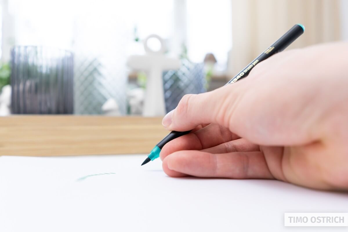
Now touch the paper with the tip of you pen: When you are able to create some kind of little drops thats a good start.
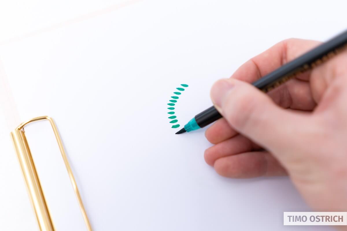
I don’t like to be too strict when it comes to individual factors like this. Eventually good is what works for you.
Basic brush lettering strokes
Lettering means you have to think in strokes. Every letter consists of some basic strokes and the more you practice, the better you will recognize these patterns.
Just as in hand lettering there are some basic strokes you have to learn. From now on there are always two things that matter:
- The direction of your line
- The pressure of your brush pen
Thick and thin
The brush pen allows you to create lines of different width. When you add much pressure to the pen, the line will become quite thick. When you draw line with less pressure you will create a thin line.
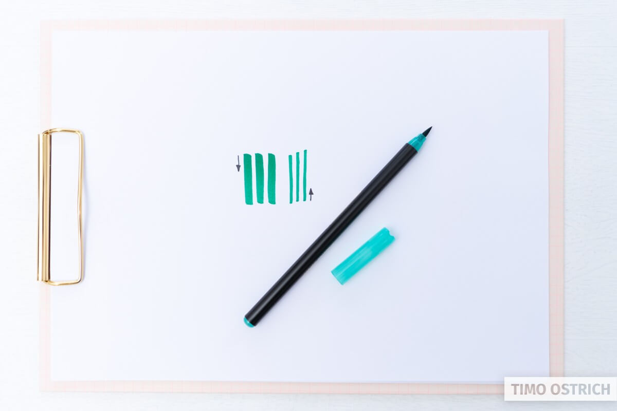
The basic rules are as follows:
- Lines from top to bottom are painted with much pressure. They are called downstrokes.
- Lines from bottom to top are painted with less pressure. We call them upstrokes.
We will use this principle to learn some basic strokes. By changing the amount of pressure while drawing the lines you will get that great brush lettering look.
Practice these basic strokes as much as possible. You will recognize these strokes when drawing real letters. If you skip the basic strokes it will be much harder to draw letters later on.
You can also fake the effect of down- and upstrokes with a normal pencil. It’s called the faux calligraphy.
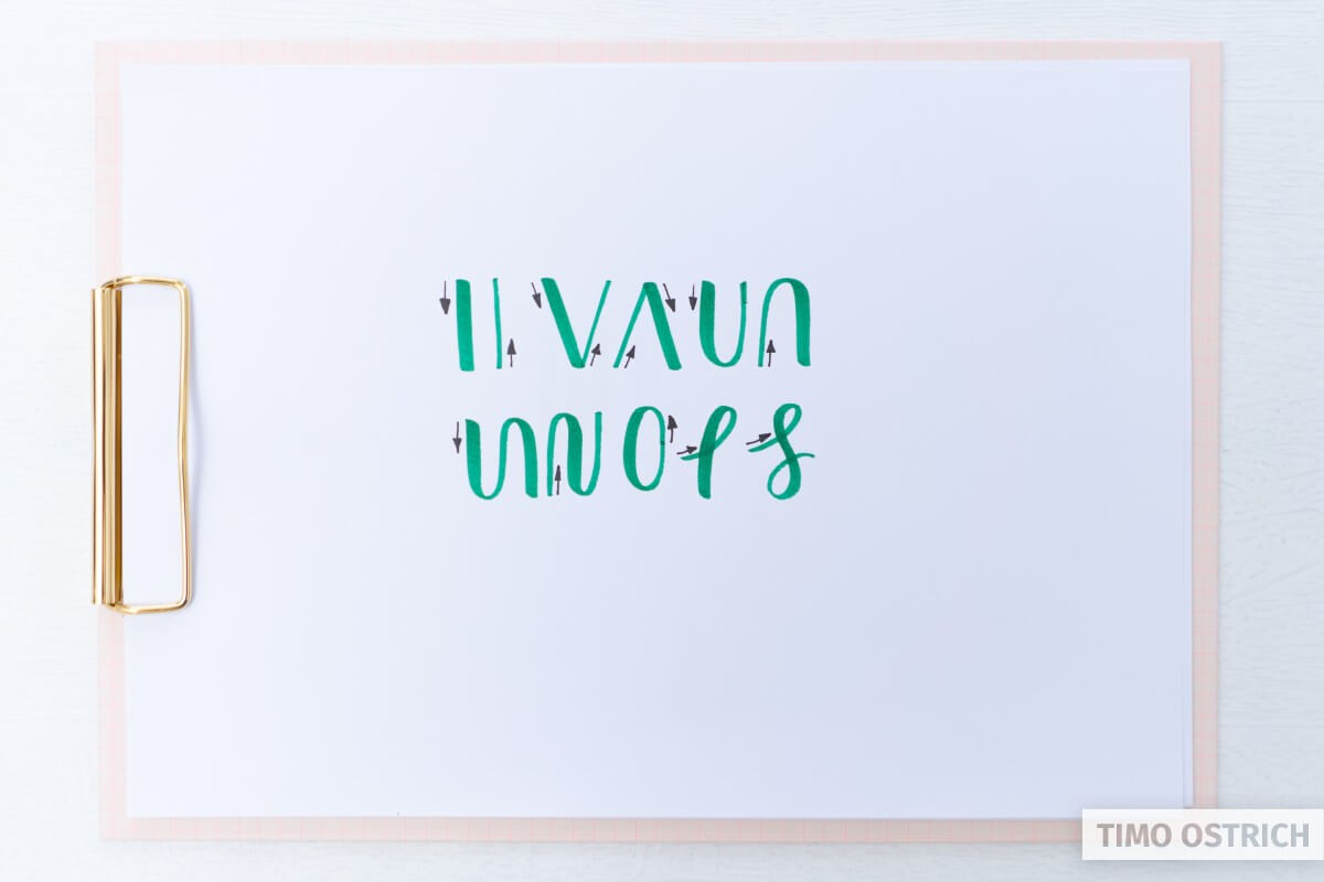
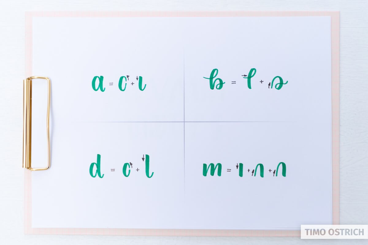
Combine the basic strokes to letters
The next step is to combine our basic strokes to complete letters. Every letter (depending on its style) consists of one or more line. By seperating these lines it’s easier to learn the single letters.
After every line, remove the brush pen from the paper and really start a new stroke. Even when you are drawing the letter as a whole.
The following image shows some lower case letters and the lines they constist of. Try to draw them, too!
Lower case letters are easier to learn, because of the smaller radius of movement of your hand.
If you want to have an overview of every letter and its strokes take a look at the brush lettering workbook.
From letters to words
You probably know the next step: We will connect the letters to complete words!
By drawing a little upstroke after every letter you can connect it to the next one. The first stroke of the next letter always overpaints the last line a little.
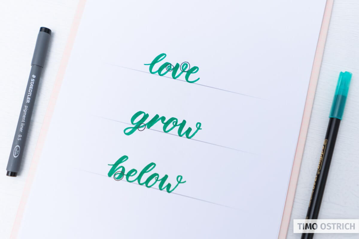
The majority of the letters have their transitions on the baseline.
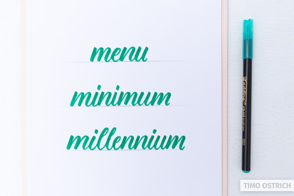
Take a look at the word “minimum”. Every letter connects to the next one on the baseline.

But there are also some letters which start or end on the median (x-height). And some letters do end below the baseline.
If a letter ends on the median, you have to connect it to the next letter at this level. Otherwise you won’t recognize the letter anymore.
Letters which end below the baseline (or on the left side) are connected to the next letter with a little loop.
- Letters which end on the median: “o”, “r”, “v”, “w”
- Letters which end below the baseline: “g”, “j”, “p”, “q”, “y”
- Letters which end on the left: “b”, “p”
Depending on the style of a letter these rules might change.
Sometimes its even good not to connect every letter. Sooner or later you will get a feeling for a harmonic look of your words.
Practice the drawing of words
There are some typical words which are quite easy to write at the beginning. These words mostly constist of simple down- and upstrokes without too many oval letters. Use these words to practice the connection of letters.
Good words for practising brush lettering are “menu”, “minimum” or “millennium”.
Do you feel that special flow of these words? Give them a try!
The brush lettering workbook also contains nice words to practice. The templates are perfect if you don’t want to start on a completely white paper. It helps to concentrate on the brush, too.
Letter your favorite words
You know the basics! Nice! Now you may try to write some of your favorite words.
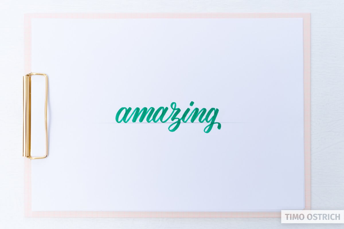
Think of the single strokes, every letter consists of. Think of the downstrokes and the upstrokes. And now keep trying! The most important thing is to practice regularly.
Multiple words
Sooner or later you will draw multiple words. Then you also have to keep a consistent style on every word. Furthermore you have to place the single words so it looks good.
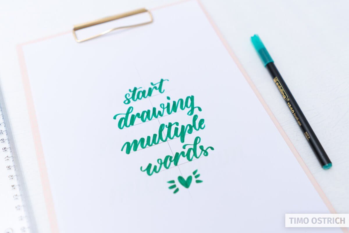
Use your additional tools to create guides, axes or even sketches of your letterings. If you need some inspiration what to draw, have a look at my huge list of lettering quotes.
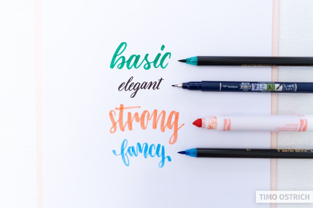
Brush lettering styles
As I told you there are many different brush lettering styles. When you mastered the basic style you may try some other font styles. It helps you to understand the optical effects of typography.
If you want to learn many different styles you should use my ultimate hand lettering alphabet. It contains over 700 different letters you may choose from.
You can also try other brush pens. Maybe there are other pens which work better for you?
I would like to make very nice notes
quiero hacer mis apuntes bonitos de la universidad
Me interesa aprender, las letras forman parte de tu identidad.