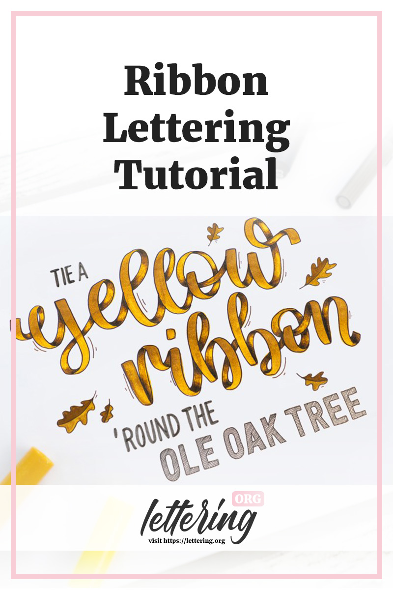
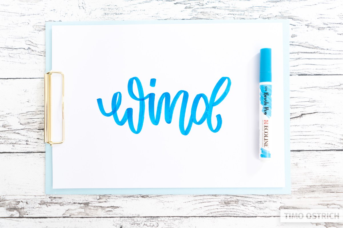
Colorful ribbon letterings have a highly dynamic and haptic effect. The creation of realistic ribbons is a lot of fun but not easy.
That’s why you will find detailed ribbon lettering instructions here! With the right tips and techniques, you will be able to create fantastic ribbons by yourself.
Contents
What you need
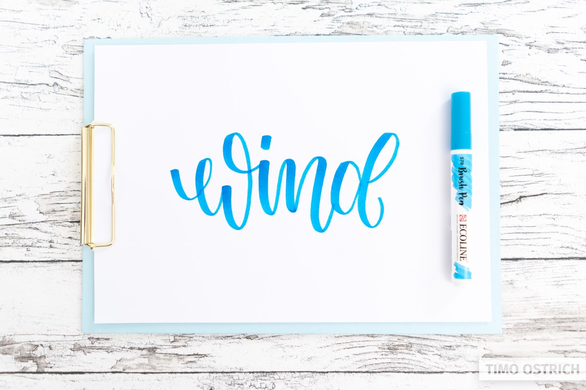
- Brush pens* with different shades
- Fineliner*
- A white gel pen* if you want to draw some highlights
The look into reality
With all the creativity, the different strokes and techniques you must not forget one thing:
If you want to use a realistic effect, then take a look at the reality!
In this case that means that we take a look at a real gift ribbon. Then we can see exactly what the look of a ribbon is all about.
- What do the transitions look like?
- Where are dark and light areas?
- How do the edges run?
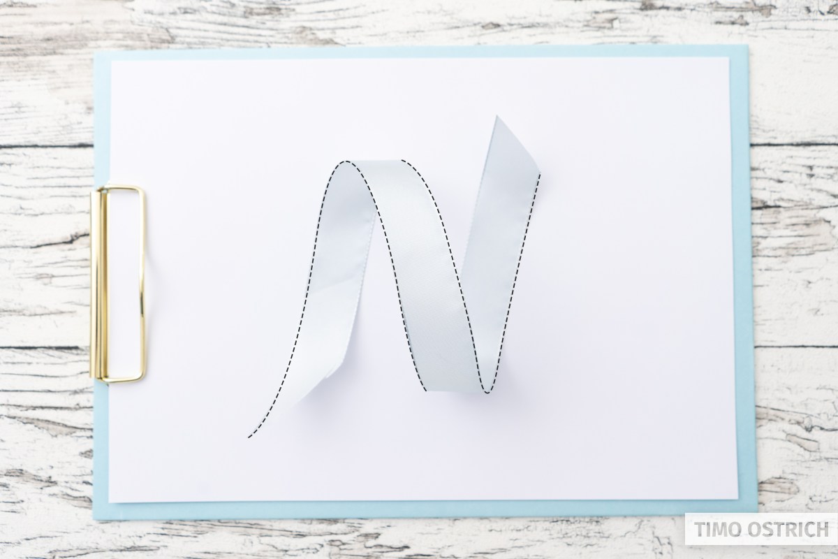
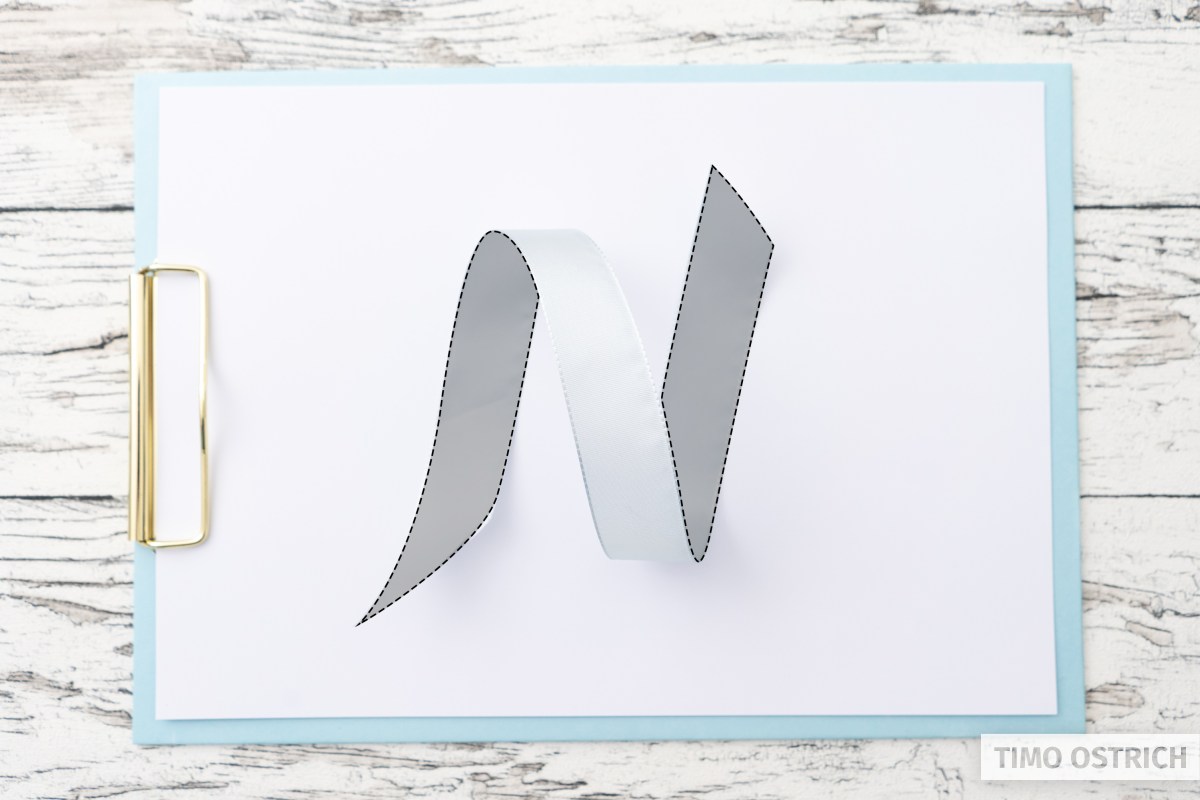
And so that you don’t have to look for a ribbon right now, I have a suitable photo for you, of course. I have imitated a very simple line with a ribbon there.
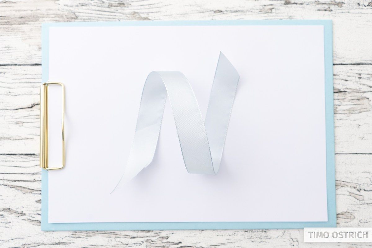
If you look at the photo in detail, you will see the following important factors:
- The band is (logically) always the same width. Minimal differences result from the distance to the camera or the eye.
- The back part of the ribbon is darker than the front part.
- The edges stand out additionally.
- On the front loops further light reflections can be seen.
These factors vary depending on the type of light and angle. But usually we have a light source from above, so that the typical look is very similar.
And that’s exactly the effect we want to imitate with a brush lettering and the appropriate technique!
Techniques at a glance
There are many different ways to create a ribbon. Whether completely with a pencil, with different brush pens or with a parallel pen.
Once you understand the principle, you can use the different approaches or combine them as you like.
The following photo gives you an overview of the many possibilities.
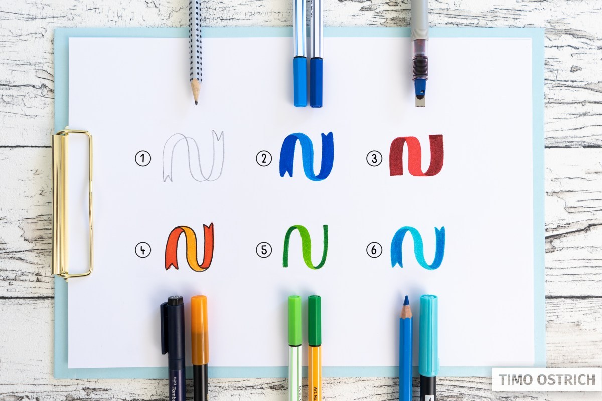
- Creation of the ribbon using two offset lines. For example with a pencil or fineliner.
- The use of two brush pens of the same color but different brightness. The back line is widened here afterwards.
- The use of a flat tip (like a highlighter). Here the ribbon results almost automatically if the tip is always guided at the same angle.
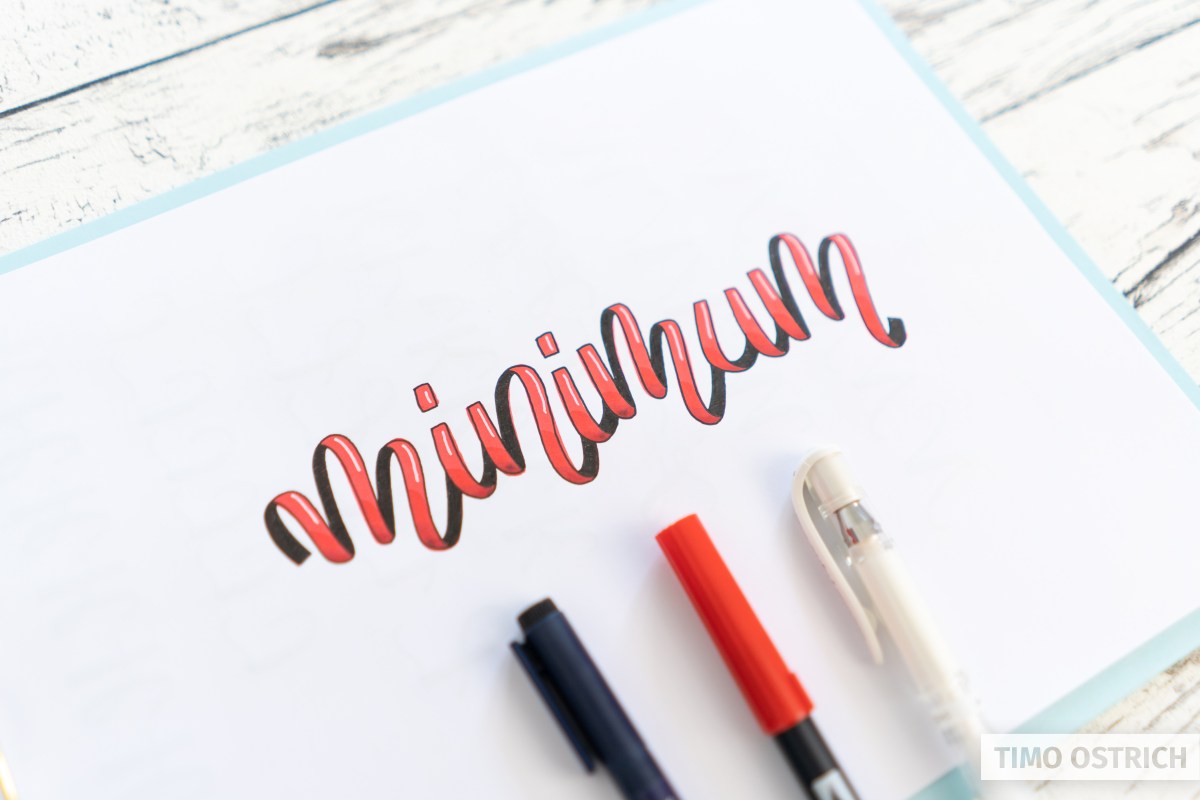
- Ribbon lettering with an outline. The strong contrast of the line ensures that the individual sections are clearly visible.
- An abstracted ribbon, where the lines were drawn with a brush pen only. Only the rear lines (usually upstrokes) are darkened.
- A colored pencil is also suitable for shading. With this you have a lot of control over the shading and nothing can melt.
In this tutorial I show you how to create a nice ribbon lettering with approach number 2.
The simplest ribbon lettering
In principle, there are two challenges with ribbon lettering:
- Creating the basic shape correctly
- Paint the finished form in a way that the ribbon effect occurs
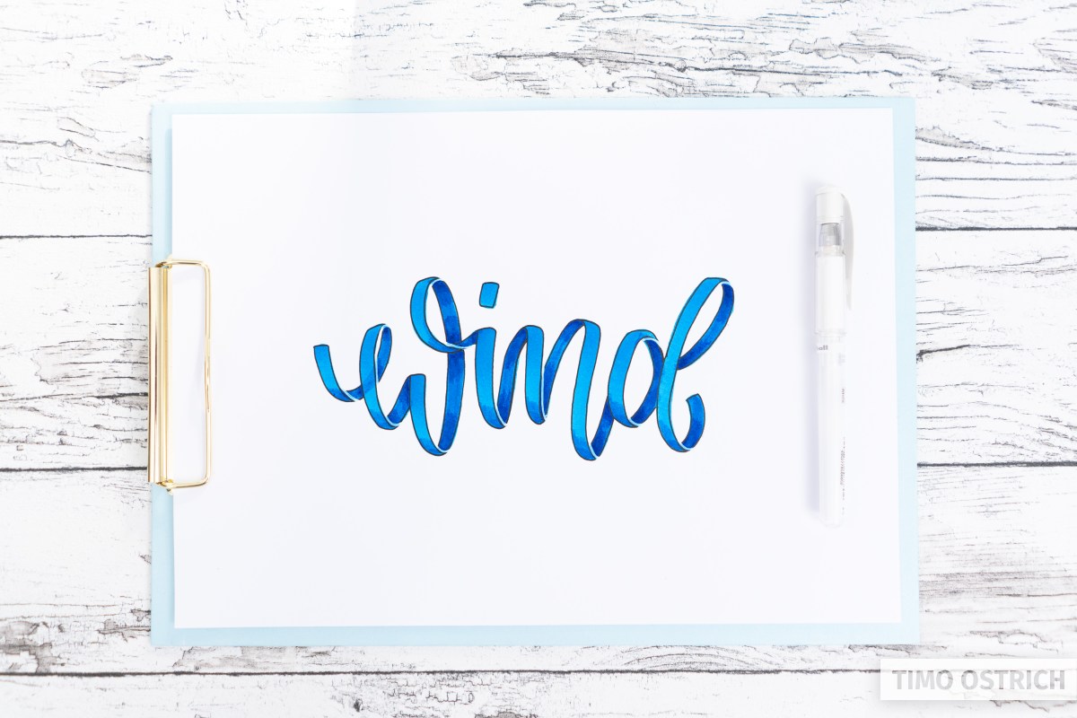
Therefore we now start with a very basic form of ribbon lettering using brush pens and a dark outline.
The basic form
First you have to write the desired word with your brush pen. Follow the typical rhythm of up and downstrokes.
The downstrokes are later the front part of the ribbon, the upstrokes form the back of the ribbon.
If necessary, make sure that the spacing between the individual letters is increased so that you have enough space later on.
Widening the upstrokes
The second step is to widen the upstrokes. They should be just as wide as the downstrokes.
During this process you should already have in mind how your widenings will affect your ribbon later on. With time you will develop a feeling for it!
It is also possible to draw the lines always with the same pressure (i.e. without different up and down strokes) to avoid subsequent widening. However, this is absolutely not good for the brushpen and it will fray quickly. If you want to test it use discarded brush pens only!
Defining the outlines
The outlines help to clearly delimit the individual areas. Although this is not completely realistic, it helps enormously in defining the critical areas. These are the transitions from back to front and the overlaps.
Look at the real ribbon. I marked the most important outlines there. Of course the other borders also get an outline.
You now transfer this principle to your lettering. If possible, proceed step by step and think about how each line should run. Careless mistakes can easily happen during this step.

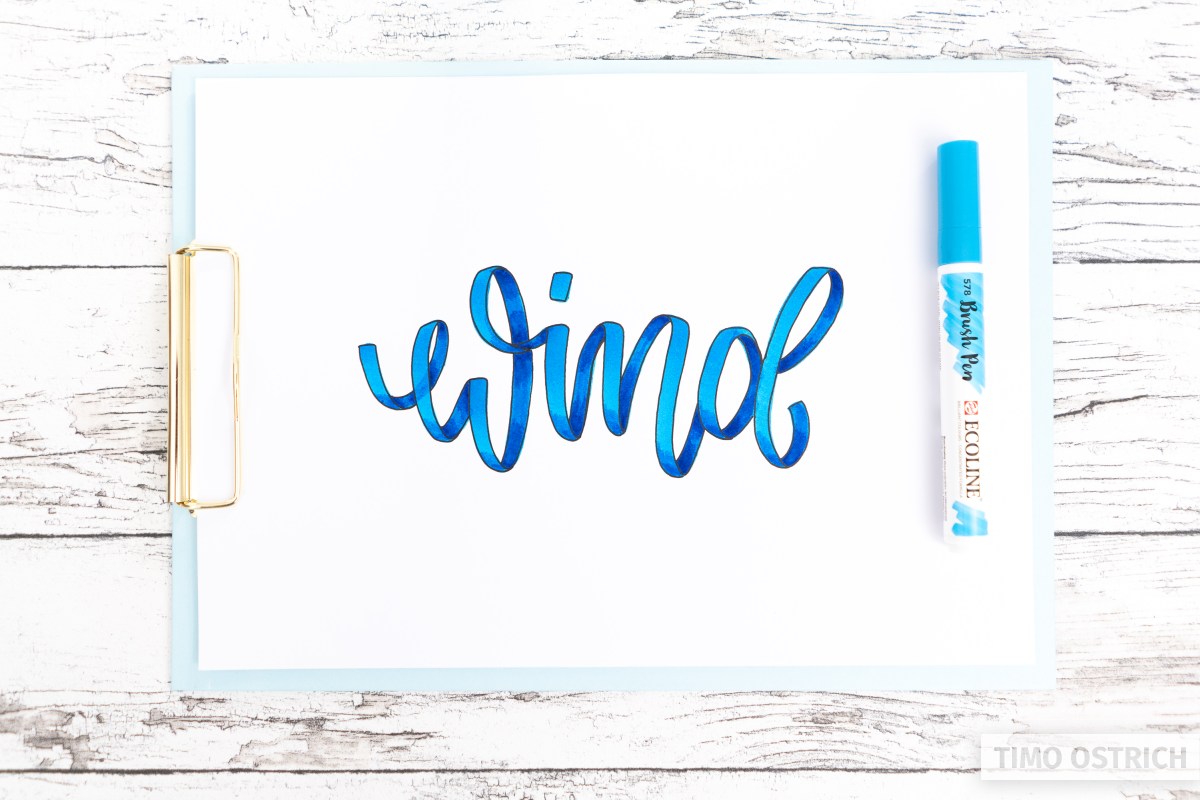
At this point a slight ribbon effect is already noticeable!
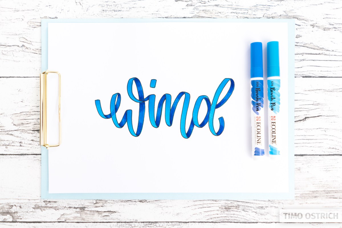
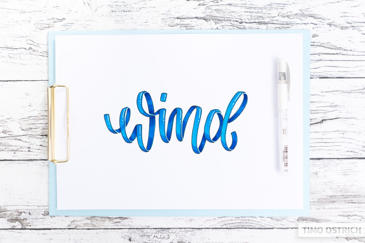
Painting the back
By filling the back areas of the ribbon with a darker brush pen of the same colour, the brilliant ribbon effect is created.
If your brush pen gives off a lot of color, it is sometimes enough to paint over the back areas several times with the same color.
Again, pay special attention to the transitions. Also take another look at the real satin ribbon and see how the rounding in the transition runs.
Wait before this step until the paint has really dried and can no longer run. Otherwise you will get unclean edges.
The combination of light foreground and dark background is one of the simplest ways to create a ribbon lettering.
You can theoretically fill the background with black to visualize your ribbon, too. This would be a simple (but still nice) variant and would look like this:
However, you will then no longer be able to work with gradients and more shadows in the background. That’s why we don’t use a black back in our example.
With further techniques and details you can now enhance the ribbon effect.
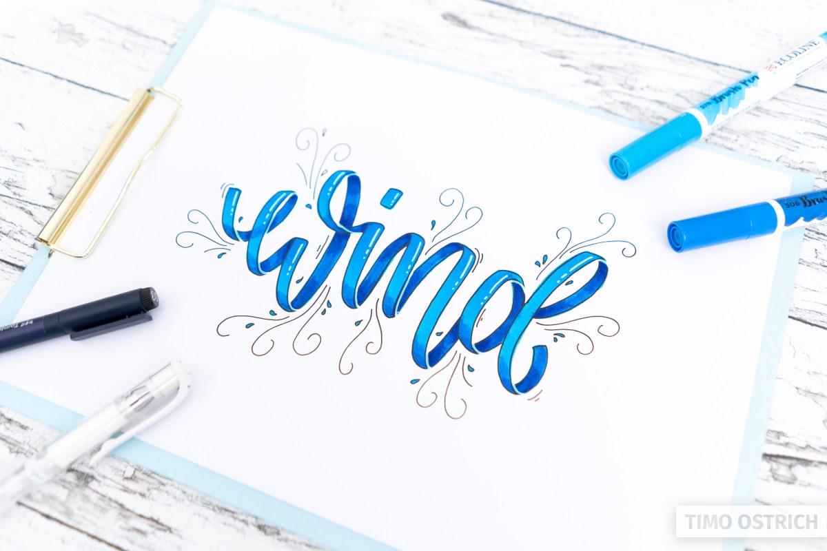
Add details
Now it is time to embellish our ribbon lettering with more details. Let’s recall again a real ribbon and the different brightness levels.
First we add the shadows in the area of the loops. This area is mostly darker, because less light goes there.
It is helpful here if you are already familiar with gradients.
In short: Apply a little bit of colour with the darker pencil in the corresponding area. Immediately afterwards, use the lighter pencil to blend the dark color.
We also darken the lower area in the foreground so that the upper area is a little lighter.
The 3D effect is thus already significantly enhanced.
In the next step, we reinforce the contours of our gift ribbon. One side becomes light or white. This also makes the important area of the transition even more visible.
For this step I am using a white gel roller.
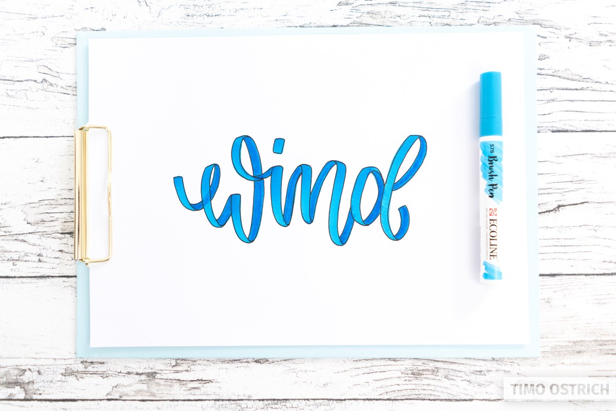
At this point I find the ribbon optimized enough and really appealing! Optionally you can now add additional highlights (lights or light reflections).
In reality, this would mainly depend on the material used. A typical satin ribbon usually has no hard light reflections. But of course we always have the possibility to act artistically free here.
The main thing is that you are aware of which effect you are creating with which approach.
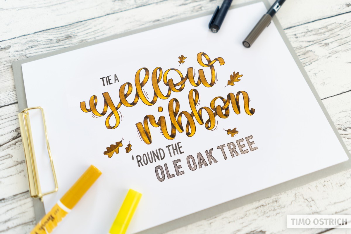
Last but not least, I decorated my ribbon lettering a little.
Ribbon lettering in time lapse
To illustrate the technique I have also created a time lapse for you. But there I use a colored pencil for the additional shadows.
Combining techniques
A ribbon lettering looks really great even in the simplest version. In combination with other lettering techniques you can make a lettering even more exciting and dynamic.
A good partner for ribbon lettering is for example bounce lettering. The dancing letters create a brilliant appearance.
Gradients can be used in combination with your ribbons, too. Some of them are even necessary to use the different brightness levels correctly.
In the end, it’s best to let your passion run wild and create as you like!
I hope my ribbon lettering guide helped you to understand the topic ribbons. Have fun with your first ribbons!