Of course you can also use numbers and figures in your hand letterings! Unfortunately, they are not given much attention in most manuals.
Therefore, in this article I would like to show you the basic stroke pattern for hand lettering numbers and inspire you with some styles.
Furthermore, I will show you a kind of numbers that you have probably never consciously noticed before…
Contents
The basic patterns
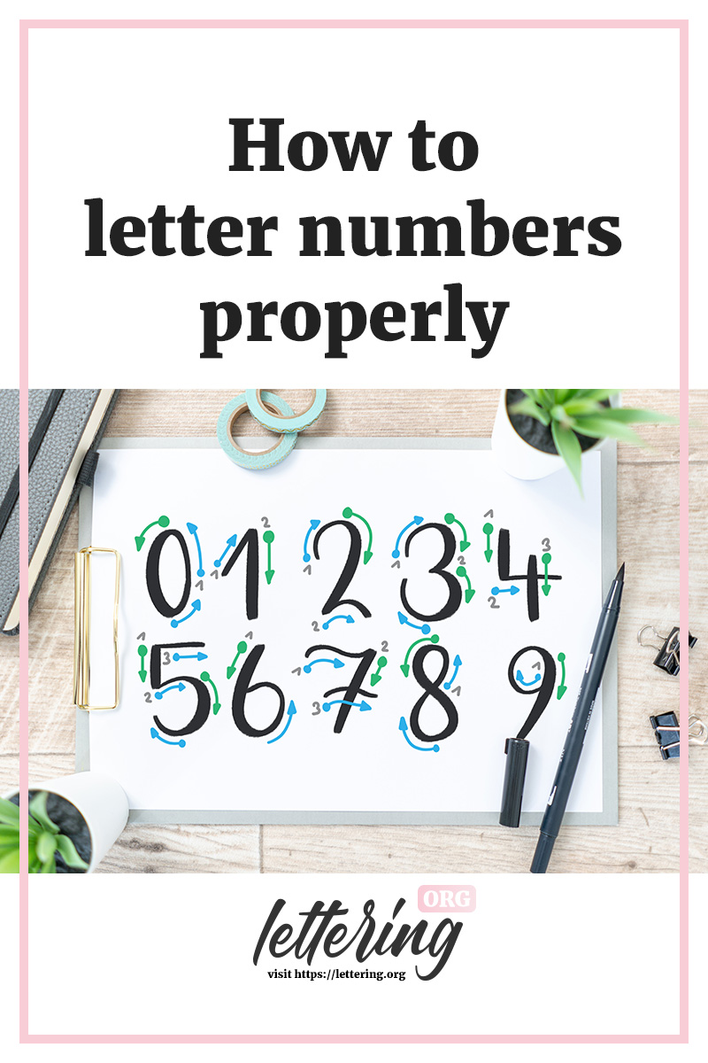
To write the numbers from zero to nine (the normal way), there is a typical sequence of strokes. This is how the individual digits are created and can be put together to form numbers.
In the following photo I have marked these lines with a simple font:
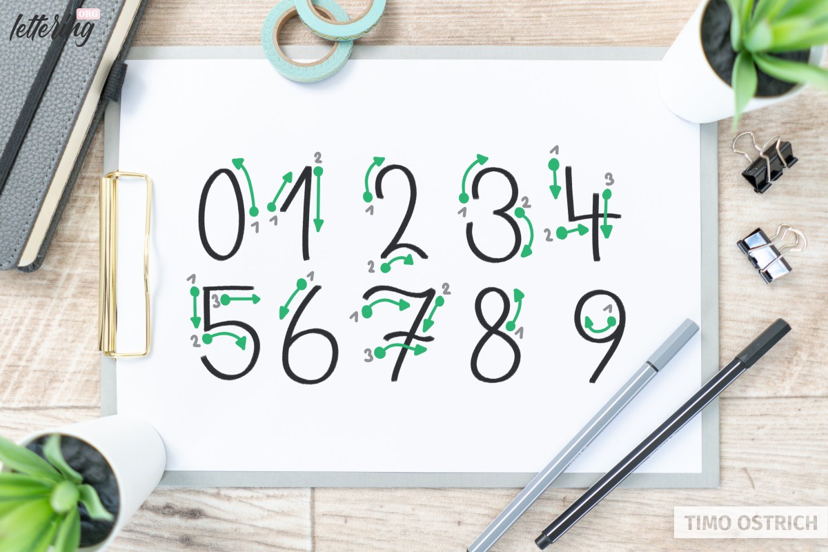
The approach is very similar to the way I learned it in school.
The individual movements are precisely coordinated with each other to create the best possible flow of writing. Only with the “9” I have chosen a different line management, which will help you in brush lettering.
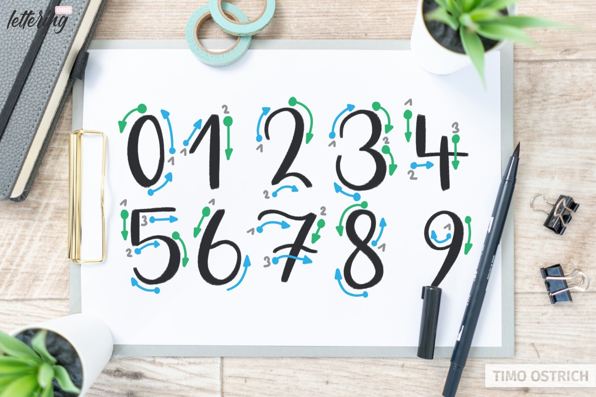
Writing numbers with brush pens
The typical line width contrasts that make the brush lettering so special can also be applied to numbers (you need a brush pen for this).
In order to work in the right places with much and little pressure, it is important to know the basic line strokes.
Because if you can already draw the individual strokes correctly, all you have to do now is apply the principle of brush lettering to the strokes:
- Strokes from top to bottom are executed with a lot of pressure, a thick line is created
- Strokes from bottom to top are executed with little pressure, resulting in a fine line
Hand lettering numbers follow the same rules as letters. In my brush lettering workbook I have dedicated a special page to numbers. So you get a feeling for the lines and shapes.
Old-style figures
At first glance, the so-called old style figures (also known as minuscule figures) do not differ from the usual figures (majuscule figures).
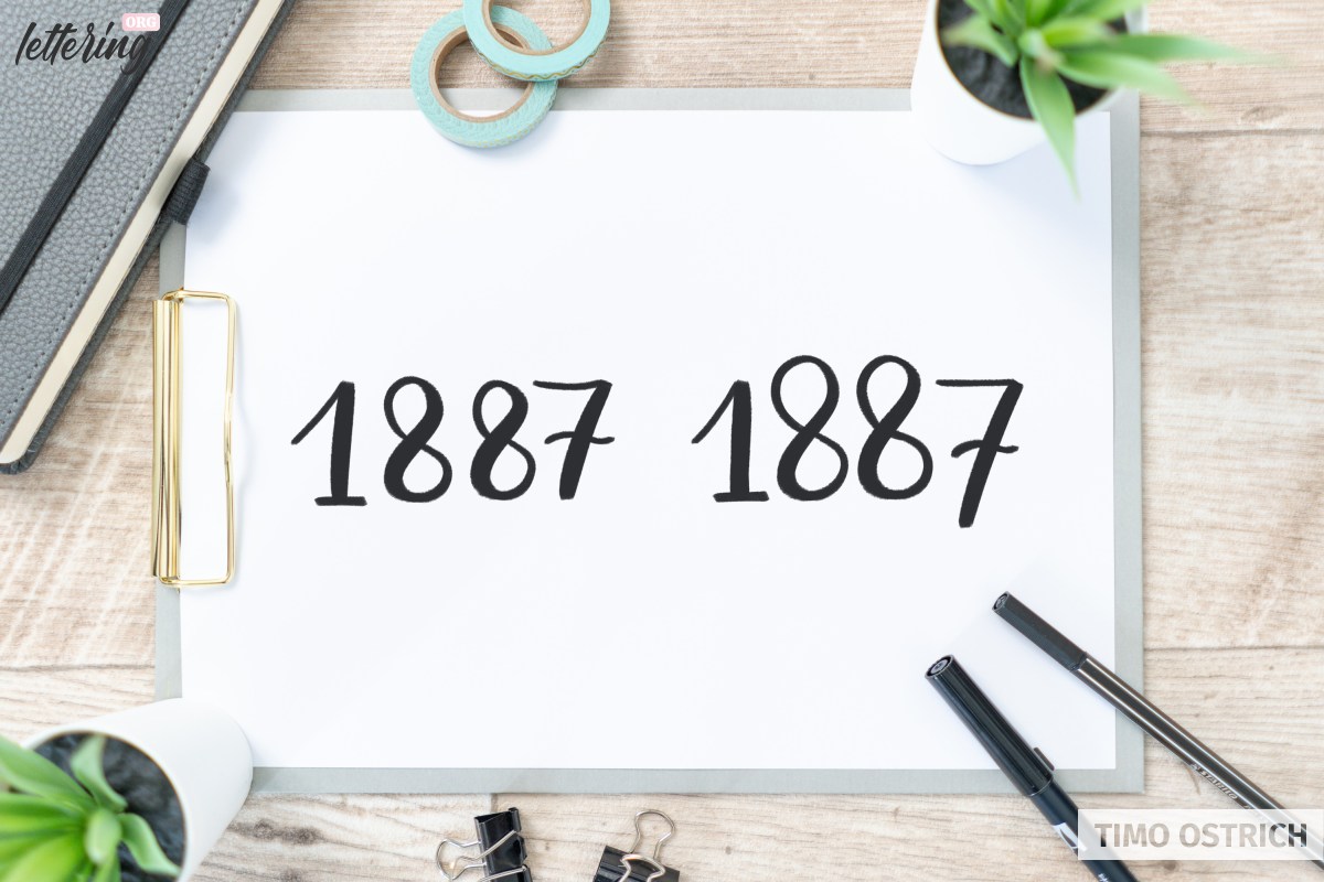
Only when you look at the numbers in the baseline system they reveal their effect. Just like letters, old style numerals have fixed ascenders and descenders!
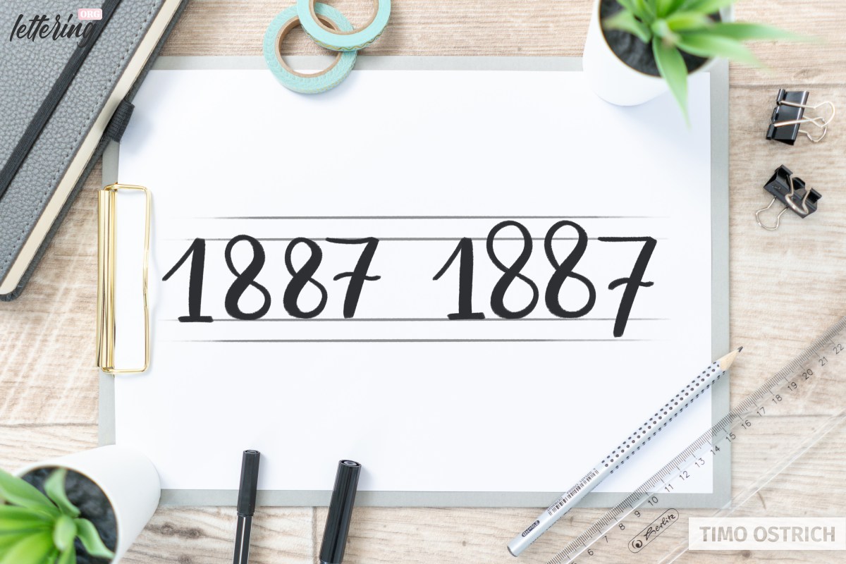
As a result, these digits fit better into continuous text. For you as an artist they also offer an exciting visual effect.
According to the artistic freedom you have, you can use these digits as required – and thus change the character of your lettering.
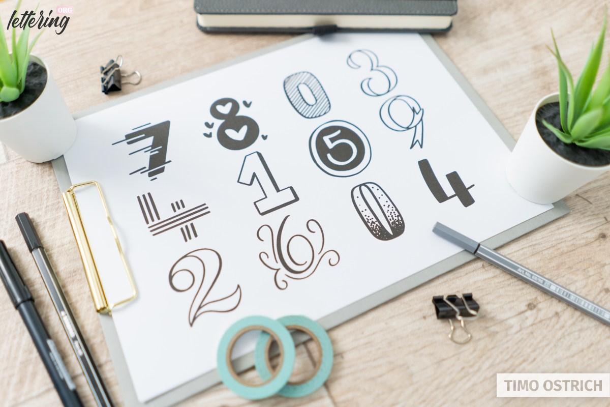
Different styles
Beside simple numbers with the same line width and the variant with brush pens, there are endless possibilities to draw hand lettering numbers.
Here too, it is worth taking a look at different hand lettering styles and alphabets. The individual styles can usually be transferred to numbers in a wonderful way.
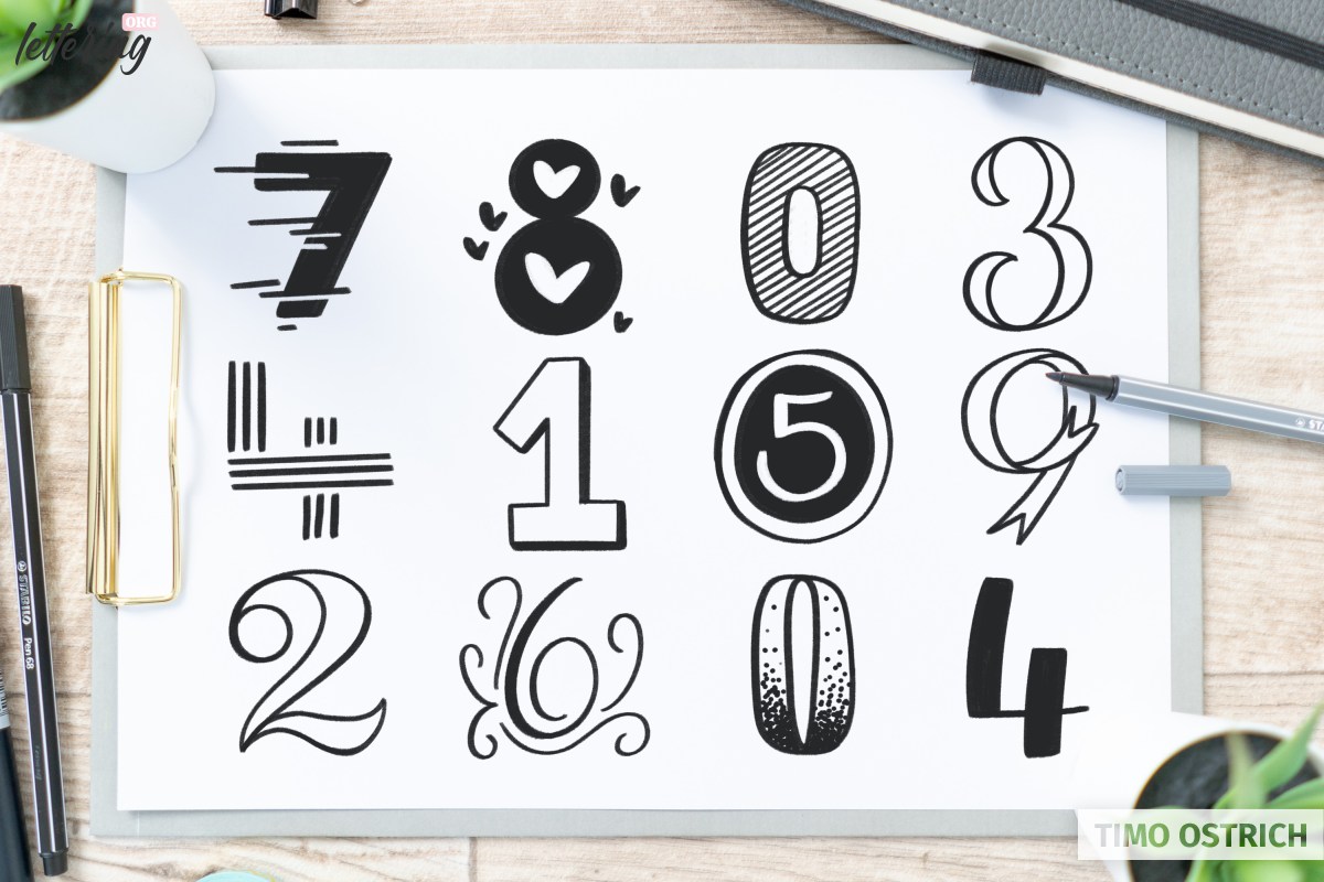
Whether strong and three-dimensional, slim and embellished or charmingly decorated – there are no limits to your imagination.
Ideally, you adapt the look to the content. This results in a harmonious overall work.
With this I would say: Have fun with your next hand lettering birthday cards!