
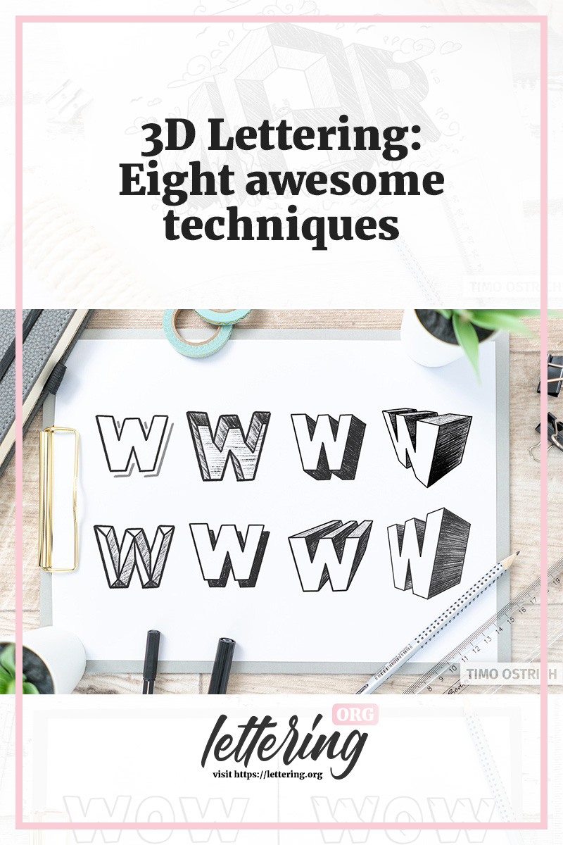
Hand letterings with 3D effects practically jump at the viewer. Your lettering comes to life!
There is a whole range of brilliant techniques to get depth into your letterings. In this article I will show you them. Almost all of them. From easy to difficult!
Contents
Overview
You want to achieve a certain result but you dont want to read everything? By clicking on the picture you will get to the corresponding section.


For a holistic understanding of 3D Letterings I recommend you to read the whole article at your leisure. It is worth it!
The feeling of depth
To create three-dimensional effects, depth or different brightness levels (light and shadow) are always required. This works both in abstracted form and in harmonious combination.
In the following I will go through simple, abstracted 3D techniques with you, but also realistic perspectives.
Ideally you should grab a few pens and join in right now!
One-sided contour
A simple and quick way to create a haptic impression is to use a one-sided contour.
If you add a contour line to each letter with a little distance between them, your hand letterings will inevitably have some depth.
Here it is especially important to always set the line according to the same principle.
In other words: always left, always left and down, always right and up and so on.
Only the uniformity creates a three-dimensional effect. Of course you can vary the contour as you like and play with distance and position:

To practice the one-sided contour, I have also integrated a suitable font into the lettering generator!
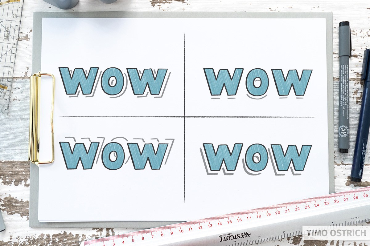
Drop Shadows
Light and shadow ensure that flat objects suddenly acquire depth. In fact, a simple drop shadow is sufficient to emphasize a lettering.
Hard Drop Shadow
A hard drop shadow corresponds in its shape and size exactly to the original lettering. Imagine that you color your lettering completely black and then push it aside a bit. This is your drop shadow!

You can also use the contour lines as a basis for the drop shadow, as in the 3D technique “one-sided contour”. Once the lines have been drawn, you only need to complete the shape and then fill it with a dark color.

Soft drop shadow
In principle this shadow corresponds to the hard cast shadow. With the difference that it should be displayed a little more realistically. For this, the shadow must be soft and diffuse.
You can create such a shadow with a fine pencil hatching, for example.

With digital lettering, the effect can be implemented much more easily with the help of a smooth blur.

Isometry
Isometry is a simple form of three-dimensional representation. There is no foreshortening in perspective as there would be in reality. Instead, the lengths of individual strokes remain the same even in depth.

That sounds complicated for now. But if we use isometry, you’ll quickly understand the principle.
Especially with simple objects you can achieve strong 3D effects with the help of isometry.
As always, a flat lettering serves as a basis. To turn it into a 3D lettering, only three steps are necessary:
- Draw an offset version of your hand letterings behind the original lettering. Similar to the contour line and the hard drop shadows. The shape will be exactly like the shape of your lettering.
- Now connect the edges together. Always use parallel lines.
- Finally, fill the area with the same color.

Your lettering has now been given a third dimension: The depth (z-axis)!
You can also reverse the procedure by drawing a parallel line of equal length at each corner and then connecting the ends according to the shape of the letters.
If you don’t color the surface completely, but take an imaginary light source into account, you can enhance the effect even more.

To do this, imagine that a little light shines on your lettering from the side (for example from the right). All surfaces that point to the right should be painted a little brighter. The areas that are averse to light remain completely in shadow.
That looks really haptic, doesn’t it?
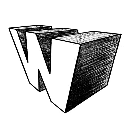
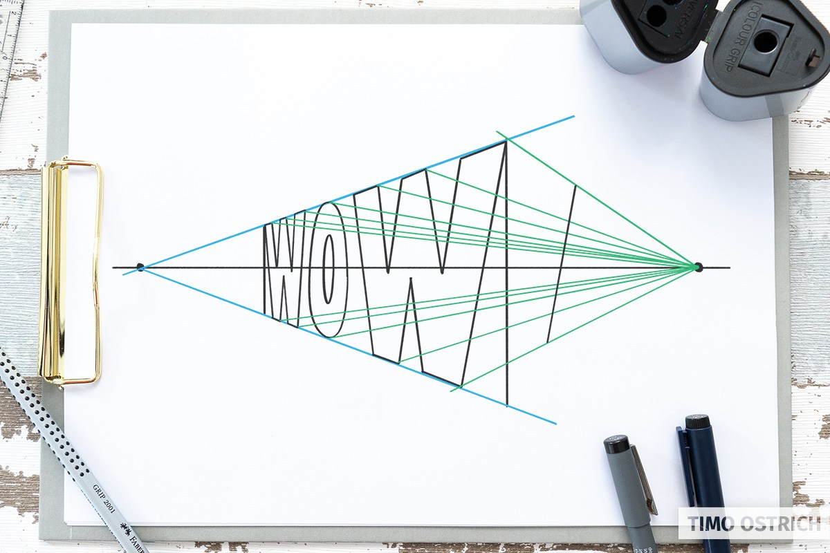
Central Perspective
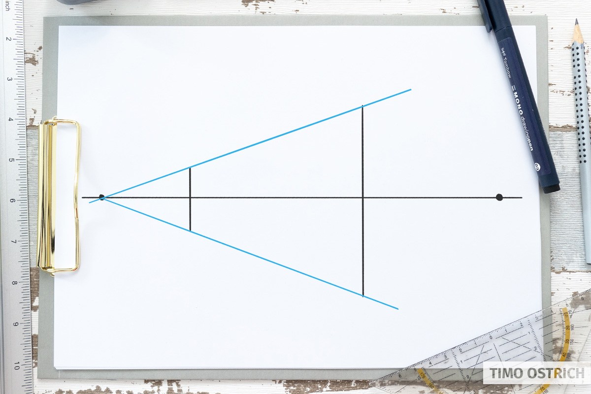
With the central perspective we create a much more realistic look by working with a vanishing point. All the lines that go into the depth of the image will converge on the same vanishing point.
This principle can also be applied to letters in a wonderful way.
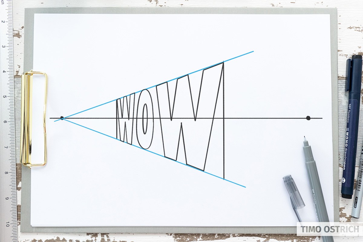
First you draw the word you want to represent in 3D.

The second step is to think of a vanishing point. The position of the vanishing point has a fundamental influence on the later appearance of your lettering!

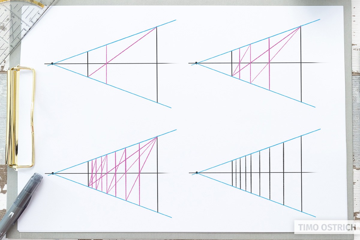
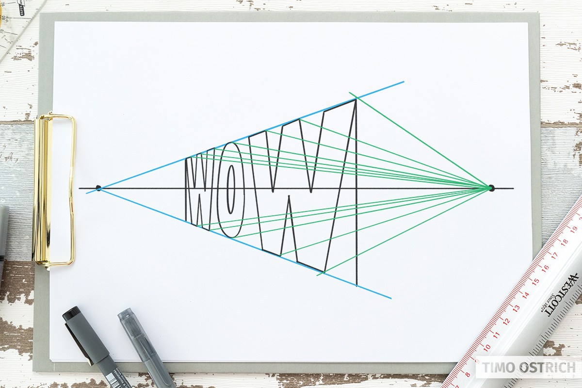
Once the vanishing point is fixed, draw a line from all corners and edges (sometimes you have to work with tangents) to your vanishing point. It is best to use a pencil for this.

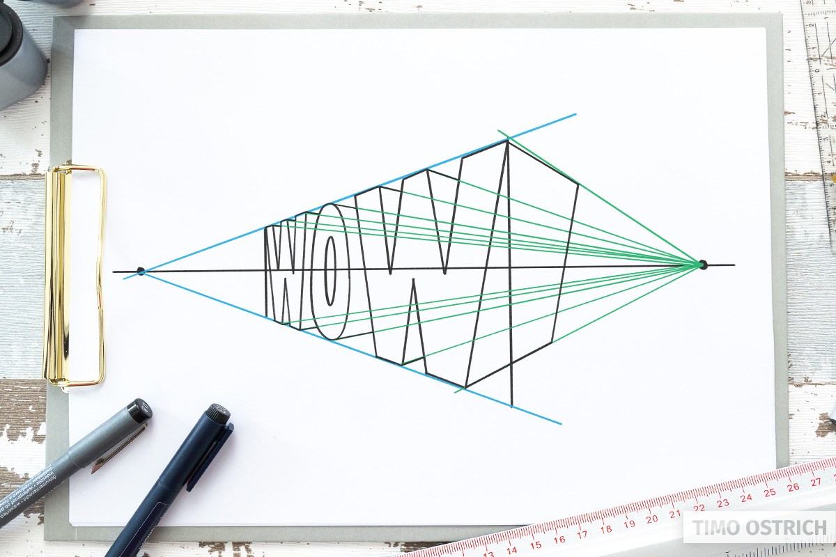
As you can see, your word is already three-dimensional. In the last step, you shorten the lines that go deeper. This is how you decide how deep your word really is. To do this, repeat the outline of your letters between the alignment lines.

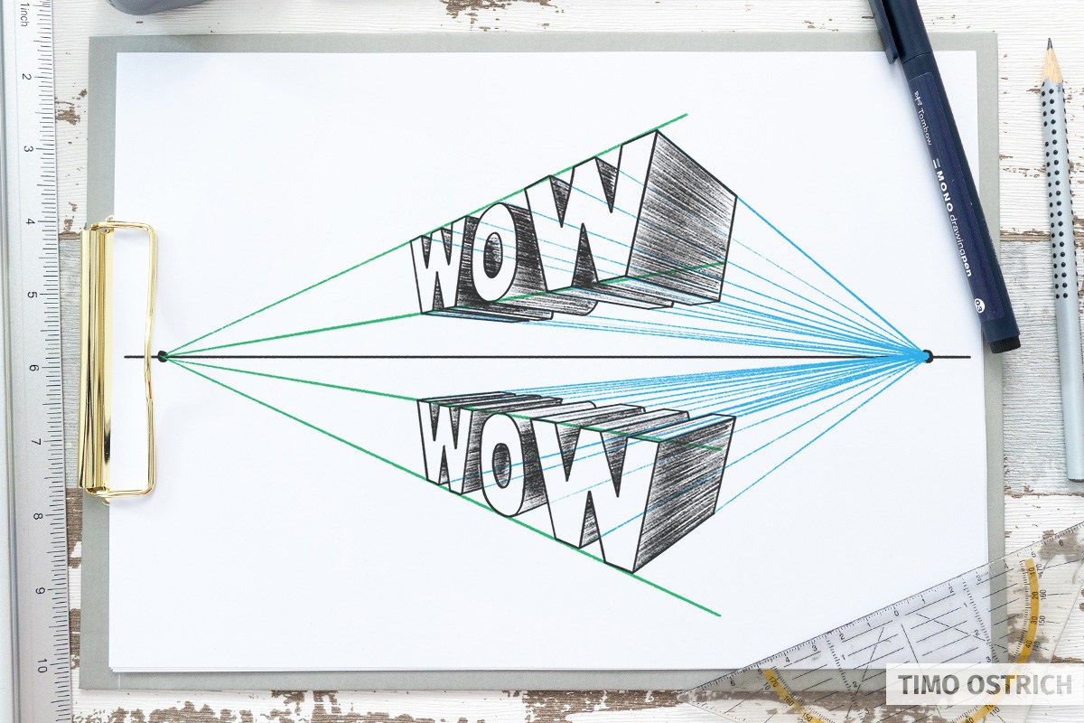
If you now erase the superfluous lines, you have a brilliant 3D hand lettering in a central perspective.

By adding light and shadow again, the effect is further enhanced. If you draw the shading parallel to the alignment lines, you will also add a sense of depth.

The principle also works with curved letters and brush letterings. However, this makes the process somewhat more complex.
And all this with only one vanishing point!
In an complex lettering, the central perspective can also have this effect:

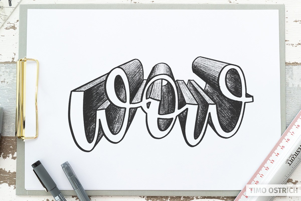
Two-Point Perspective
With the two-point perspective you have the possibility to make your lettering even more three-dimensional. For example, you can rotate the letters slightly in space.
For the step-by-step construction of your lettering you need a horizon and two vanishing points that lie on the horizon.
For construction and clarification I always draw these lines for the time being. But later we erase these guides again.

With a vertical line you now define a corner of your word. I want my “wow” to be diagonally across the room and end on the right half of my sheet. The height of the line defines how high your word will be later.

Now draw two vanishing lines from the left vanishing point, through the ends of the previously set line.
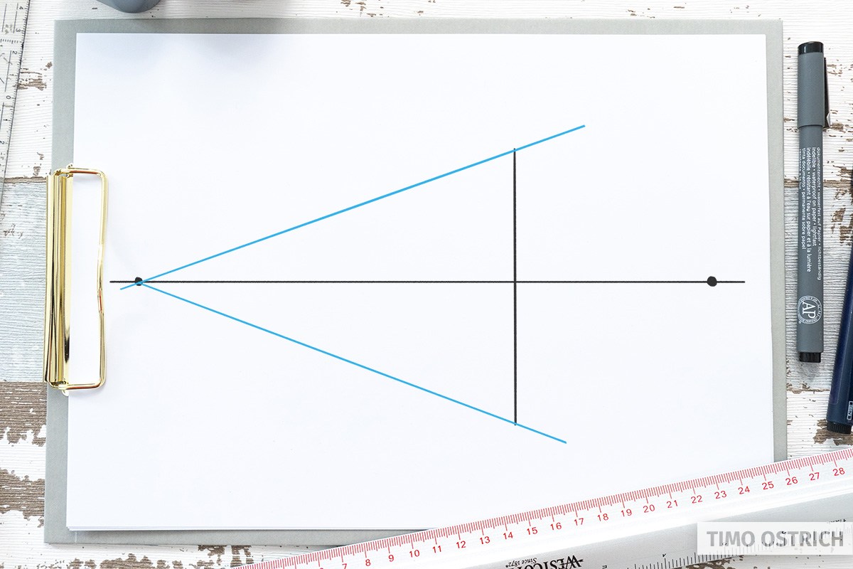
With a second, vertical line you define next the beginning of your word. The line is limited by the vanishing lines. With this line you now create an area for the front of the word.
The vertical lines of your letters remain parallel to each other in this perspective. Therefore, letters like the “H”, an “L” or a “T” are relatively easy to place.
The “wow” contains slants and curves, so the front shape needs some practice.
Tip: To construct equal distances towards the vanishing point, divide your area (bounded by the two vertical lines and the two vanishing lines) using a diagonal.
Where the diagonal intersects the centre of the vertical (here, exactly on the horizon) is the centre of the square in perspective.
If you repeat this step several times with the new squares, you will get more vertical lines that will help you to draw the letters correctly.
With (or without) these guides you can now carefully draw the shapes of your letters. You will have to do a lot of erasing here. ????
Similar to the central perspective, in the next step you draw alignment lines from all corners and edges. This time to the second vanishing point, on the right side. These lines give the depth of our word.
Now you repeat the shape of your letters in the depth of the room – depending on how deep your word should be. Since most lines are hidden, I only had to repeat one line of the “w”.
Now you use the parts of the vanishing lines to the right vanishing point and drag them so that the complete, three-dimensional form of your word is created.
If we now remove all guides, you will see the finished word in the two-point perspective.

What now follows is clear: With additional shading and lighting, we will once again significantly enhance the 3D effect!

In the two-point perspective you can also place your word differently. By placing it completely below or above the horizon, you create additional space on or below your letters.
This way you will see three different sides of your lettering for the first time.
Finally, an elaborated example of me for the two-point perspective:

Three-point perspective
With the three-point perspective, as the name suggests, we have a third vanishing point. This allows us to construct impressive perspectives. We completely dispense with parallel lines and construct all edges using three vanishing points.
Would you like to see a complete guide to the three-point perspective here? Then leave a comment on this page. If there is enough interest, I will add this section to the 3D Lettering tutorial.
Embossing
Letters cannot be emphasized only by depth and shading under the word. You can also create a 3D effect by using a relief.
The classic Photoshop effect is called “Bevel and Emboss” and provides exactly this effect.
At first the letter is only refined within its basic form.
So you start again by drawing your word using block letters (you can find a suitable alphabet here).
For our embossing we decide that we let the letters taper in the middle. Like a diamond cut.
To do this, you draw a line in your block letters (perhaps you have constructed it with such a line).
The next step is to connect the vertices with the ends of the inner lines. More areas are created!
For some letters (for example the “O”) there are no corners. Therefore there is no visible edge. So we have to work out the raised appearance by the following shading.

Imagine the light coming from the top left of your paper. Accordingly, the embossing gets a simple shadow at the bottom and right.
Inner 3D
What works on the outside, works on the inside. In other words, you can also create a feeling of depth by cutting the shapes of your letters into the paper.
The 3D techniques already described serve as a basis. The easiest way to demonstrate the principle is the isometric approach.
The basis is again your block letters. There you add a small line at each edge.
The rule: The lines are only visible within your letter shape, all of them are the same length and parallel to each other.
In the second step, you use the ends of the lines to repeat the shape of your letters. Also always only within the letters.

At the end you add, as always, appropriate shading. And suddenly it looks like you can see inside the paper! A brilliant effect.
Technical help
The construction of 3D letters is a lot of fun, but also requires maximum concentration! Careless mistakes are quickly made and the whole perspective is ruined.
Accordingly, 3D Lettering can also cause headaches. ????
The process can be made a bit more pleasant with a little technical help.
Graphic programs
Many graphics programs offer support in the construction of perspective drawings. For example, by automatically setting vanishing points and auxiliary lines.
You can also undo your steps and use the power of layers.
For hand letterings the App ProCreate with its drawing aids is perfectly suitable. You still have to construct everything yourself – but you get effective guides at hand!
In my Digital Lettering course I will show you how to use these guides correctly.
3D and CAD Software
With the help of 3D and CAD software you have the possibility to distribute letters in the room as you wish.
The software takes over any perspective distortion for you, so that you can create a template for your lettering at the end.
If you draw directly on this template, you can create almost impossible perspectives that are hardly possible on paper.
Creatively combine
Of course, the individual techniques do not stand alone. It will be exciting to combine the different possibilities.
This is how great works of art with detailed 3D letterings are created!
And now it’s your turn: Dive into the world of three-dimensional letters and let your head smoke! ????
Really! Very helpful for me for learning 3d calligraphy.I have great experience:)
thank you so much for all content are in English.
Glad you like my tutorials! 🙂
Thanks for your beautiful and clear tutorial! I used it with my year 8 Visual Arts students and it was a great success.
Good to hear! Thanks for your feedback.
Brooooo, this was very ver helpful. Thanks for the tutorials
WOULD LOVE TO SEE A TUTORIAL FOR 3PT PERSPECTIVE LETTERING!