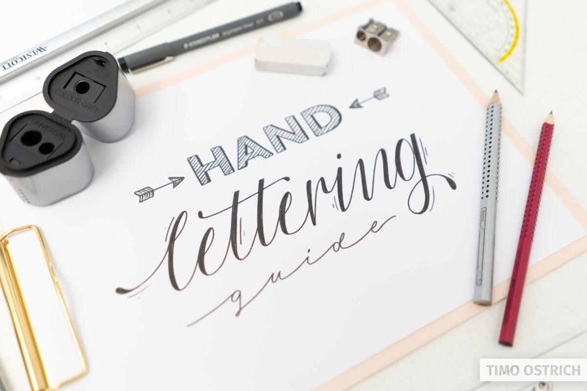
This is the most basic guide to start hand lettering. It’s all you need if you want to learn lettering with a normal pen (pencil, pointball pen, fineliner, felt-tip pen).
In this guide I will use a pencil to show you every step. If you learn and practice the basics of this tutorial, every other lettering technique will be way easier to master!
Contents
What is hand lettering?
Basically hand lettering means that you stop writing your letters or words as a whole. Yes, you read right. No more writing. It’s called drawing from now on. You will draw every single line of a letter.
Sooner or later you will start thinking in strokes.
Don’t mix up hand lettering with brush lettering.
Brush lettering definitely is part of hand lettering – but it makes use of special pens (brush pens) to create strokes with different widths.
Hand lettering allows you to use any pen. With your pen you will be able to draw monoline letters, block letters, elegant flourishes and even imitate brush letterings or real calligraphy.
About the pens
As I told you before you can use any normal pen (fixed width) to start hand lettering.
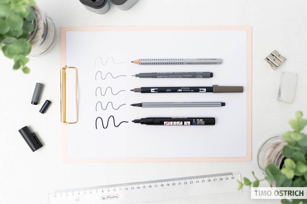
The most handy pen is a simple pencil. It’s the ultimate tool you will always need (even when you will use other pens later on). Futhermore it is erasable. If you make a mistake you simply erase the unwanted line with a rubber.
Your pencil should not be too hard or too soft. I like to work with HB till 2B. Don’t worry about that too much at the beginning. Just start with the pencil you have at home.
Additional tools
The minimum things you need are a pencil and some paper. But there are some more very useful tools, which will help you to start hand lettering.
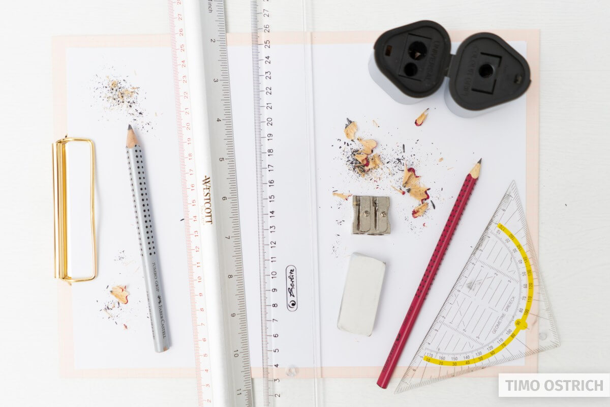
- A rubber (for erasing unwanted lines, scribbles or guides)
- A ruler or a triangle (to create guides or straight lines)
- A sharpener (eventually every pencil becomes blunt)
When you have everything together we can start! Let’s letter!
Basic strokes
It makes very much sense to start with some basic strokes first. They will help you to get a feeling for your tools and you will recognize these strokes later on.
If you learned to write in longhand at school you will probably have the right feeling already. If not – no problem. We are doing it step by step.
Try to create the following lines using your pencil. Pressure does not really matter – but the direction does. Learning to draw these lines in the right directions will make it easier to learn brush lettering later on for you.
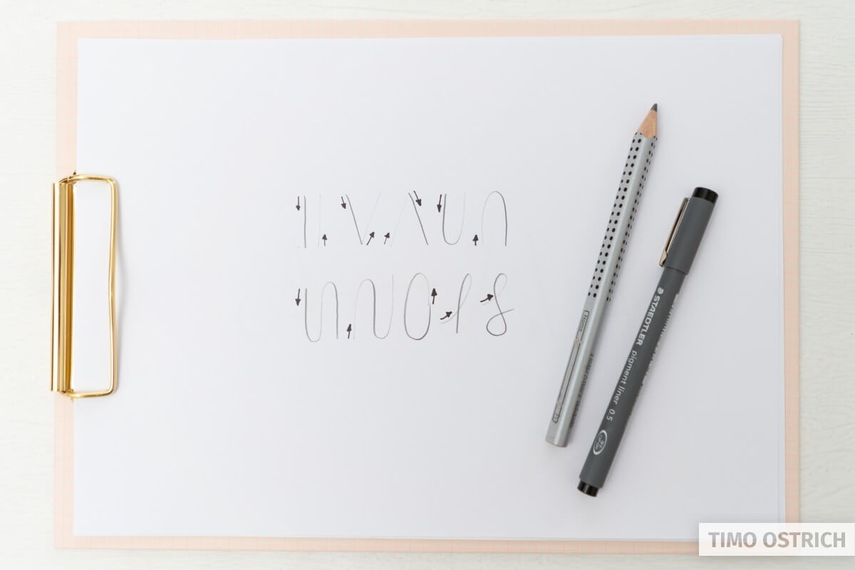
These basic strokes will always accompany you from now on. Practice them over and over again!
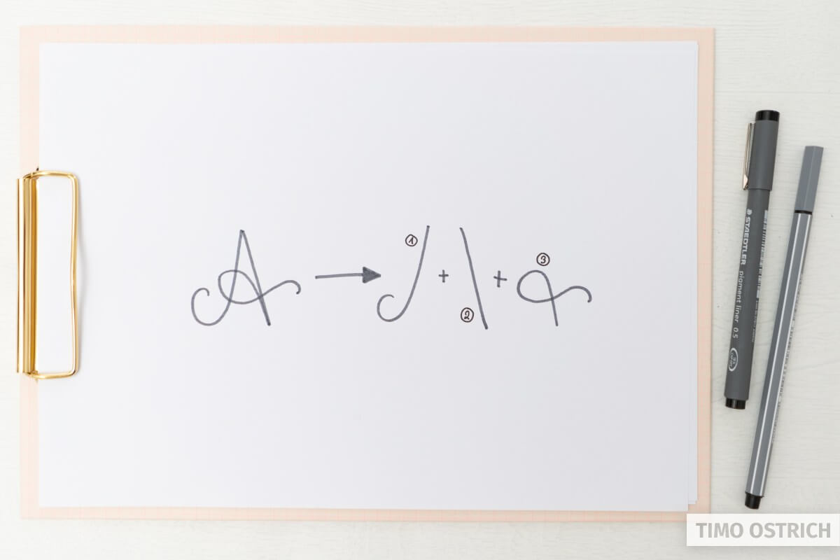
Drawing your first letters
Okay, now you know the basic strokes. Let’s have a look at full letters! Every letter consists of one or more strokes. Putting them together creates a letter. Think of them line by line.
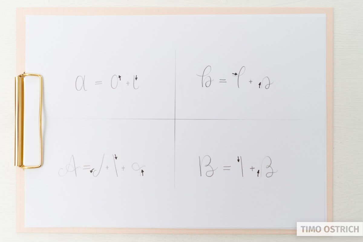
You can do this with every other letter, too. I created a simple worksheet for you, so you can practice the whole alphabet.
The lower case letters are easier to learn, because their overall size is smaller. Longer lines are always harder to draw.
So you should start with the lower case letters and once that works you can move on to the captials.
Connecting letters
The next step is to connect all these single letters to words. Sounds easy, but theres one important thing to keep in mind: The transitions between the letters.
When drawing words you always have to think of the next letter (or the first stroke of it) in order to draw the right transition.
The majority of the letters are connected on the baseline.
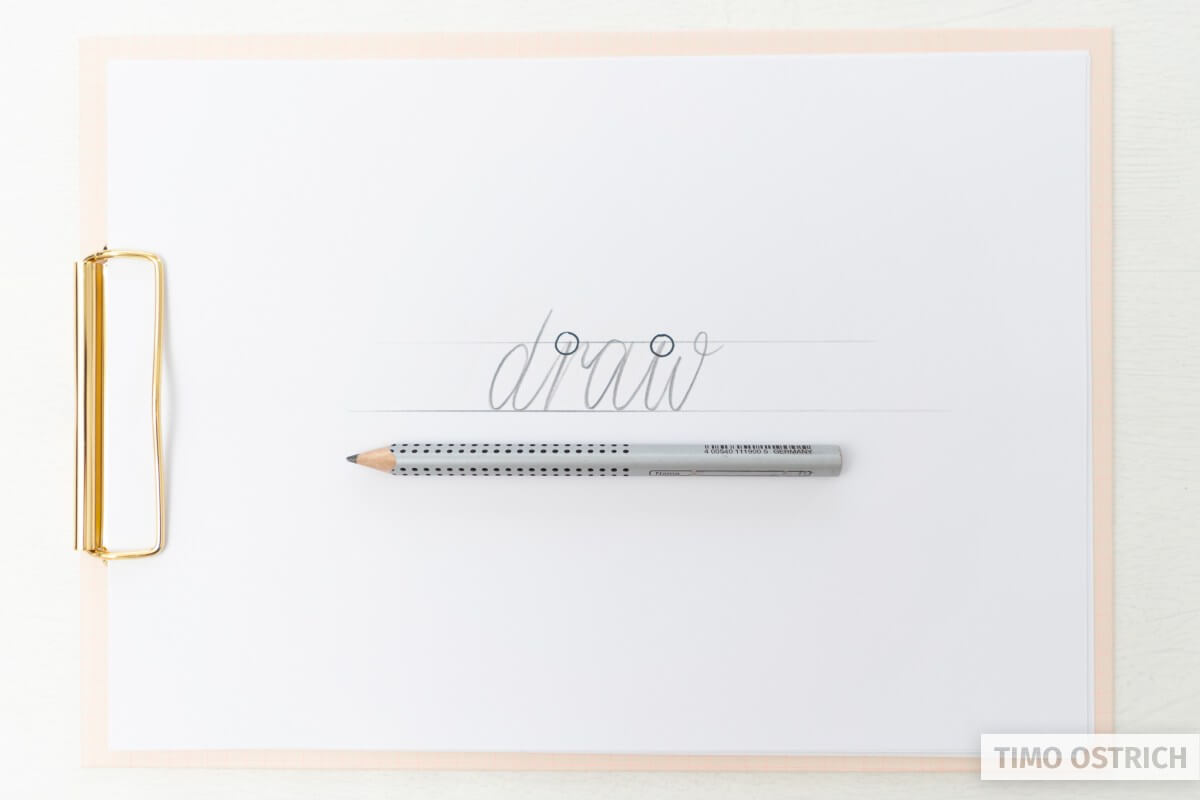
But watch out for letters which do not end on the baseline! Letters like “o”, “r,” “v” and “w” end on the median (x-height). These letters have to be connected on the median – otherwise you won’t recognize them anymore.
On the other hand there are letters which start on the median. When drawing them you have to keep in mind that the transition from the last letter has to end on the median, too. That’s the case for “r”, “v”, “w”, “x” and “z”.
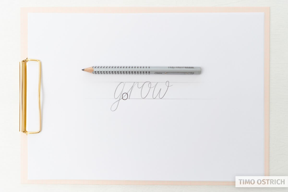
Last but not least there are some letters which end below the baseline. If you want to connect these letters to the next letters properly you have to make the line end on the baseline again. This happens to the letters “f”, “g”, “j”, “p”, “q”, “y”, and “z”.
There a multiple styles for some letters which may have other start and endpoints (for example for the “r”, “s” or “z”)!
Hint: It’s not always necessary to connect every letter. Sometimes it’s okay to have some gaps. The overall appearance has to be harmonic.
It’s your task to get creative when drawing letters and connections. You just have to keep in mind that the letters should stay readable. If you would connect an “o” to a “v” on the baseline it would look like an “u”. We don’t want that!
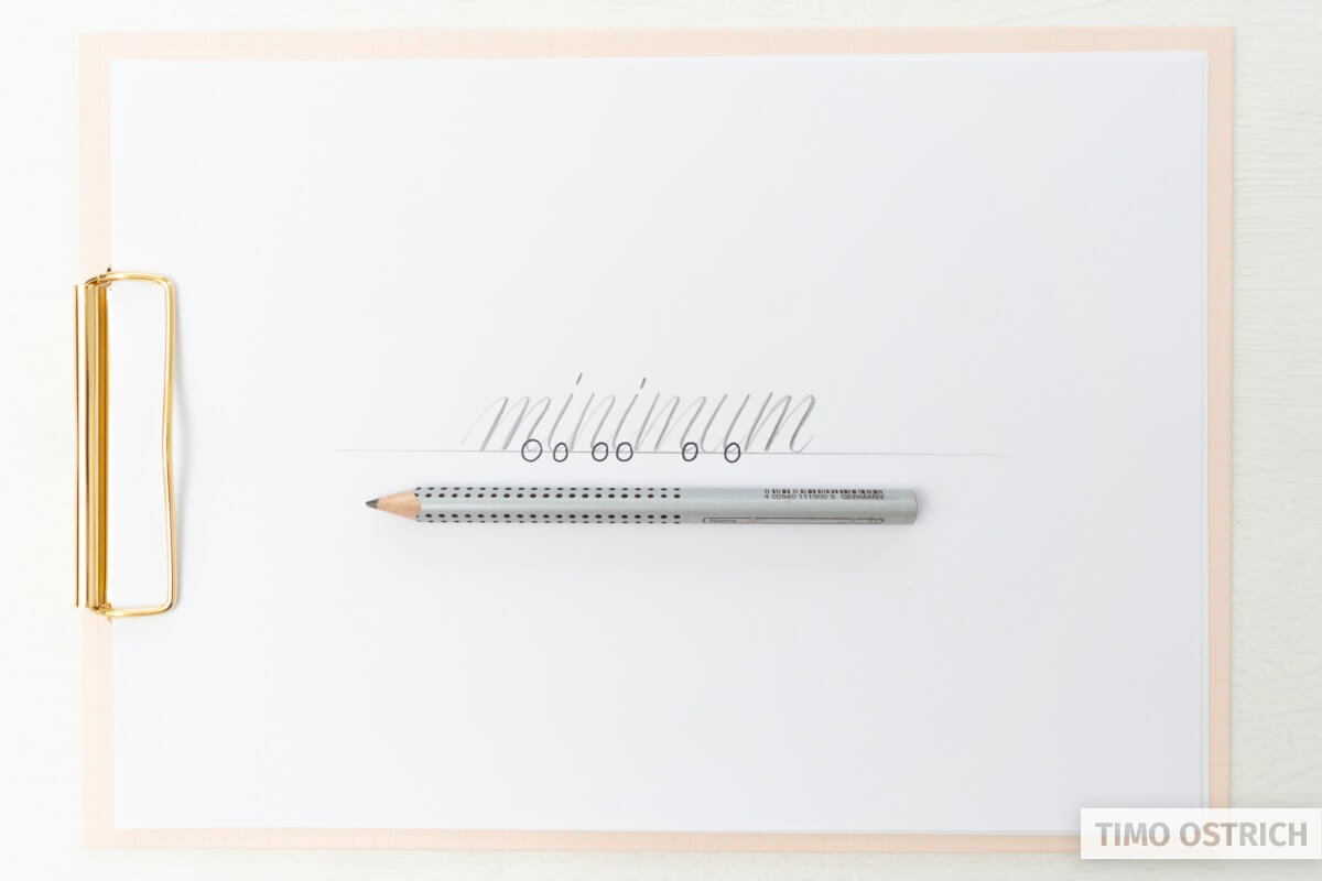
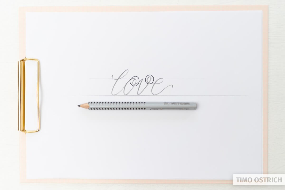
Drawing words
Now you know how to connect letters. Let’s start drawing our first words. There are some typical (lowercase) words, which are perfect for learning hand lettering. These words consist of letters which are easy to draw and connect.
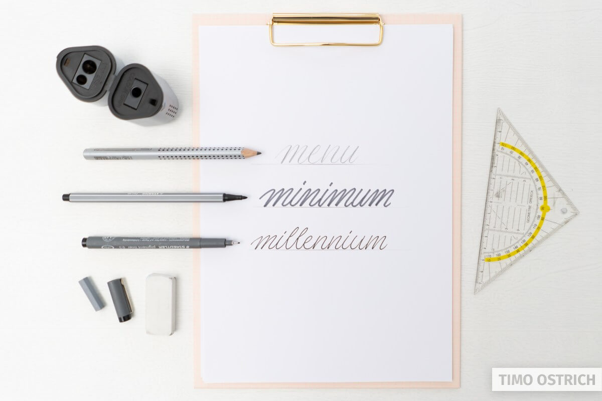
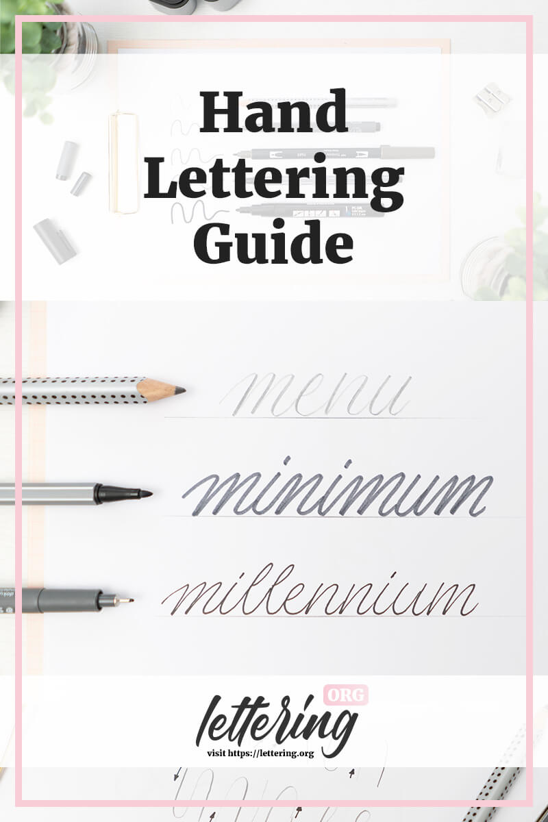
Good words for practising hand lettering are “menu”, “minimum” or “millennium”.
Try to draw these words. Think of them line by line, keep in mind the connection and you will realize that special flow these words have.
If you succeed with your pencil try it with other pens, too.
Draw your favorite words
Start drawing your favorite words! Practice hand lettering as ofter as possible. You can also use your name, the name of your pet or any other words around you.
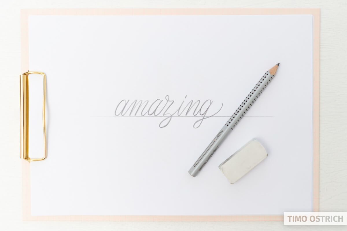
If you don’t know what to write next, have a look at my list of lettering quotes. I’m sure you will find some nice words you want to draw there.
Lettering multiple words
The next challenge is to draw multiple words or even sentences using your hand lettering style. Try to keep the same look on every letter and word to create an impressive lettering.
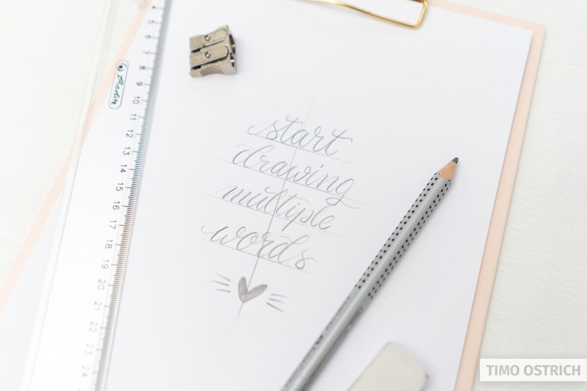
When it comes to multiple words the layout of your lettering starts to matter, too. If you want to learn more about lettering layouts you should have a look on my lettering layouts tutorial.
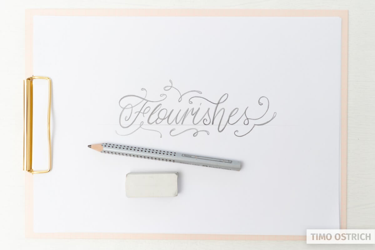
Adding flourishes
Once you mastered the basic strokes and words you may think about adding some flourishes. They make your hand letterings looks very elegant and exclusive.
Hand lettering styles
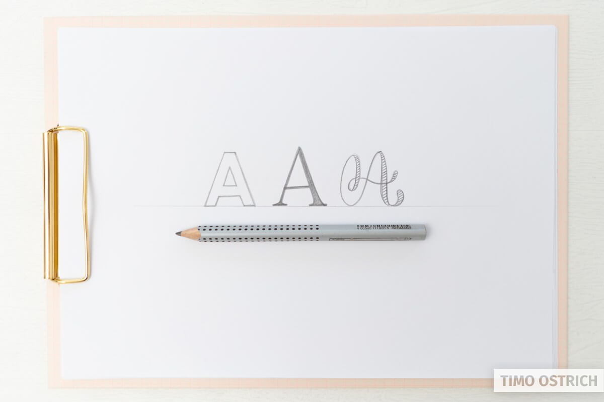
You don’t have to draw cursive fonts all the time. Every font style can be drawn with your pencil. Try some block letters or serifs, too. Furthermore you can use techniques like the Faux Calligraphy to fake the look of a brush pen.
Omg this is so helpful!! I can’t begin to thank you enough for this wonderful page❤️
Aww, thank you so much!
holagrax x la ayudaenserio muchas gracias los quiero <3 uwu
THANKS A LOT HELPED ME SO MUCH
Perfeito, muito esclarecedor, obrigada!
Com prazer!
This is just what I’m looking for. So helpful
Perfect! Glad to hear that.
This is the best information for the New learner. I have read the instructions and I really think I can do this! Thank you for such wonderful instruction and help!
Thank you so much! Learning new creative things is always fun, isn’t it? 🙂
Really helpful, thanks so much, could i subscribe to your newsletter please.
Once I figured out that lettering is simply “drawing” it began to click for me and now I’m looking at each letter, figuring out the ending and beginning of each letter, and keeping the letters the same size. Thank you so much for this page, it is so much better than the multiple books I’ve bought on hand lettering. Thank you for your passion!
That sounds great! I’m so happy that my page was helpful to you. Keep it going!
Wow, thanks so much for the quick and direct tutorial.