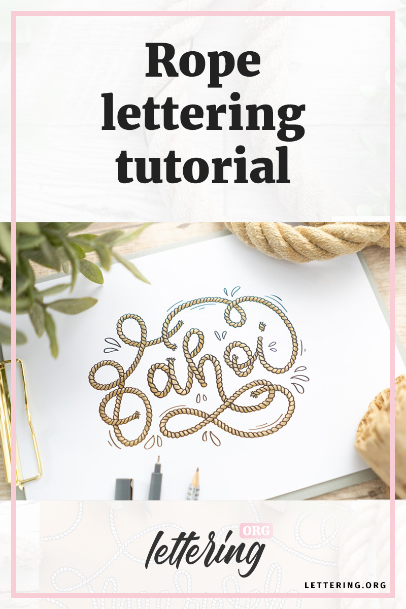
A special form of ribbon lettering is the so-called rope lettering. I developed this form of lettering for a maritime hand lettering and was amazed how well it worked out.
So I created this step by step guide which allows you to create fancy rope letterings by yourself!
Contents
Using ropes as a blueprint
At the beginning I have to repeat my typical hint when it comes to transferring properties of an object to a lettering: Take a close look at the object in reality!
In this case I used a thick rope where you can easily see which lines are characteristic for a rope:
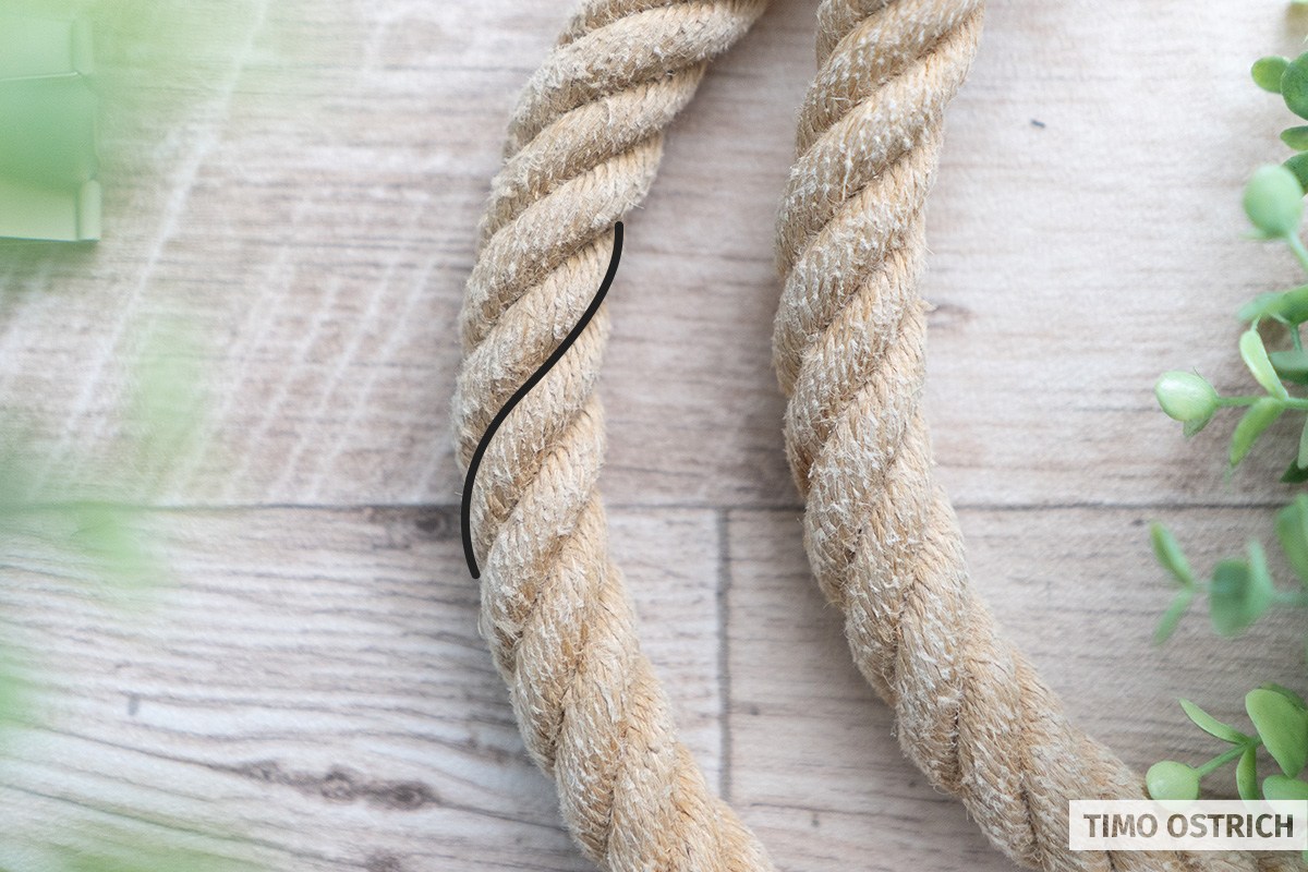
And based on exactly this pattern we will design our hand lettering.
Different degrees of detail
The rope pattern can be abstracted in various stages. Depending on how detailed you want to draw the rope, the approach is slightly different.
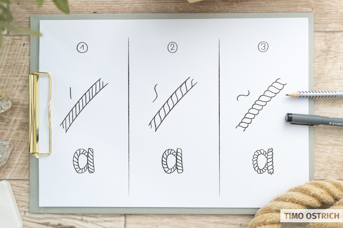
- For versions 1 and 2, we can define the word with two outlines and insert the pattern afterwards.
- Variant 3 forces you to draw the outlines in a curved style as well.
For our tutorial we will use the first version.
The basic form of your rope lettering
The basis for rope lettering is a lettering with thick, consistent line width. After all, the rope is always the same thickness.
You should make this preliminary drawing with a pencil. Just write the word in a monoline style.
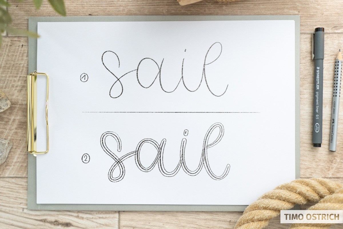
In the second step, you draw a border around the previously drawn line, always with the same distance between them.
Here you can already define where the rope overlaps – and which part is on top or bottom.
Drawing the pattern
First, you now trace all the outer lines with your fineliner so that only the shape of the rope remains. You can then erase the pencil lines completely.
Once your basic shape is finished, an almost meditative process follows: we have to apply our rope pattern line by line to our letters.
So: music on, head (almost) off and full concentration!
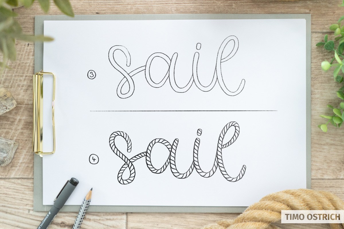
Always attach the elongated “S” in the direction of the rope to create the typical rope pattern. The outer lines are used as a border.
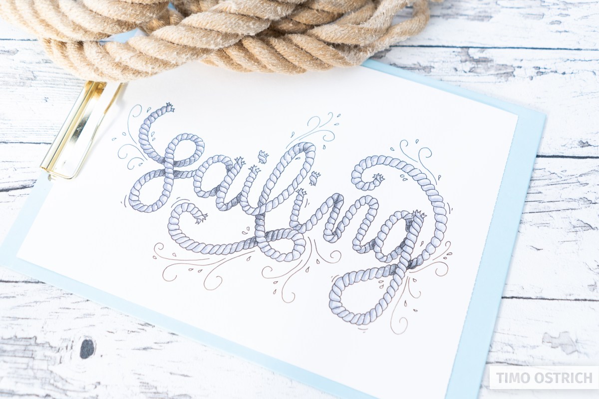
Adding color
By coloring the rope in brown you get a charming maritime look. Your rope lettering font also is a great style for a focus word in longer lettering compositions.
If you want to color the rope afterwards, you should use a waterproof fineliner for the outlines and the pattern. Then the lines will not blur (so much).
The detailed version
If you want to make your rope a little more realistic, you can draw it without an outer contour. This is achieved by drawing the pattern with some kind of curve.
As with a real rope, this will create areas of varying thickness.
With this approach, the rope is created practically line by line. The result has a bit more depth.
Tip: Alternatively, you can create the basic shape with a thick, round marker.
Then you don’t have to add the outlines afterwards either. In my example I used a white POSCA marker on kraft paper.
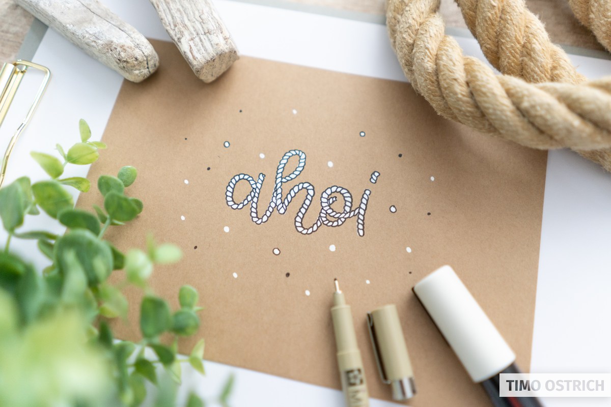
The white rope on the brown background looks completely different again – but also super chic!
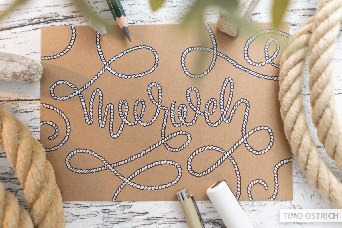
Using natural forms
If you want your rope lettering to be even more realistic, you have to abstract your letters a bit. In doing so, we try to draw the lines really the way you would lay them with a rope.
Corners are reduced and loops are usually larger. It is important to find a balance or a compromise between realism and readability.
If you are unsure about the lines you can use a real rope to test how you can create some letters.
Let’s have a look at a more natural rope lettering using the german coinage “meerweh” – which means that you are missing the sea.
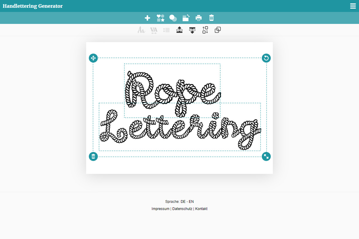
Practice using the lettering generator
In the lettering generator you will also find a few fonts in this style. You can use them to get a feeling for rope lettering.
After a few tries you are ready to try it all on your own. Have fun!