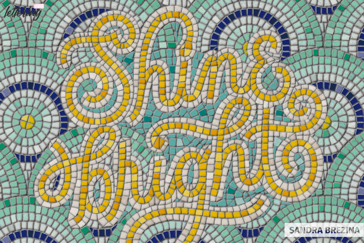
In this tutorial, I am going to show you my step-by-step process of crafting a beautiful typographic illustration which looks as if it is made out of innumerable colorful mosaic tiles.
When I first discovered these gorgeous fauxsaics, I even thought that they are all real mosaic artworks.
It was a real epiphany to find out that all these superb designs are hand drawn illustrations and digital illusions perfectly created with Illustrator, Photoshop or Procreate.
The name fauxsaic means false or simulated mosaic tile.
To stimulate your inspiration and dive into this style, you should take a look at the website of Nick Misani. He is an Italian designer based in New York and is a master in creating complex and breathtakingly beautiful fauxsaic artworks.
Contents
Get inspired
I also detected the website maverickmosaics.com by Bonnie Fitzgerald (founder of Maverick Mosaics) which I find very helpful to study mosaic art in detail and get a better understanding of how to cut your typographic illustration into mosaic tiles.
Keep in mind that your elements should have edgy rectangular, triangular or trapezoidal shapes rather than rounded contours to be recognized as realistic mosaic tiles.
But do not be intimitated: We will come to this step later! And with each mosaic lettering you create, you will be more experienced of how to finetune your illustration.
What you need
- A fauxsaic brush set of your choice (I am using this one)
- Or Procreate’s default brushes
- An iPad with an ApplePencil and the app ProCreate
- Some scratch paper and a pencil
Make your sketch
Note: If you prefer to make your very first sketches on your Ipad, proceed like this. I am too traditional to start digitally 🙂
I decide on a script style and draw several sketches on a piece of scratch paper. As soon as I am happy with my result, I refine my monolinear pencil drawing by thickening my letters a little bit.
To save time, you can do this thickening process on your ipad. This is just my personal way of elaborating things and bringing them to life non-digitally in front of me.
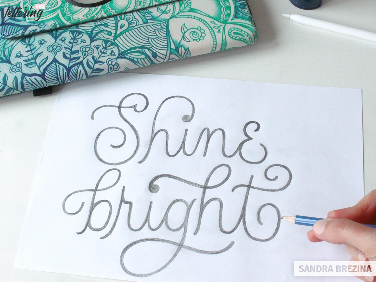
Your letters will be cut into square-like pieces and surrounded by a second layer of mosaic tiles. For this reason, I pay attention to have enough space between my letters and keep the tracking constant.
I do not care about any patterns or ornaments surrounding my hand lettering in the sketching phase. I will think about these add-ons later.
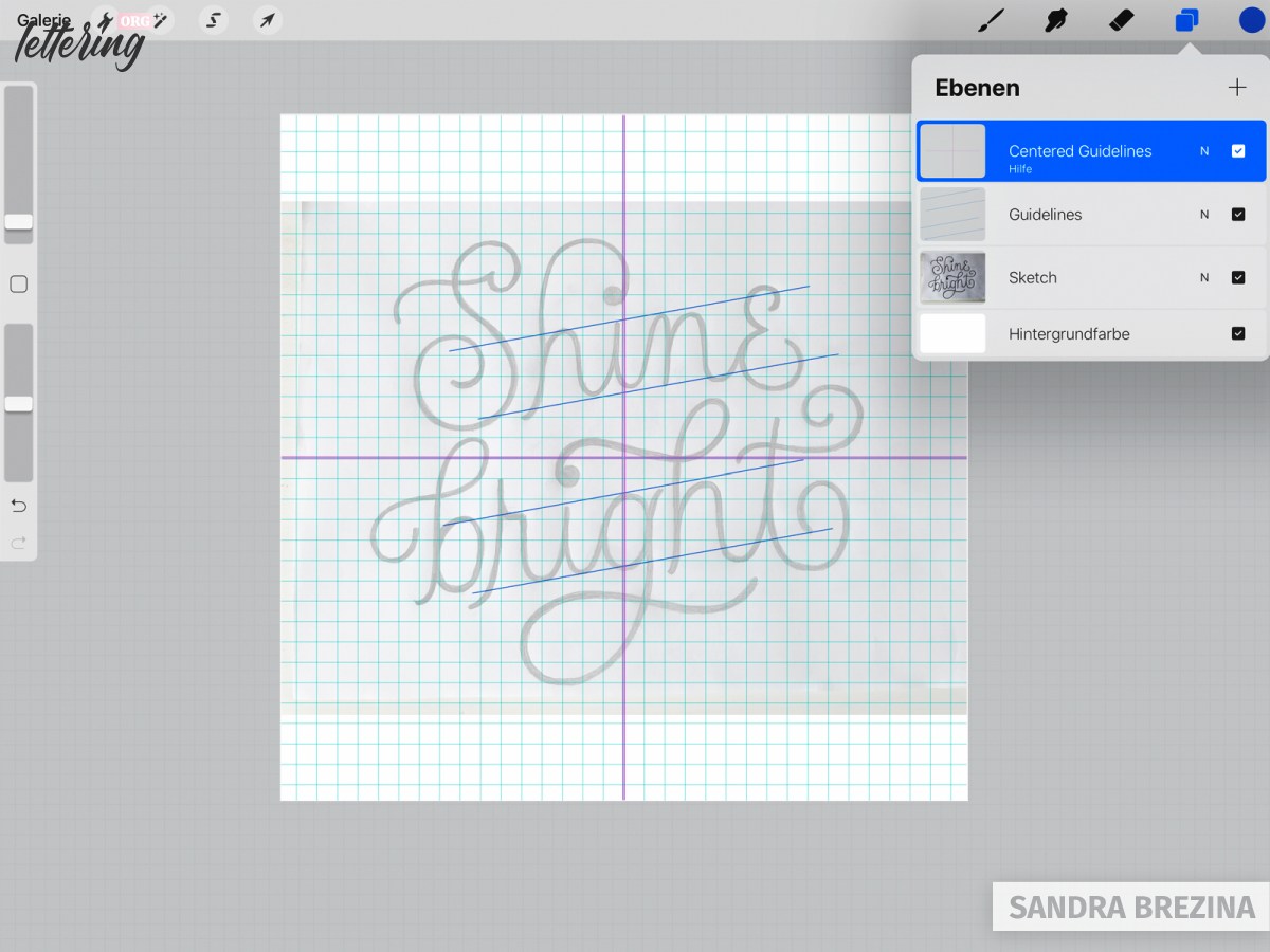
Proceed in Procreate
You can scan your sketch and insert it into a new Procreate file or you can make a picture of it with your ipad which is the way I do it here.
Open a new document. The size is 3000 x 3000 pixels (= 25.4 x 25.4 centimeters) at 300 dpi (RGB color scheme) with a number of 55 layers which is optimal. I prefer square sizes which makes things easier regarding future posts on Instagram.
The resolution of 300 dpi keeps me on the safe side in case I want to print my design.
I insert the photo of my sketch into my file, reduce its opacity and prepare my pencil drawing. I create guidelines helping me to center my design. I place baselines and x-height-lines to refine my hand lettering piece. Last but not least, I turn on a 2-D-grid which I like for consistency reasons.
Create your hand lettering
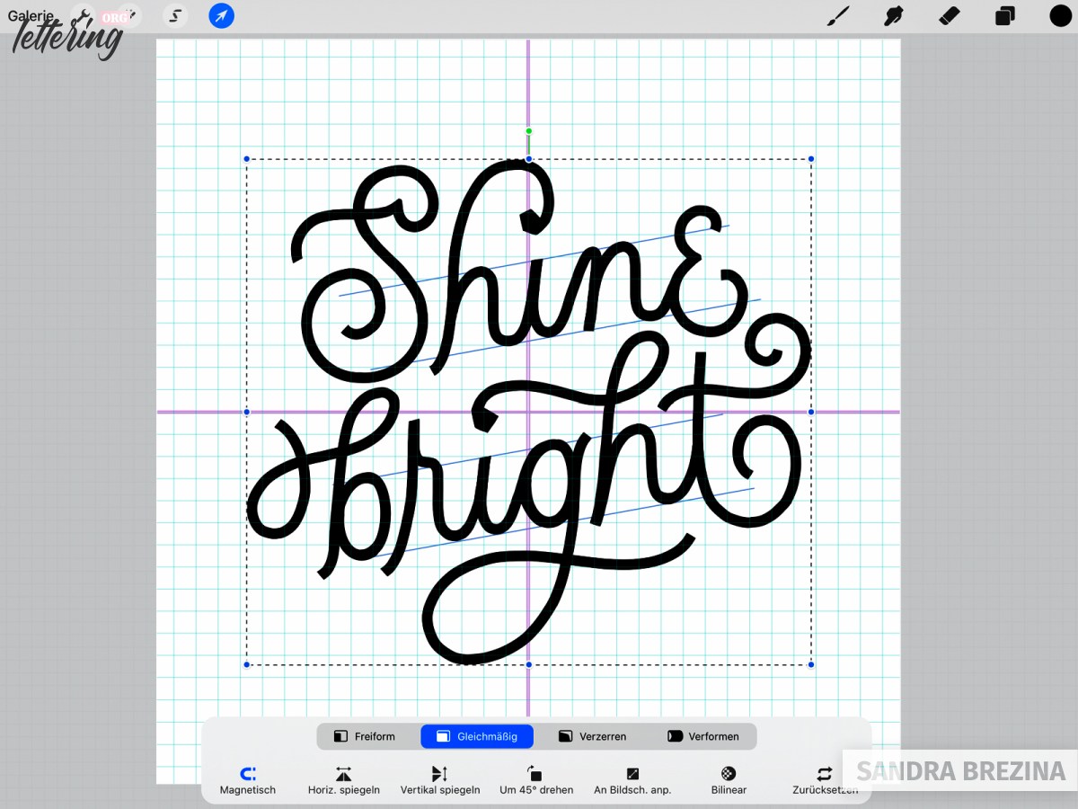
To create my hand lettering based on my pencil drawing, I use a default monoline brush pen.
Then I use this monoline brush pen as eraser and cut the terminals (ends) of my letters to have sharply edged letterforms. As you see in the picture, I center my lettering piece within the document.
Develop your mosaic tiles
Now you can use any sharp brush to cut your letters into pieces!
I like to use the brush prepared by Molly Suber Thorpe which is called tile cutter – sharp edges brush.
Currently, we have a white background. But at a later stage, we will color our background with grout.
So keep this fact in mind when you cut your letters into pieces. The distance between all your tiles is the space where the grout (whether greyish or offwhite or as you plan to match your style) will show through.
I like to work in a way I can go back and reverse my decisions. So here, I like to cut my letters in a non-destructive way to give them the shapes of triangles and squares.
The size of my tile cutter-sharp edges brush is around 40%.
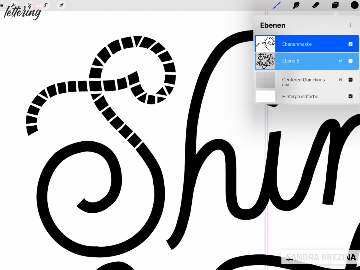
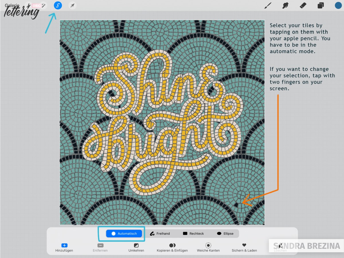
I tap on my lettering layer and choose mask. Whenever I paint on this layer mask with my brush in 100% black (= RGB: 0-0-0), my brush functions as an eraser. Whenever I use 100% white (= RGB: 255-255-255) on the layer mask, I can change my decisions and undo my deletions.
And of course I can delete the entire layer mask if necessary.
Take your time. Zoom in and out while you are going through this process. Try to generate a result which resembles a real mosaic artwork.
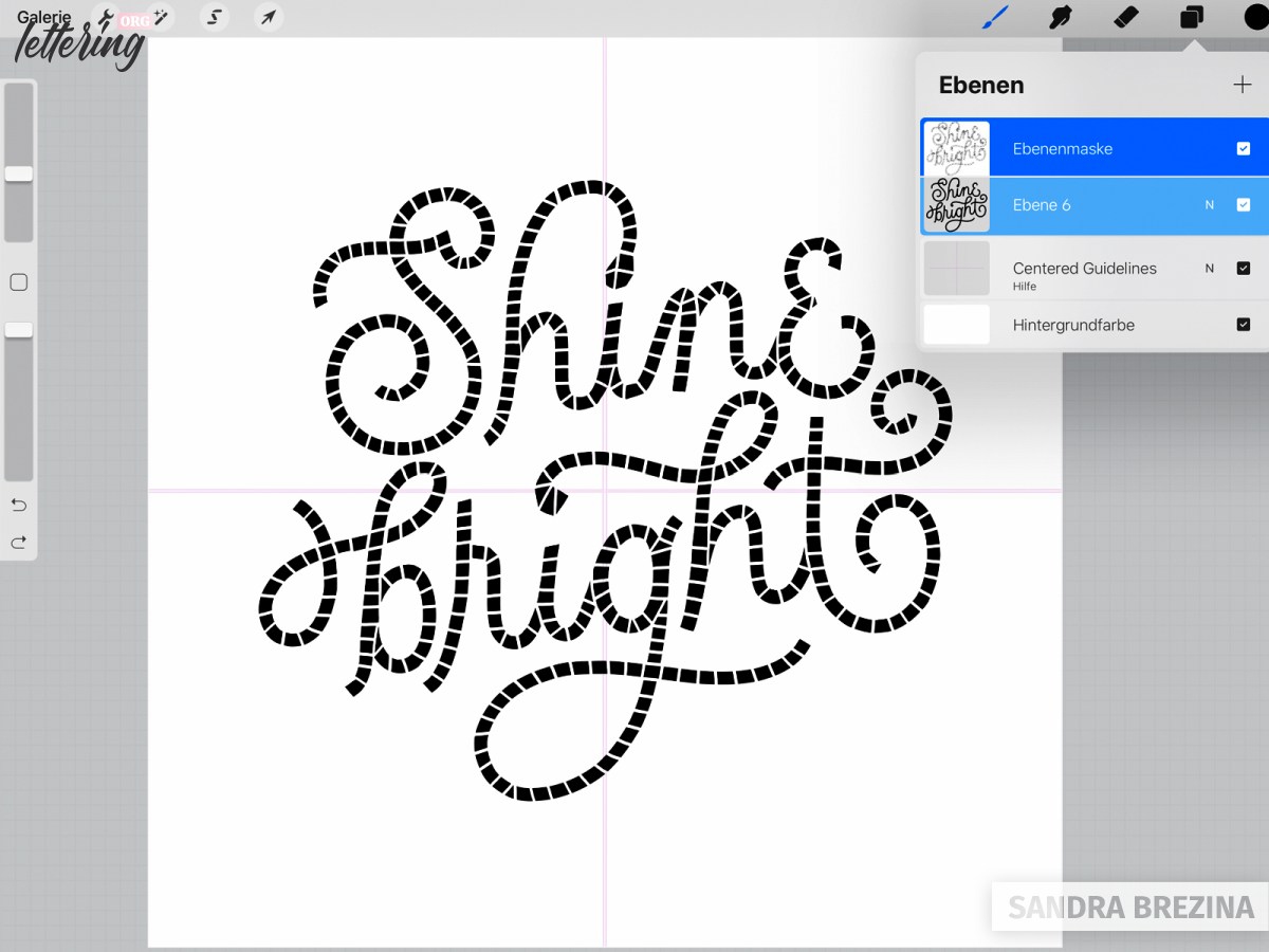
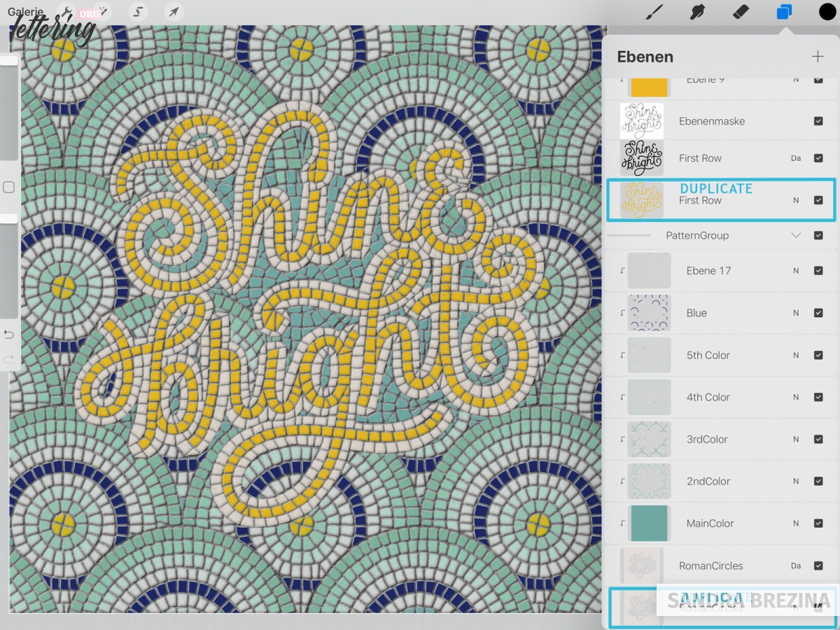
At present, my hand lettering looks as you see in the picture. My design is undestroyed in black and all the mosaic tiles are on the layer mask above.
Develop your second row of tiles
On a new layer, I outline my black letters with my monoline brush in orange. The color you choose does not matter at this stage. Do not be afraid to overlap your black letters with the orange drawing. We will fix this in a second.
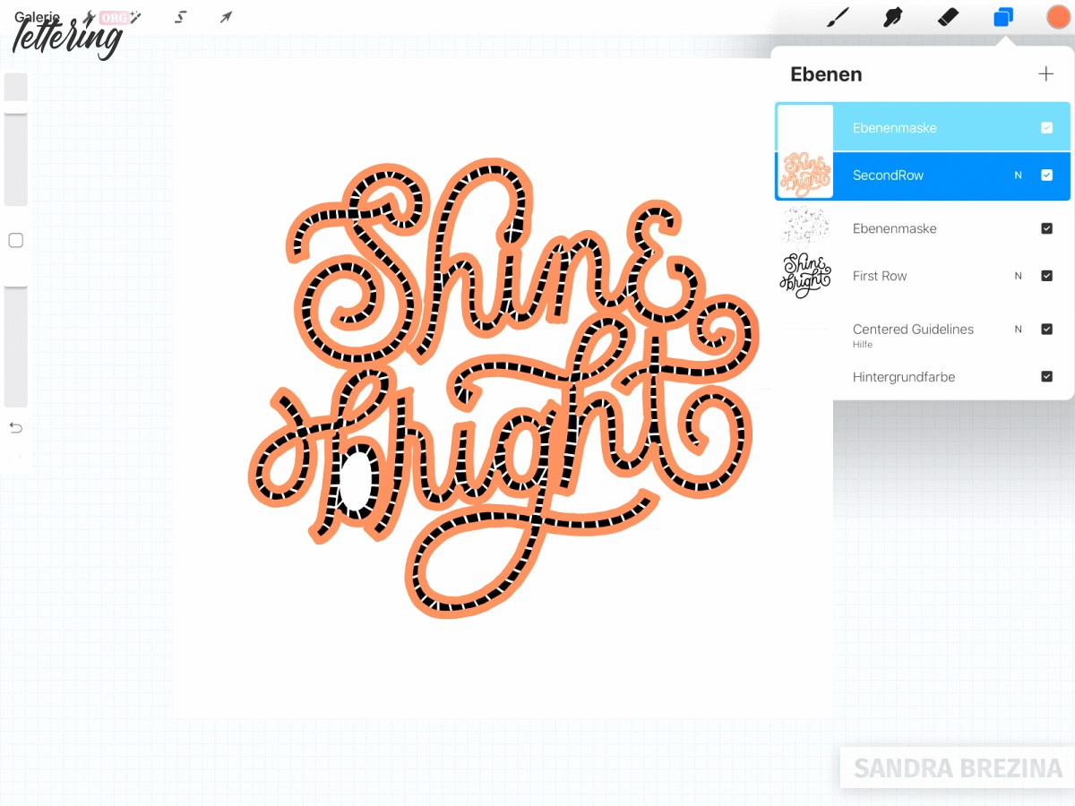
Tap at the new layer and opt for a layer mask. Then go to the layer of your black hand lettering and click select.
With your hand lettering selected, go to the new layer mask of your orange border, take a huge monoline brush in black and delete all areas where your orange drawing overlaps your hand lettering.
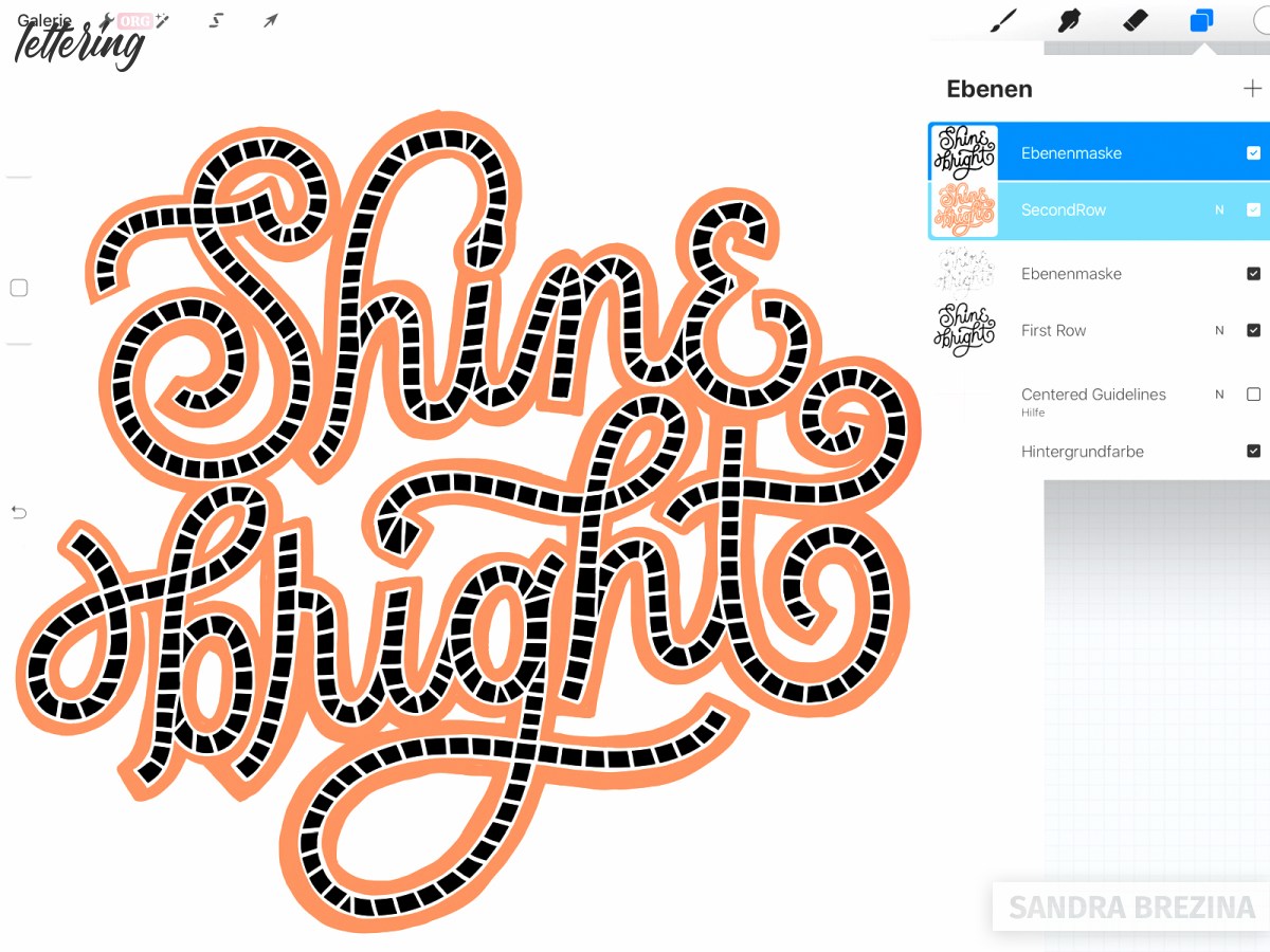
Note: This is an easy way to get rid of these unpleasant overlappings.
Prepare your mosaic tiles
Every single mosaic tile has to be separated by a certain space where you will see the grout at a later step.
For this reason, take a hard brush or the tile cutter-sharp edges brush. Opt for black and work on the new layer mask above the orange border to create your second row of mosaic tiles.
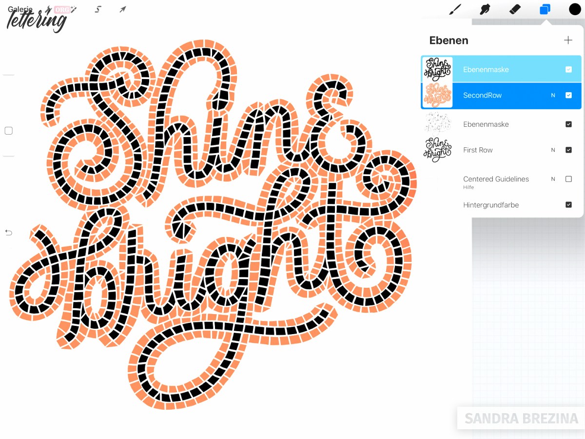
Don’t forget: Do all your deletions with a brush in black on your layer mask! Black is the correct color to erase items. Opt for white, if you want to undo your actions.
- First draw an outline along your black letters.
- Then, cut the entire orange area into more or less equal parts.
- Give your tiles the shapes of squares, triangles and/or trapezoids.
- Look at the terminals (ends) of your letters and let them have sharp edges for a realistic result.
In case you want to add any changes to the orange area, you can always go back to the layer itself, take a brush in orange and change your drawing.
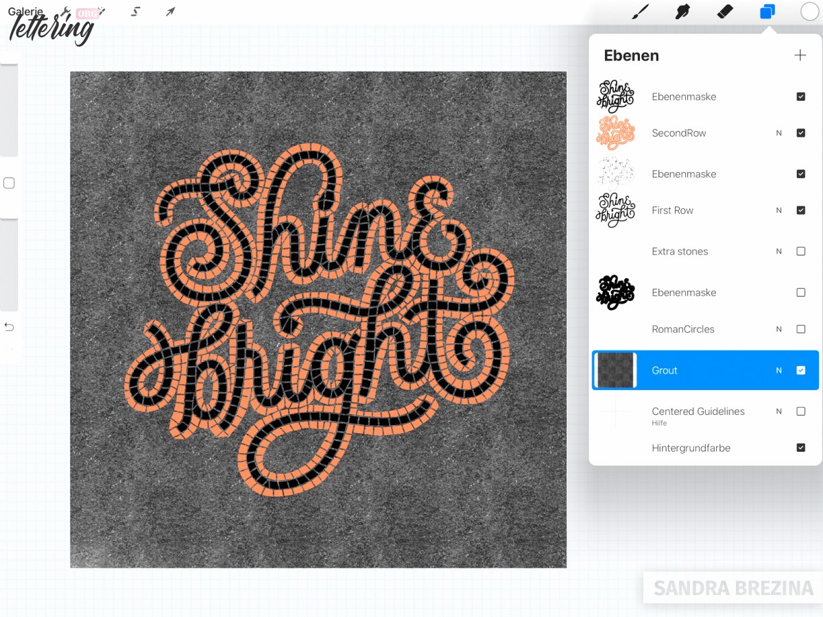
Add the grout
Create a new layer below your two existing layers. Choose your grout brush from Molly Suber Thorpe’s brush pack and color your background in black.
Create your own grout brush
However, if you want to create your own brush, just follow my process. Go to Procreate’s default brushes in the sketching section and duplicate the Bonobo chalk brush.
Tap on your duplicate to get into Procreate’s brush studio. On the left side, you see the brush menu.
Go to the fourth section which is called “Grain”. Click on the top right bar (edit) to get into Procreate’s preset library. There I choose “Recycled Paper” as my new source of grain and confirm my selection.
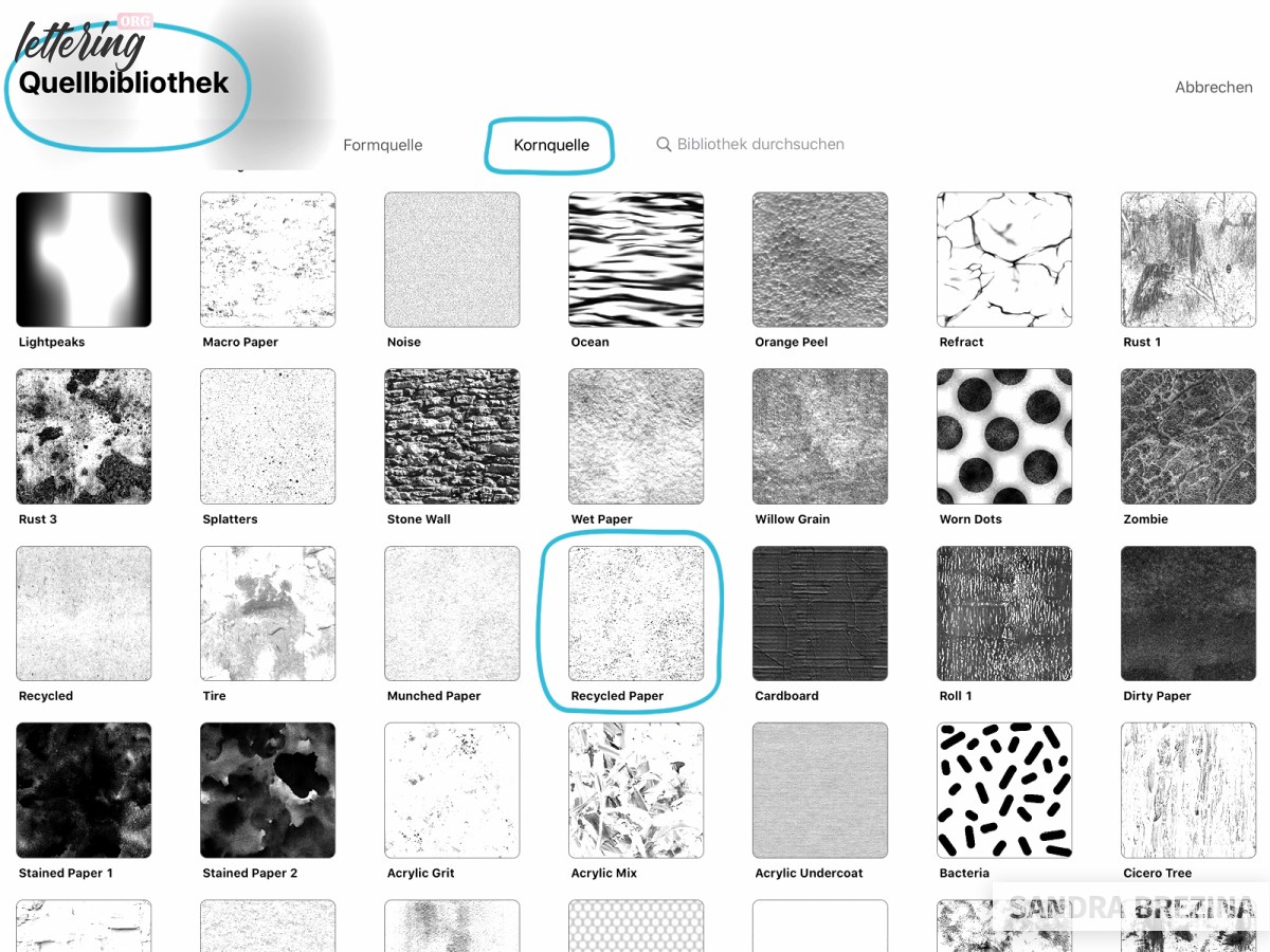
When you come back to the section “Grain”, play with the adjustments to individualize your own grout brush.
You can test the settings of your new brush in the area on the right side. Just paint with your brush there.
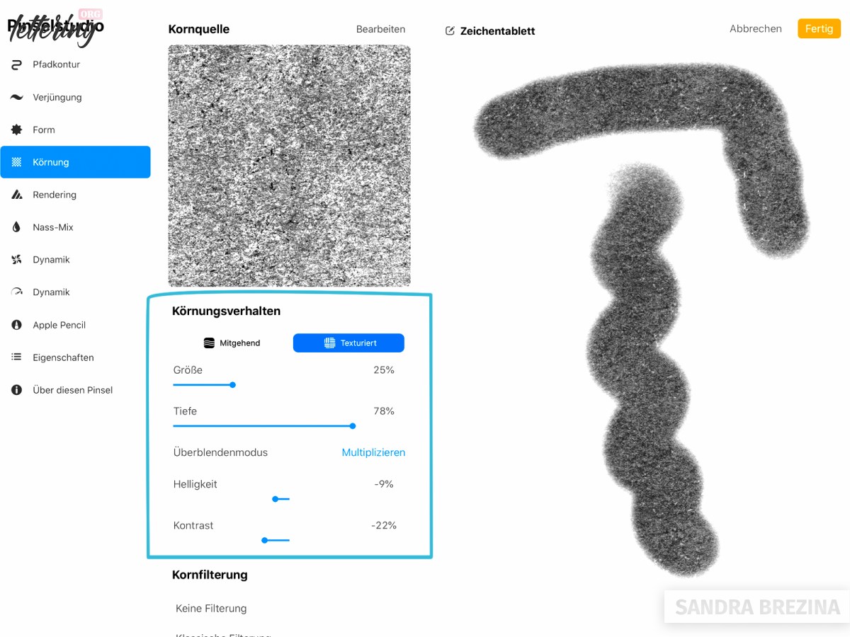
Finally, I go to the last item of the menu and rename my new brush.
Great job! Fill the background with your new brush in black. Don`t worry! You can change the background color at any time.
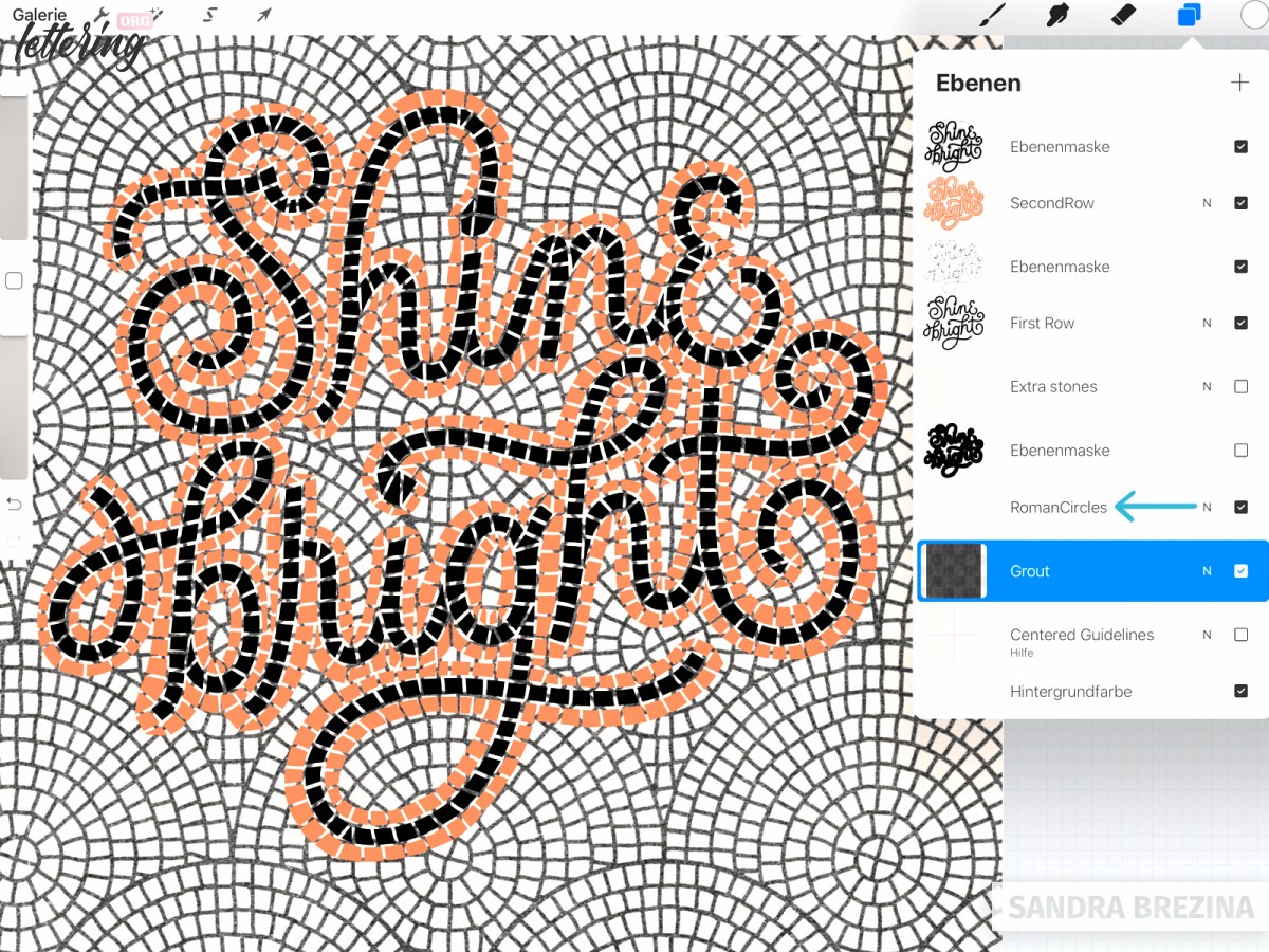
Add a mosaic pattern
The brush pack of Molly Suber Thorpe includes various fauxsaic pattern brushes. I choose a creamy white color and use the “Roman-Circles” brush to paint my pattern on a new layer.
The pattern layer is above the grout background, but below the two layers that contain my letters.
In case, you like to have a background filled with a regular tile pattern made by yourself, do the following: Go to Procreate’s default texture brushes and choose the grid brush.
Refine your design
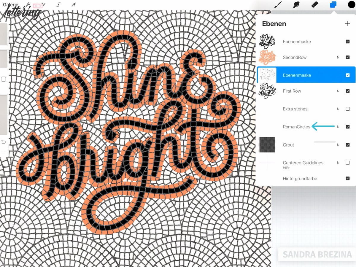
This step is very important: Currently, the pattern shines through your black letters and its orange frame. But the thing is: there should be only grout instead.
Follow my approach to correct this: Go to the layer of your black letters (= “First Row” layer). Click select, return to the “Roman-Circles” layer and click delete. Your black letters will be cut out and you will see the grout shining through.
Next step: Go to the orange (= “Second Row”) layer, click select from the menu window, return to your pattern layer and click delete from the menu window. Your orange areas will be deleted.
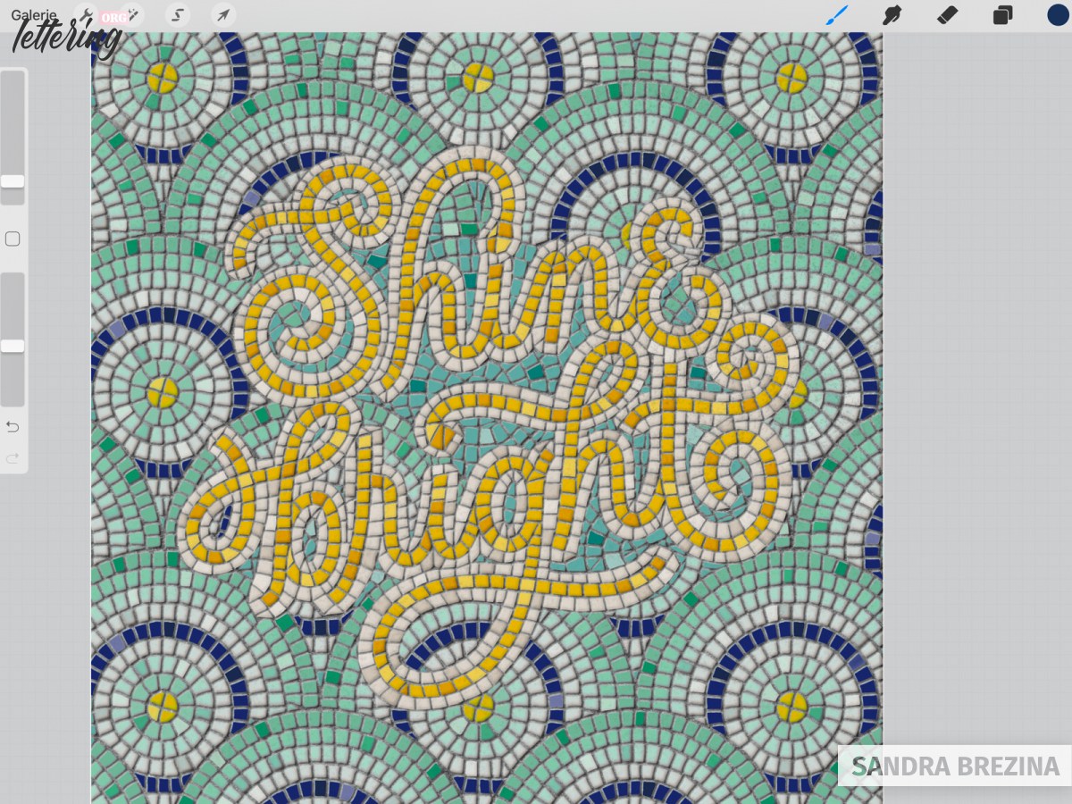
Your result should look similar to my picture:
Go to your pattern layer and add a layer mask to it. Take your black tile cutter-sharp edges brush (or a default Procreate hard brush) at 40 % (always have the same brush size which depends on the size of your design!) and draw a line around your orange border.
By doing so, you let the grout shine through.
Further refining
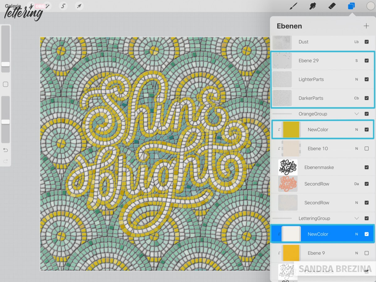
After this step, you may discover that some tiles look weird. I add a new layer above the layer mask of the pattern layer.
I call it “Extra stones”. I add stones which I draw in creamy white with the brush I used before. I also erase elements I do not like from the layer mask which is below.
During this manual refining work, I always switch between the new layer and the layer mask below. Step by step I refine my design and zoom in and out to evaluate my actions.
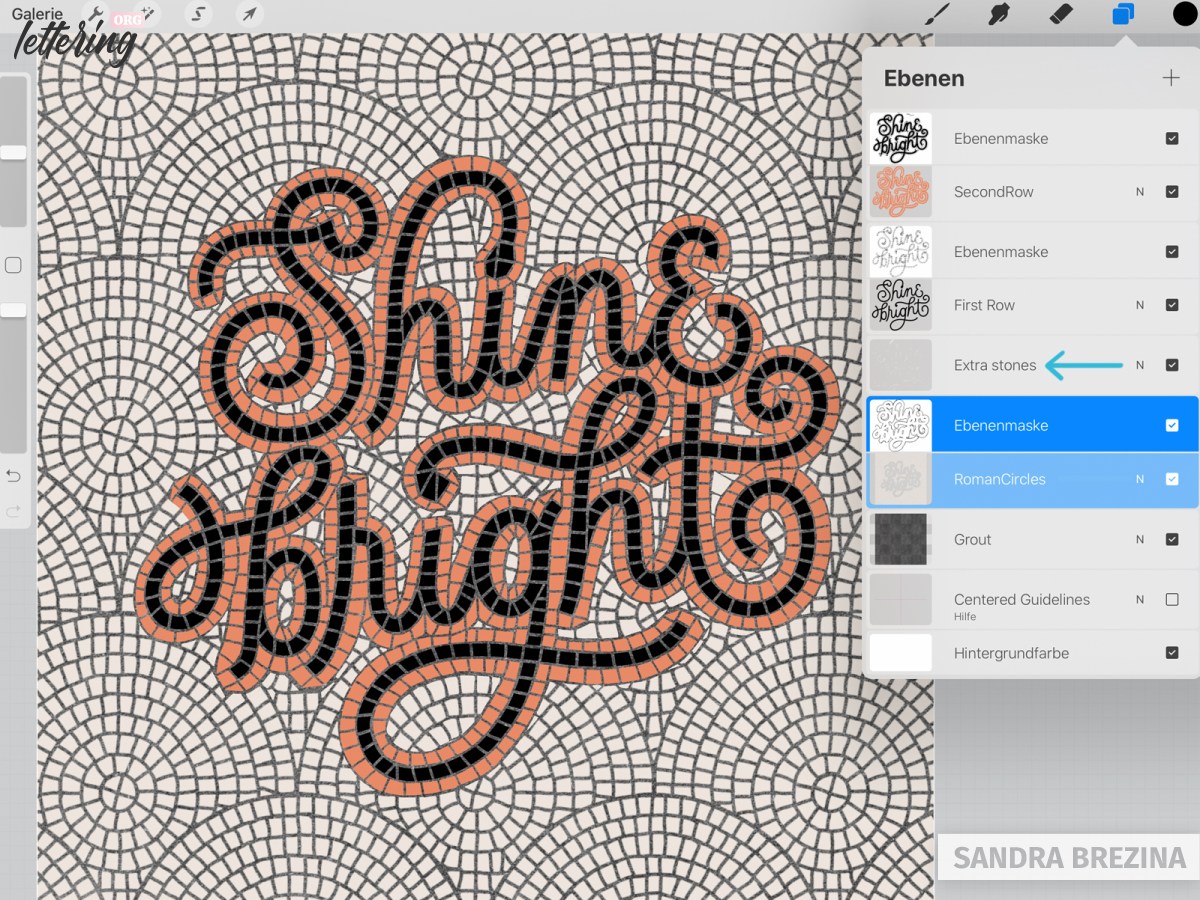
Finally, I put the pattern layer, its layer mask and the new “Extra stones” layer into a group and flatten it (= merging these 3 layers). The result is one single layer which is much easier to work with.
Coloring your design
It’s time to choose some colors for our black letters.
- Place a new layer above the layer mask of your layer containing your letters (= first row of tiles).
- Convert this layer into a clipping mask by tapping on it and clicking clipping mask from the menu window.
- Fill this layer with your color of choice.
Repeat this step for the orange layer (= second row of tiles) and for your pattern layer (= Roman circles pattern for example).
If you are unsure about color combinations, I like to recommend this instagram account. This site is really great to get inspired. Another gorgeous tool to find colors is Adobe Color.
Optional coloring of your pattern tiles
Maybe you like to color your pattern tiles in various shades. To do so, go to your pattern layer, click the selection tool and choose “automatic”.
Tap with your apple pencil on a tile and move your apple pencil to the right while staying on the screen. This process increases the selection threshold and you see that the area you want to select is getting bigger (= the selected area gets black).
Once you are happy with your selection, tap on other tiles. They all get black once they are selected. Add a new layer above your pattern layer, convert it into a clippling mask and fill your selection with a color of your choice.
Note: Sometimes, the selection does not work correctly or as you wish. Don’t be worried. You can always go back if there are wrong areas selected by tapping with two fingers on your screen.
If you like to add a second color, a third color and so on, you always have to go to your original pattern layer, select your tiles on this layer and then add a new clipping mask above and fill it with your color of choice.

Adding texture for a realistic look
Let’s make a brush to add some texture to our tiles. Add a new layer at the top of all other layers and choose black as your color.
- Duplicate the Bonobo chalk brush from your default sketching brushes.
- Tap on the brush to get into Procreate’s brush studio.
- Go to “Grain”. Click on the top right bar (edit) to get into Procreate’s library. There I choose “Charcoal Vine” as my new source of grain and confirm my selection. Then I edit the adjustments a little bit and confirm these. Don’t forget to label your new brush.
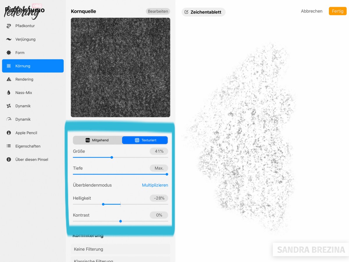
Just tap with this brush on the screen. I reduce the opacity of my layer. I just want to decrease the polished look of my mosaics, but I do not want to darken them too much.
By the end of this tutorial, I will change the mode of my texture layer to the blending mode “linear burn”, since this blends very nicely with my tiles.
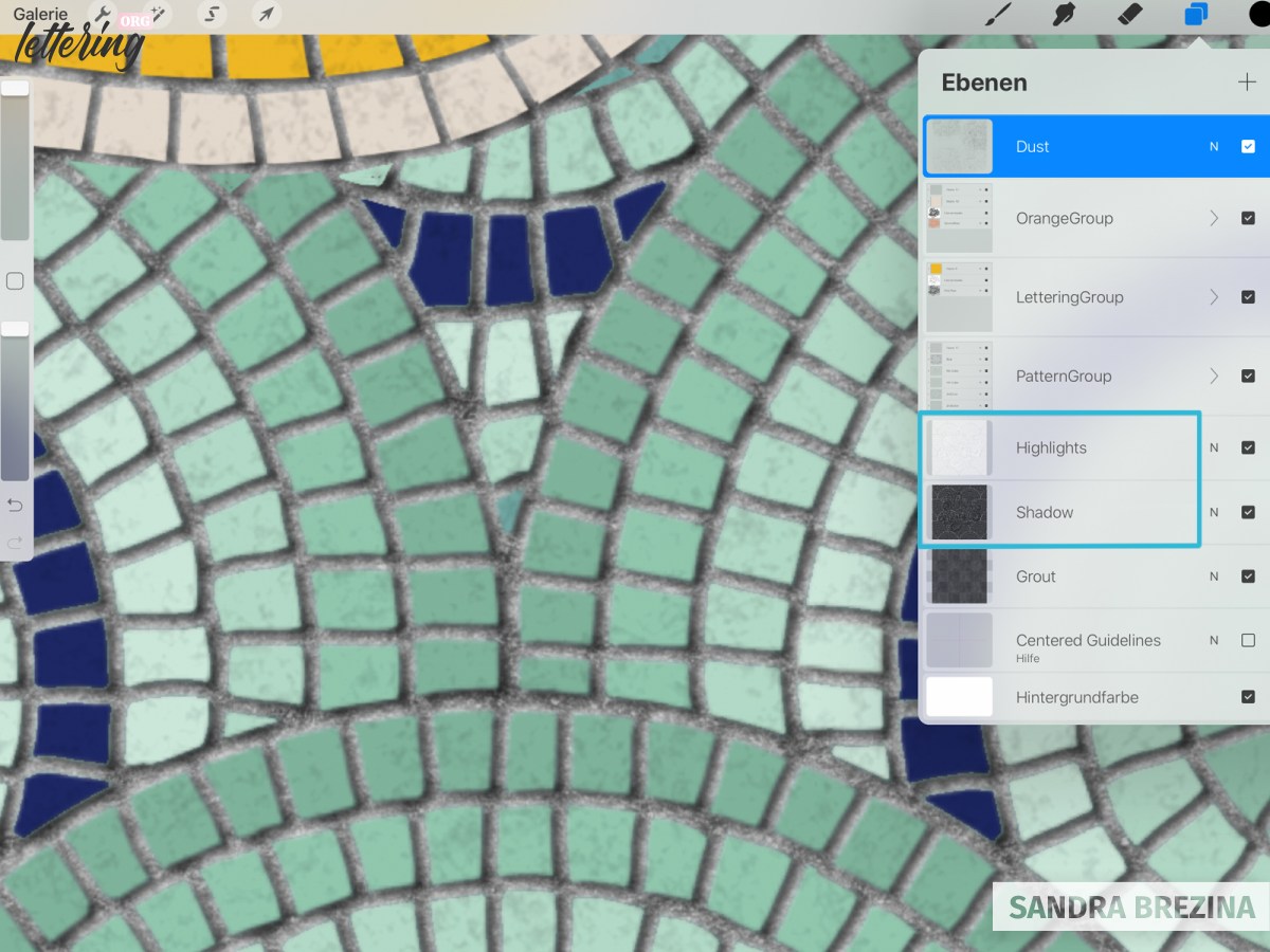
Adding highlights and shadows
At present, our design looks very flat. We will fix this in the following step.
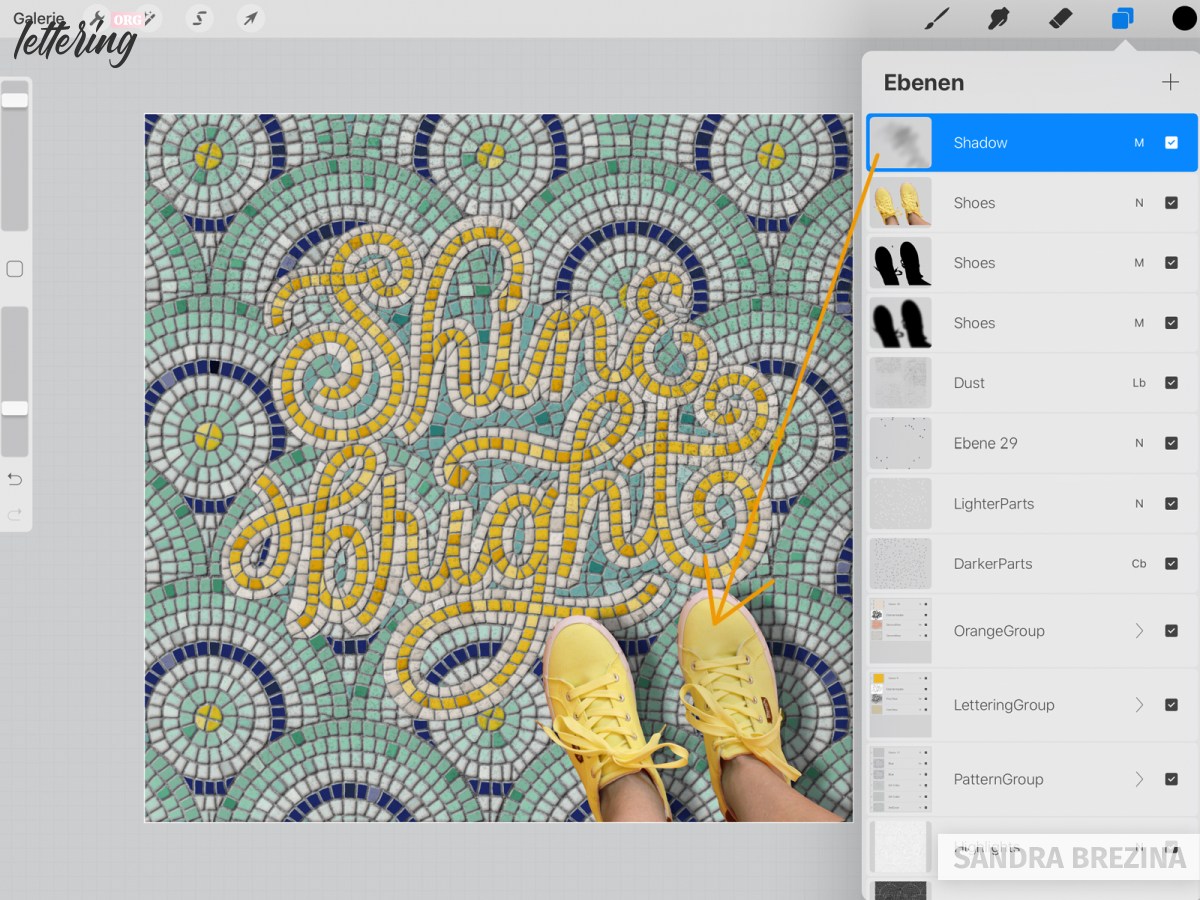
First, I group my three layers with their corresponding layer masks and clipping masks in three separate groups (= lettering group, outline row group, pattern group). Pay attention to leave these three groups as they are! Never delete your originals!
Then, I duplicate these three groups. Within each group, I delete every color clipping mask. My duplicated groups just consist of the main layers and their layer masks. I flatten (= merge) these groups to receive three layers: my hand lettering layer, my outline layer and the pattern layer. I merge these three layers to receive ONE single layer.
Copy this layer to have two identical layers. Click alphalock. Fill one layer with white color (= highlight) and the other layer with black (= shadow). These two layers lie behind your three groups.
Move the black layer a tiny bit to the right and downwards. Move the white layer a tiny bit to the left and upwards.
The effect is the following: the white highlight layer and the black shadow layer are visible to some extent on the left and on the right side of your main design (= the three groups) and let your tiles pop from the background.
Remove alphalock and click Gaussian blur for your white and black layers to blur the edges a little bit. I reduce the opacity of both layers as well.
If Gaussian blur does not work, check if you really left the alphalock mode.
Let us make our tiles pop from the grout
To reduce the flatness of your tiles, you can follow the following steps: I go to my pattern group and duplicate the main layer (= the bottom layer of this group). The duplicate is now below the main pattern layer. I set its blending mode to “normal”, but reduce its opacity.
Now, go to the pattern layer above and play with various blending modes. Choose “darken” or “multiply” for example. Do you notice the magical effect? By reducing the opacity of the layer below, grout is slighly shining through the tile which looks as if the edges are darker. This effect gives a curved shape to the tiles.
Let’s proceed with our lettering group. Duplicate the entire group and flatten (= merge) it to receive one single layer. Set this layer which is below the main layer to “normal” and reduce its opacity. Set the blending mode of the layer above (= the black lettering layer) to a blending mode you prefer and play with the degree of opacity. The flatness of your tiles will vanish to some degree.
Proceed with your outline group in the same way.
Color variation is the key
Have a look at real mosaics, handmade ones, or very antique artworks.
Even though they have similar shades of colors, some mosaic tiles are darker or lighter or show a slight variance in their shading.
Let us mimic these color deviations to give our artwork this little extra touch to shine.
Remember the way you selected all those innumerable tiles to recolor them. You always have to go to the main layer which contains your items, select your tiles manually, jump to the new file and fill this file with your preferred color.
First, we go to the pattern layer and randomly choose our elements which we want to darken for example. I choose a midtone of grey. I create a new layer below the top texture layer. Once I have selected all my tiles on the pattern layer, I go to this new layer, fill it with grey and play with various blending modes. I decide to use “color burn”. You may also go to your settings and experiment with various degrees of saturation or brightness/darkness.
For our hand lettering and the border, you have to go to the merged layers we have just created before, select your tiles on these two layers (one layer after the other of course), jump to a newly created layer, fill it with white or a bright orange and reduce the opacity.
Don’t worry: as soon as you get used to this process, you do these steps automatically. 🙂
If you keep layers of selected tiles darkening or brightening your main design on top of your layers, the advantage is the following.
You can easily blind your color clipping masks, create new clipping masks on top, fill them with new colors you prefer and your color variations will be there without the task to select any tiles once again.
The final touches
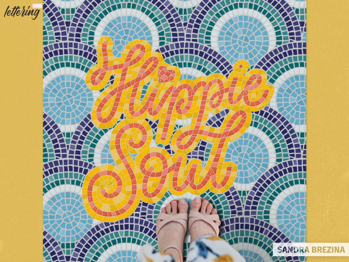
Adding feet to our fauxsaic
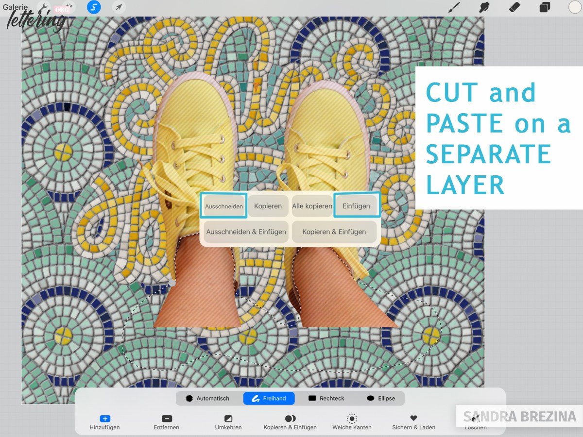
I take a picture of my feet and insert it into my file as my top layer.
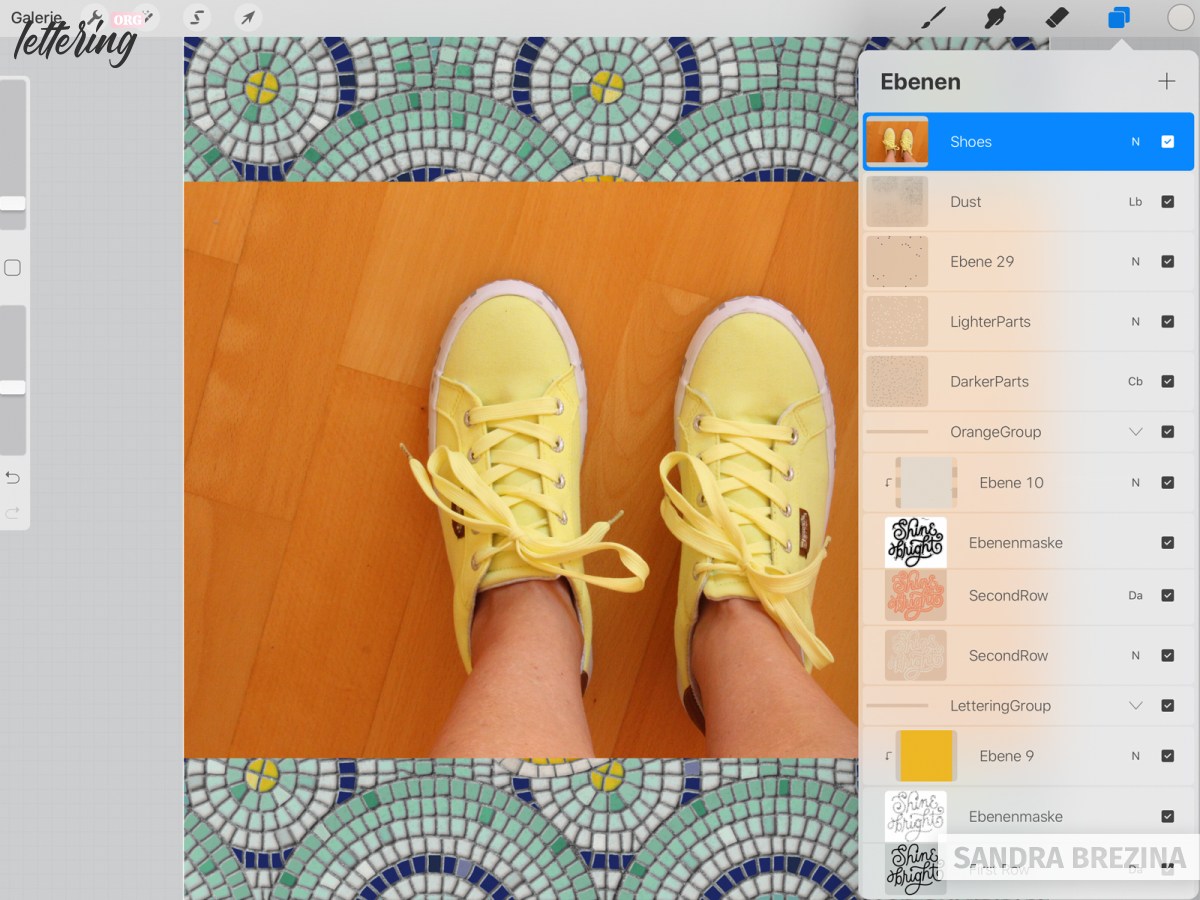
I erase all the background from the photo by using a big monoline brush. For smaller parts, I use the technical brush from the sketching brushes and finally an airbrush at very small size.
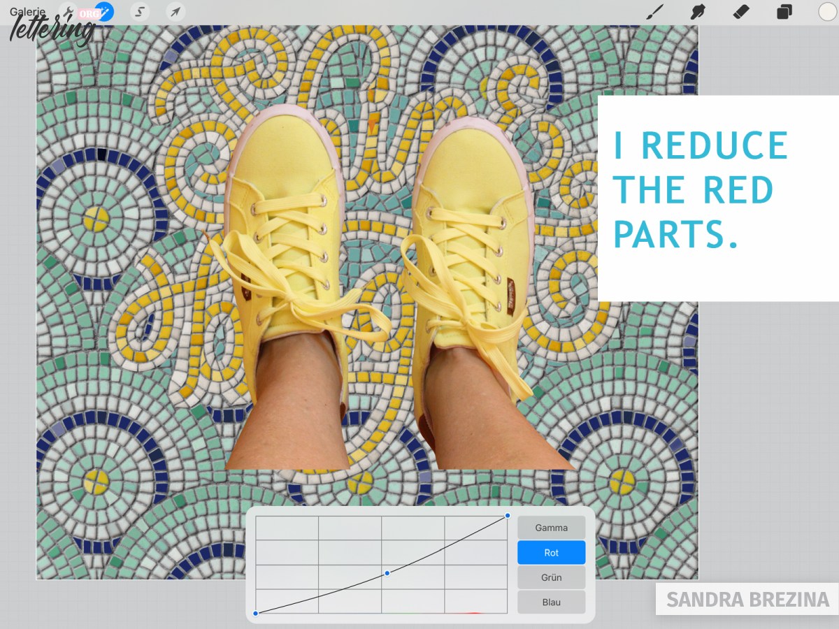
Since my feet are very saturated, I cut them off from the shoes and place them on a separete layer. I use a gradiation curve to reduce the redness. Then, I merge feet and shoes on a single layer again.
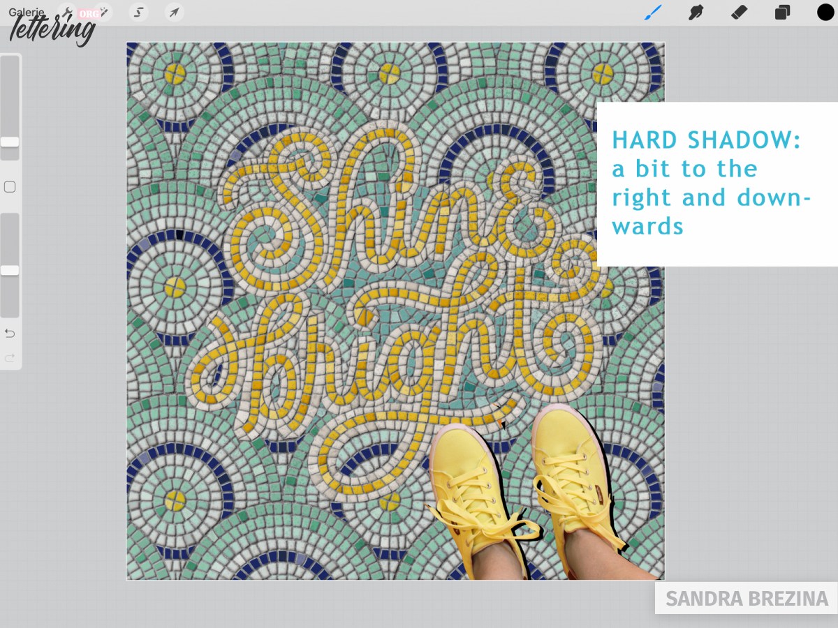
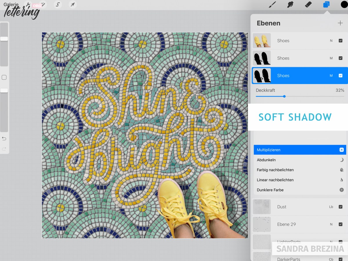
I duplicate my “shoes” layer to create a shadow. For the layer below, I click alphalock and fill it with black color. I duplicate my black layer, so the result is: “shoes” layer, black layer 1, black layer 2.
Note: If your light source comes from the left upper corner, your shadow is on the right side at the bottom corner. However, this is my personal preference of having a concept of light and shadows in my mind.
Undo the alphalock mode for all these layers. Move “black layer 1” a tiny bit to the right and downwards. Reduce the opacity to some degree and set the blending mode to multiply. This is your hard shadow which is near to your body.
Move “black layer 2” somewhat farther to the right and downwards. Reduce the opacity to some degree and set the blending mode to multiply. This is your soft shadow which melts with the floor.
I like to use Gaussian blur bit for these shadows to reduce their sharpness.
The last two steps
When you stand on a floor, your body casts a shadow on the tiles and your shoes. For this reason, I add a new layer on top of my “shoes” layer, take a soft non-opaque (= reduced opacity) airbrush and draw a very slight shadow above my right shoe in black. Have a look at my picture. The left shoe is brighter than the right one.
And here is our very last step: Create a layer at the top, take a soft non-opaque airbrush at a big size, reduce the opacity and choose white.
Tap very, very gently two or three times on your screen at the left side of your design to brighten your artwork. This last step is only a soft nuance of brightness of the left side compared to the right side of your fauxsaic.
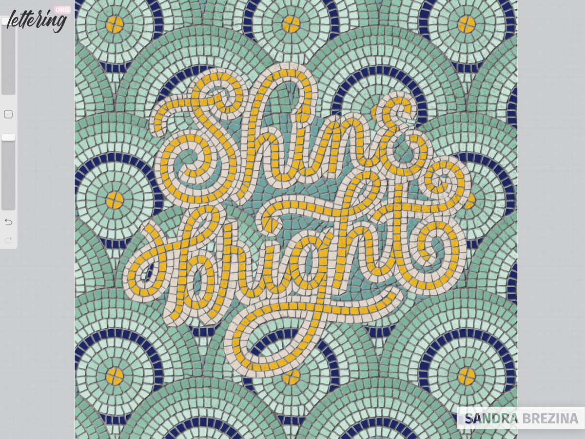
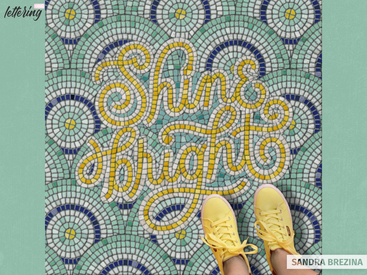
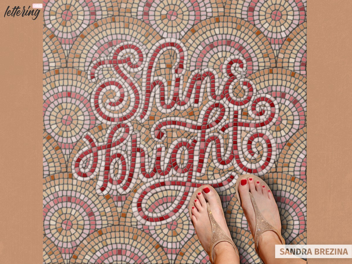
And that’s it! Yeah, after all this time-consuming work, let us enjoy our gorgeous mosaic lettering artwork.
Final thoughts
Thank you very much for joining me at this tutorial. I hope you had fun and learned a lot. I know that some steps seem to be quite complicated. That’s why I added a lot of pictures to visualize my step-to-step guidelines and present to you my structure of layers.
However, if you find it easier to follow along a video tutorial, I recommend the class of Molly Suber Thorpe (on the platform Skillshare) and the video of Abbie Nurse on You Tube.
For me, the process of cutting my hand lettering into innumerable mosaic tiles is very relaxing and meditative. And in the end, you are rewarded with a very stunning artwork which surprises a lot of people since it looks so real 🙂
Sandra, I appreciate your very detailed process, but I got a little confused in the middle of the process. I don’t suppose you would want to create a YouTube video to explain this process? Even if you didn’t have audio, you could use the steps you outlined here to guide the instructions. I am very visual and I learn better when I can see where the steps are. For example, pointing out which layers are alpha-lock, etc.
Thanks!