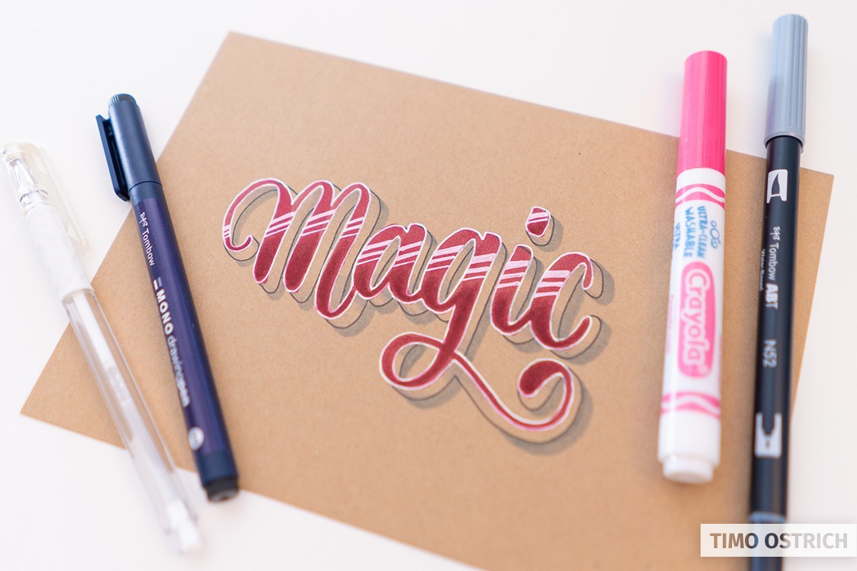
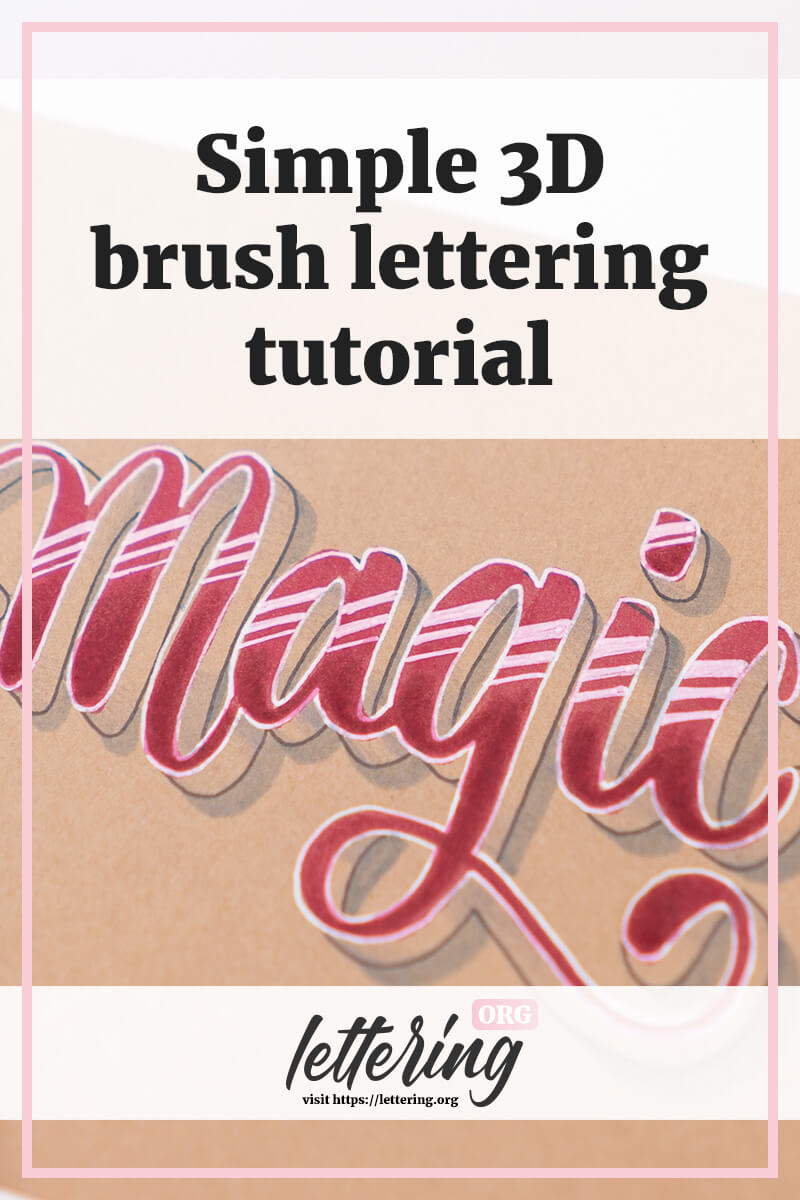
In this little tutorial I will show you how to add a brilliant 3D effect to your brush letterings!
The combination of light and shadow is so effective that the handlettering almost jumps on you at the end.
Contents
What you need
- Kraft paper* (optional, but it increases the effect)
- Brushpens* (1x colored and 1x light grey)
- Fineliner black*
- Gel pen white*
Be careful when you paint on kraft paper with your brushpens. It is relatively rough and not good for the brush tips. Therefore I used a Crayola marker for the basic lettering.
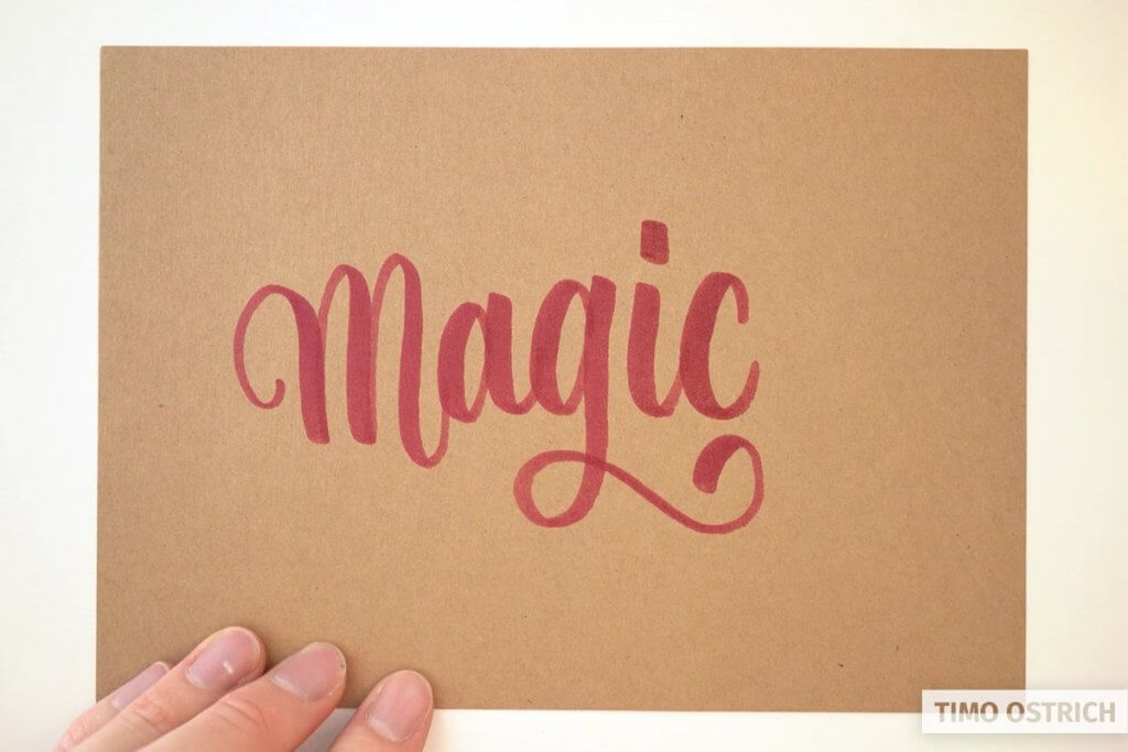
The basic brush lettering
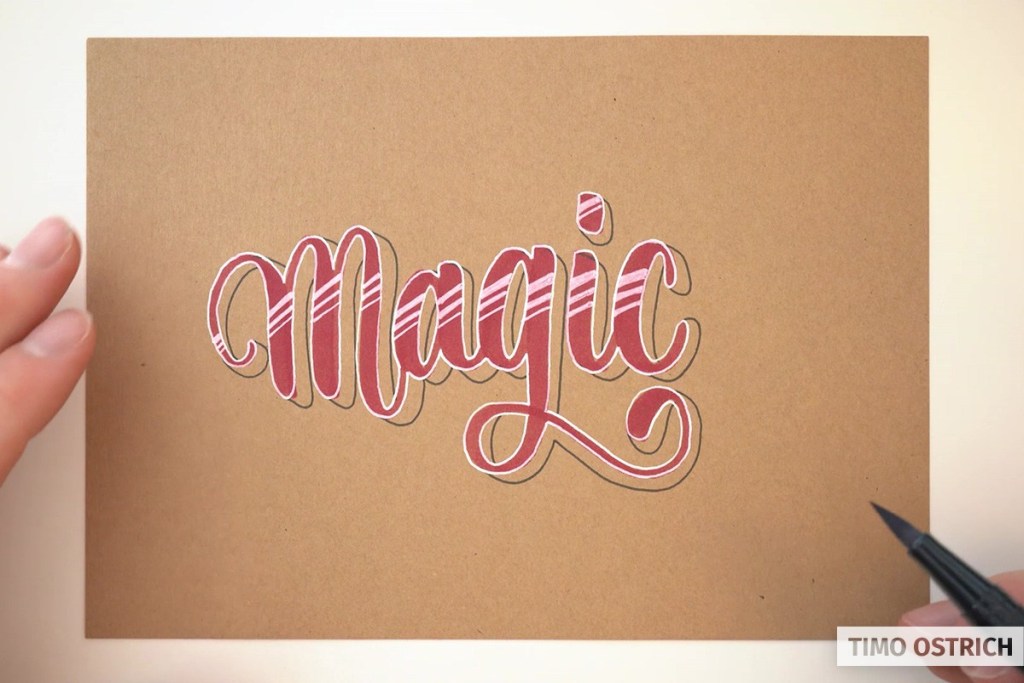
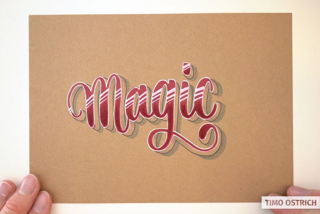
You start with a simple brush lettering. Of course positioned as centrally as possible. Try not to write the letters too tightly, because you will need the space later for the height of your lettering and the shadow.
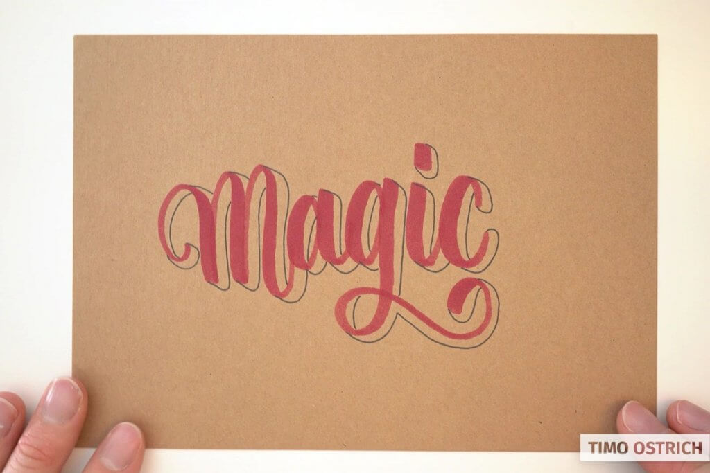
Add height to your letters
Now follows one of the most important steps. With a black fineliner you draw the lines in parallel offset.
Imagine that your lettering is slightly offset to the right and down. Then you connect your lettering with the offset lettering with parallel lines and otherwise follow the shape.
Add highlights
Next we set so-called highlights. For this purpose you tighten your brushlettering completely with a white gel pencil. Just frame the complete word.
Be very careful and absolutely focused – otherwise you might draw the wrong line.
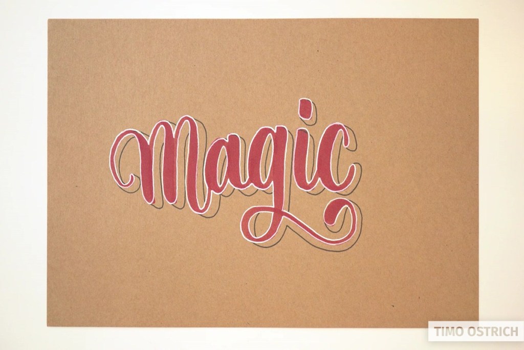
The second highlight is a kind of light reflection on each letter. Like in a pane of glass.
This intensifies the effect even more.
Make sure that you always set the reflection in the same style. So at the same angle and with the same number.
Add shadows
Now follows the shadow of your lettering. For this you draw another line with your brushpen, again parallel offset.
Imagine the light comes from a certain direction (in this case from the top left) and draw the shadow on the opposite side.
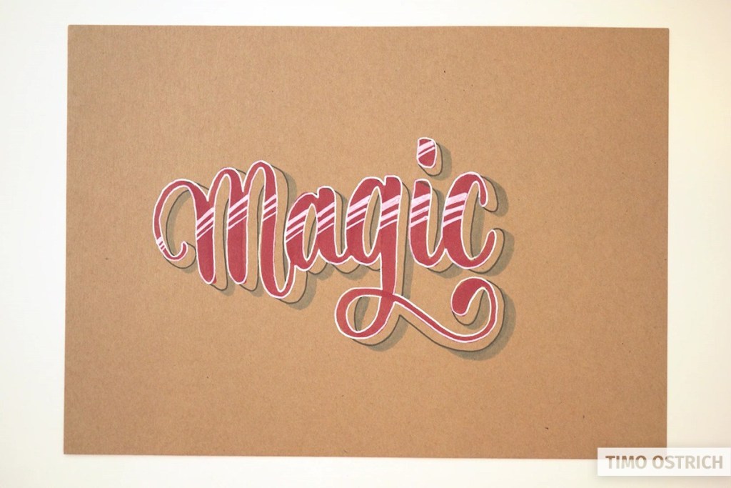
I have added a few more subtle shades to the “height” of the lettering. For this purpose I simply took a pencil and always shaded the areas that are located in a letter loop, for example.
Enhance the gradient
In the last step, you further enhance the effect by creating a gradient. Theoretically you can do this right at the beginning.
With the darker lower area the highlights are even better and the 3D effect is complete.
I think it’s just brilliant how the effect is intensified with every detail. Be sure to try it and leave a comment if you like the result!
Really very helpful in 3d calligraphy:)
So clever!
Thank you! 🙂
Nossa! Que fantástico! Estou encantada!
So happy I found your site! I’ve always loved to do lettering and this teaches me sooo much more, thankyou!!!!
I love it!
Very helpful for my lettering!
Thank you! Perfect for a name in a birthday card 😃 Lookjng forward to trying again when I get my white pens. God bless!