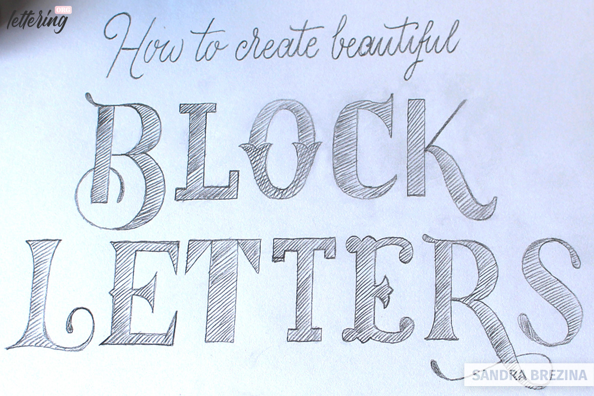
In this tutorial, I am going to show you 4 ways to draw basic block letters.
If you are interested to go a step further, you can learn some basic typographyic facts and proceed with my advanced-level approach to develop variations of your basic letter shapes.
Contents
Drawing simple block letters
Usually, you develop only those letters you need for your lettering project. However, let us go through the steps of creating a whole alphabet. I use squared paper and develop my letter shapes within a grid of 6 squares in height and 4 squares in width. This template is our basis for applying 4 methods for creating block letters.
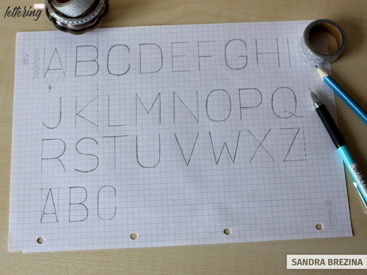
My tip: Play with your grid. If you use 6 x 3 squares, your letters will have a more condensed appearance.
Method 1: Using outlines
Based on your skeleton letters, draw a consistent outline around your shapes. The rounded corners here are just my personal preference.
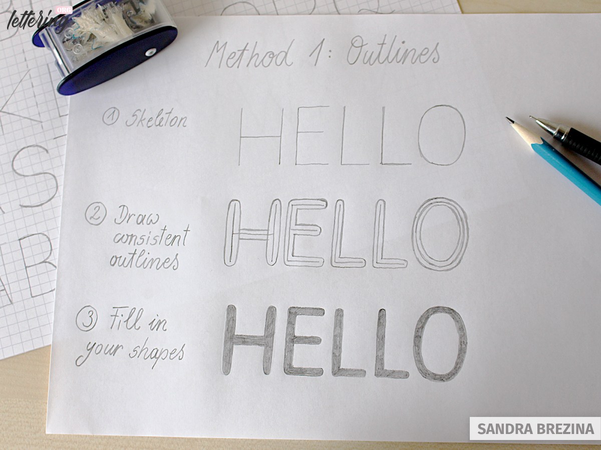
Note: Round edges influence the look and feel of your letters in so far that your lettering looks very friendly and soft.
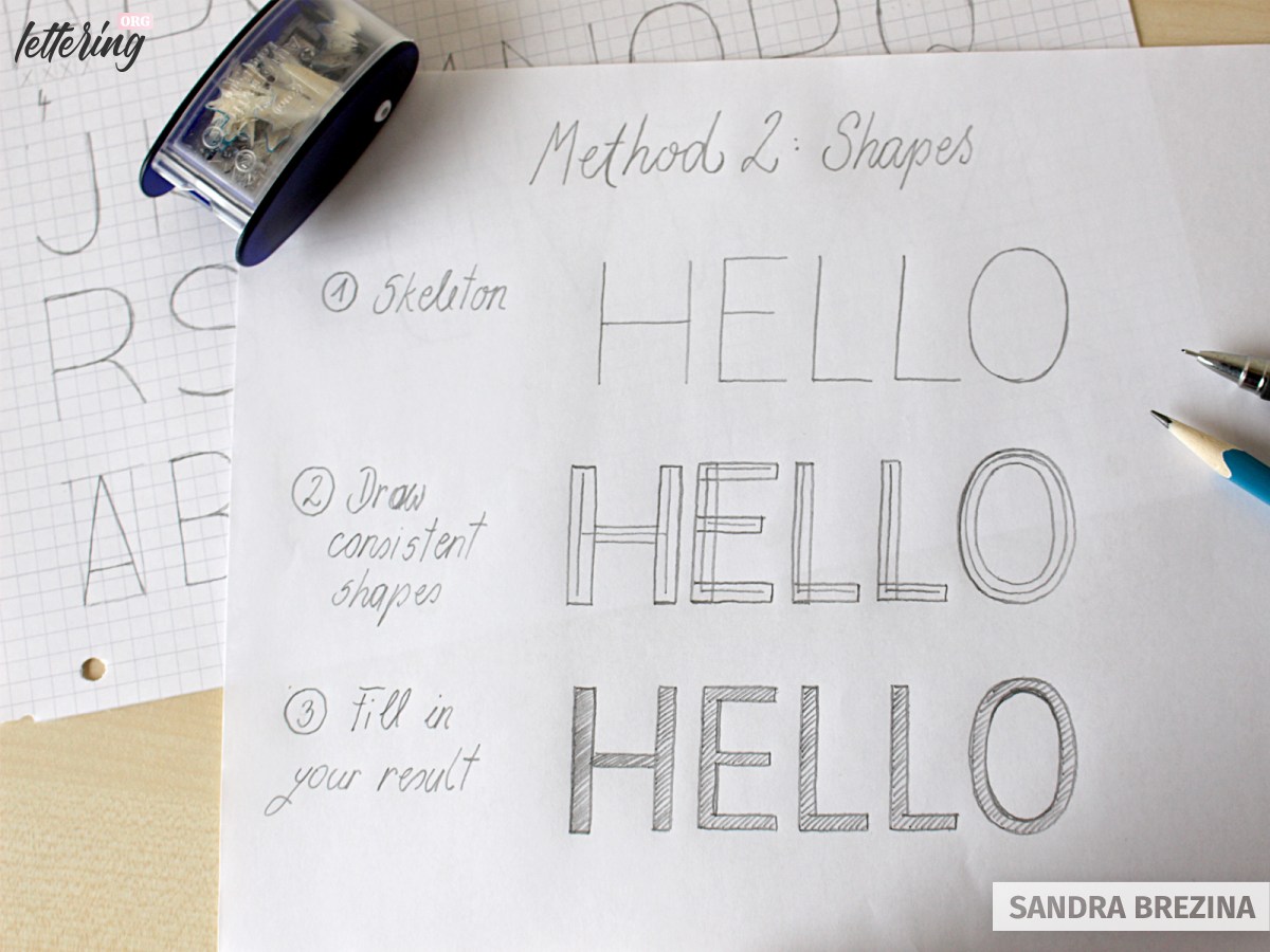
Method 2: Applying geometric shapes
For this technique, you draw consistent shapes such as rectangles around your skeleton letters. A squared paper underneath your drawing helps to ensure consistent widths.
Your skeleton should be centered within your geometric shapes.
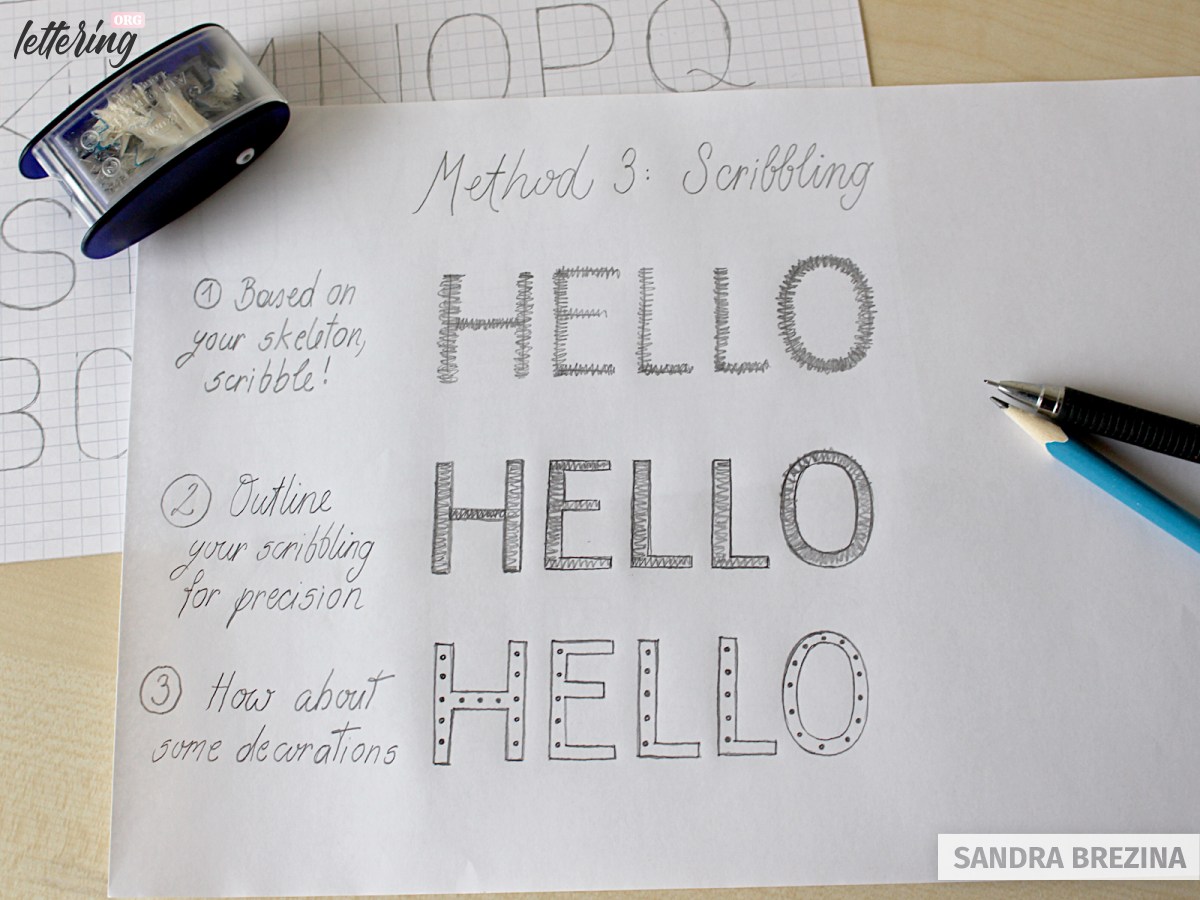
Method 3: Scribbling
This is my most favourite approach since you can shape your letters at speed. Scribble onto your lines as thin or as thick as you wish. Outline your result to gain a more precise appearance. Refine your result and fill in your letters.
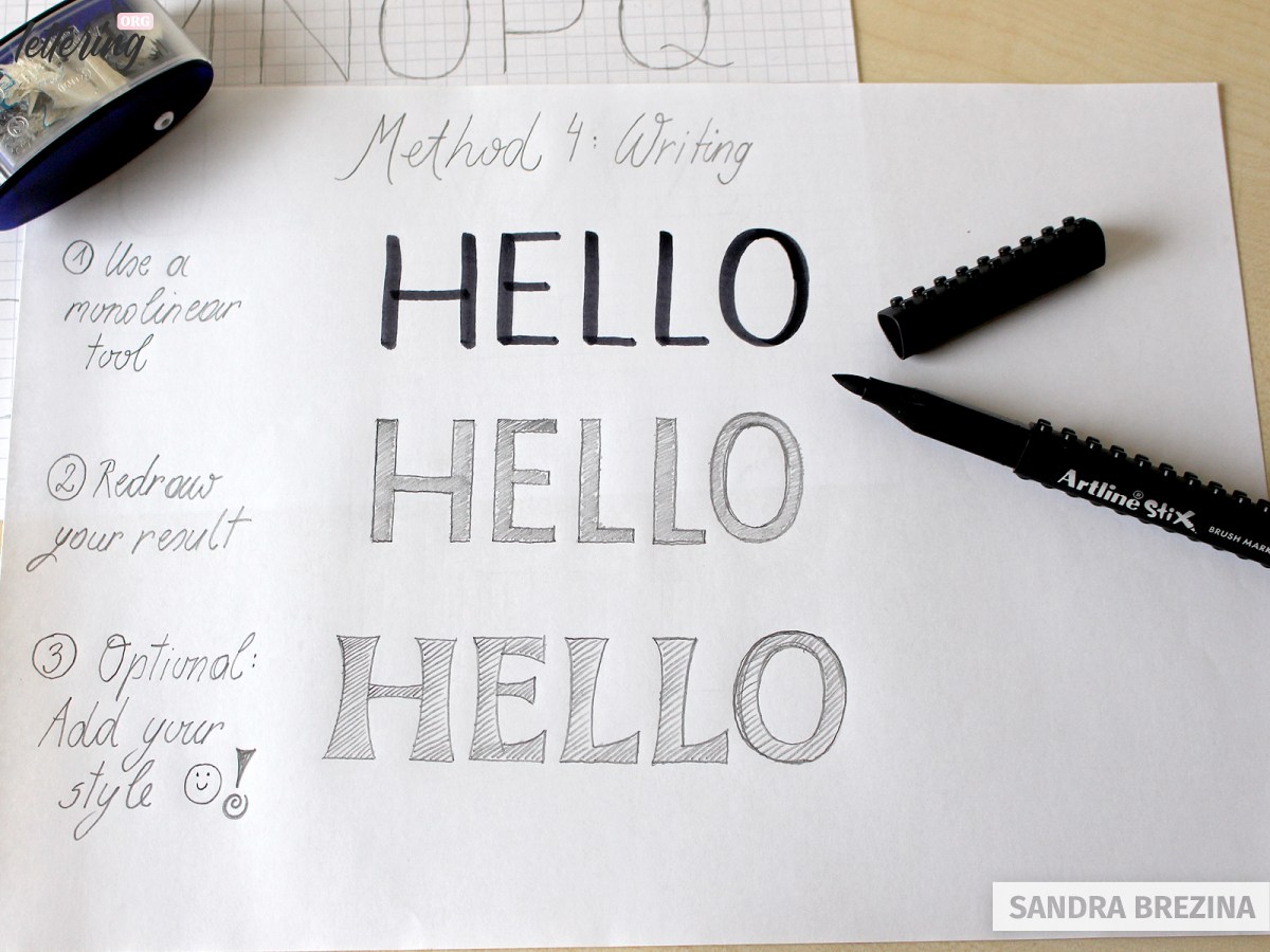
Method 4: Use a monolinear brush marker
Use a monolinear brush marker (felt tip) and write your letters above your skeleton. Place a paper above your writing and redraw your shapes with a pencil. Optimize your shapes.
Challenge yourself: Block letters have multifaceted shapes. Develop your own style by building fancy shapes out of your basic block letters.
I give you more advanced tips to modulate your letter shapes in the course of this tutorial.
Creating an entire block letter alphabet
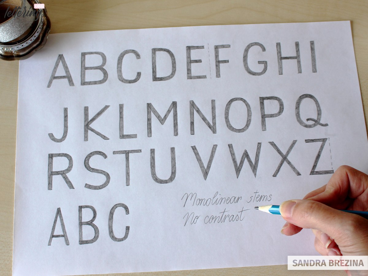
Place a new sketch paper above your skeleton and add widths to your lines by drawing equal shapes (rectangles) around each line. Take a close look at my example to see my process of how I develop more complex letters such as A, R, M, N, V, W.
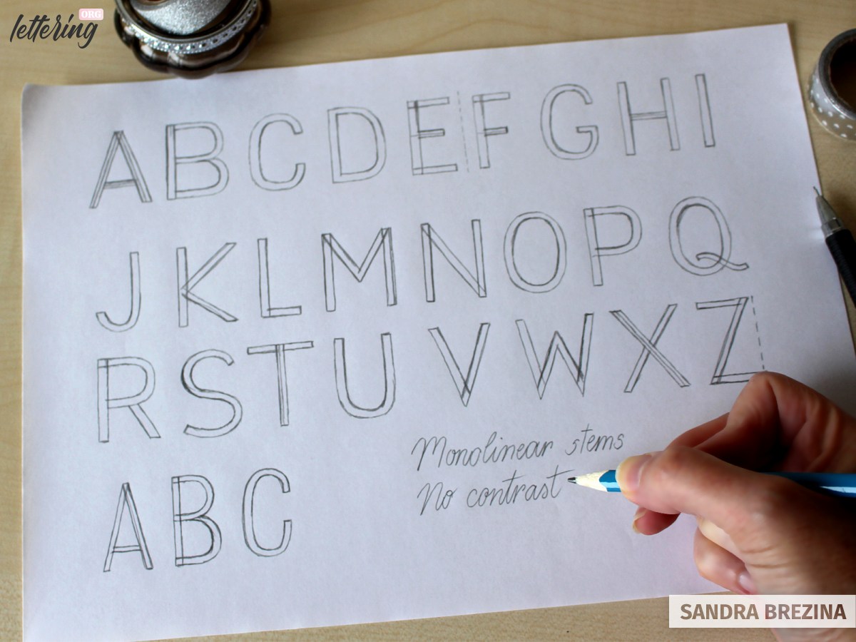
Once you are happy with your letter bodies, fill in the sketched shapes.
Congrats, there you have it: your alphabet of block letters with monolinear strokes.
Advanced skills to create block letters
Let us talk about sans serifs and serifs
We can divide block letters into sans serifs and serifs. During the industrial revolution around 1760–1840, new type designs began to emerge, among them sans serif letters which were called grotesque letters as well. The reason for this name: People were not used to the appearance of letters without serifs.
Sans serif letterforms lack calligraphic characteristics. They do not have any elongations or ornate endings added to their stems.
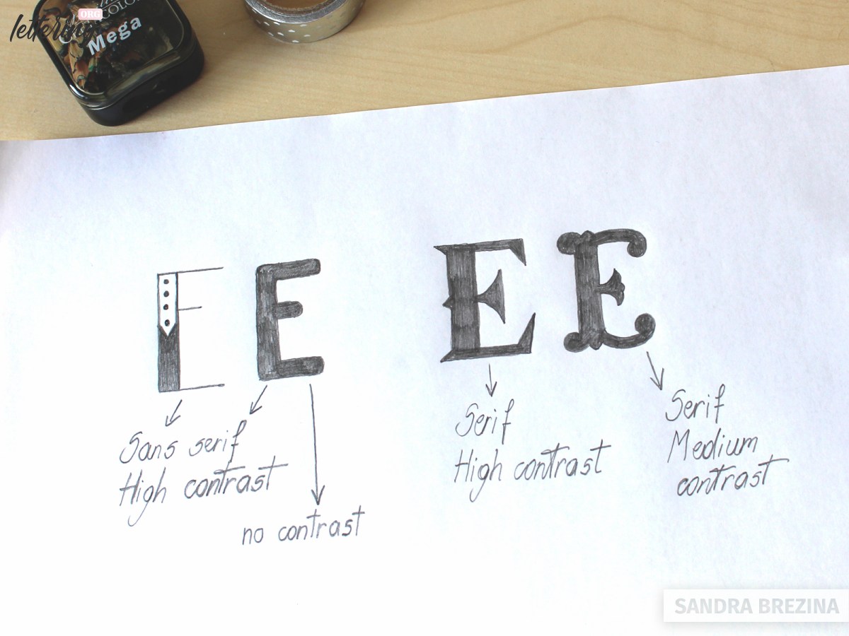
Serif letters which go back to ancient Roman times have one thing in common: they all have specific marks or decorative stuff added to their major strokes or stems.
The Trajan’s column in Rome for example shows a very ancient Roman alphabet whose delicate serifs were achieved with a chisel.
High contrast and low contrast letterforms
There is another classification: You can divide your letters into shapes of high and low contrast or no contrast at all.
My tip: The respective stroke width has a great influence on the look and feel of your letters.
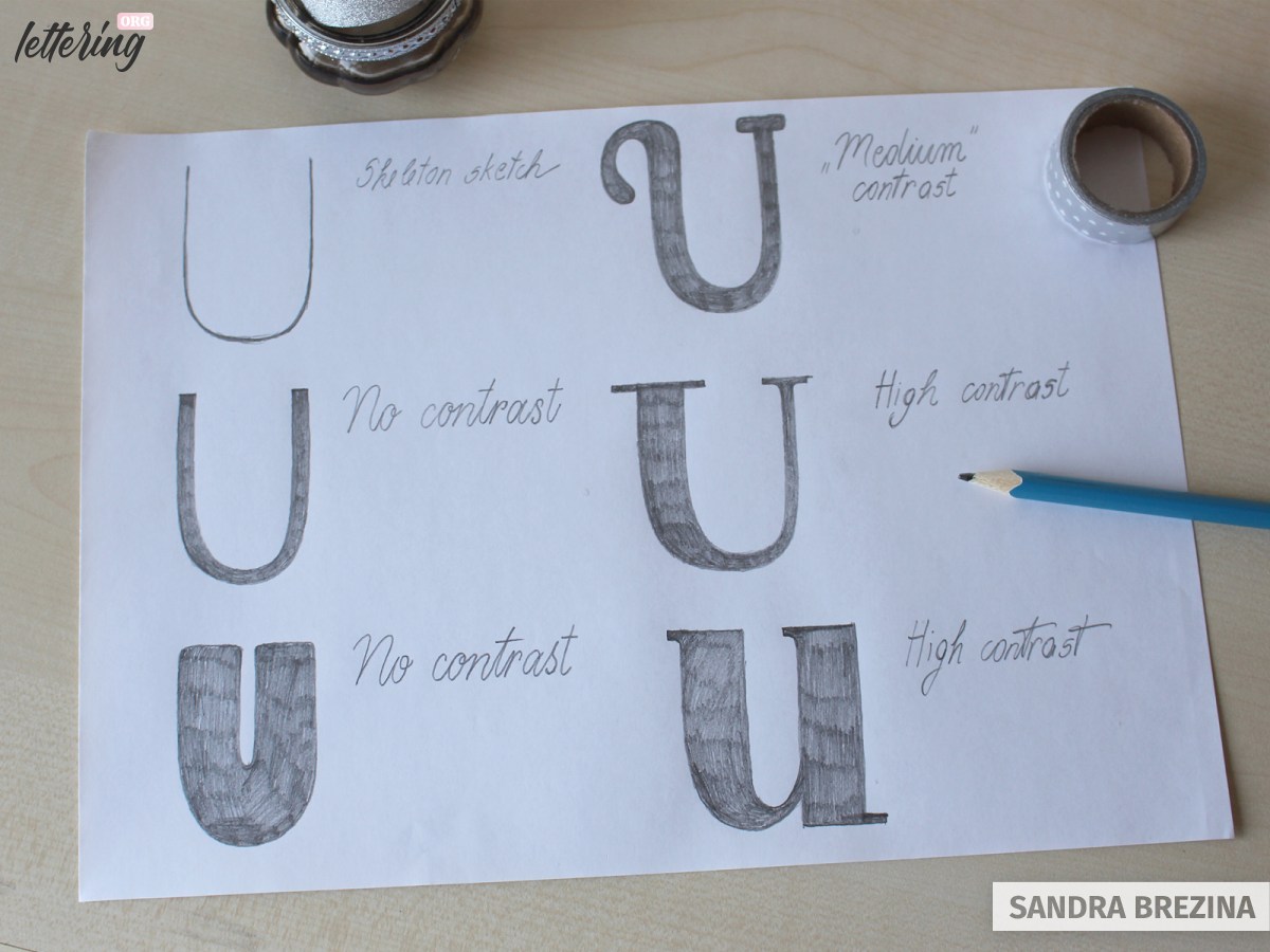
All capital U letters are based on the same skeleton U you see in my sketch. Letters with monolinear strokes whether these strokes are thin (2nd row on the left) or thick (3rd row on the left) are shapes with no contrast.
Differences in widths draw attention to your letters and in most cases they look more interesting or elegant or playful. Experiment with creating various degrees of contrasts.
Advanced level knowledge
Your capital letters sit on the baseline and go to the cap height. This is your basic frame made of 6 x 4 squares.
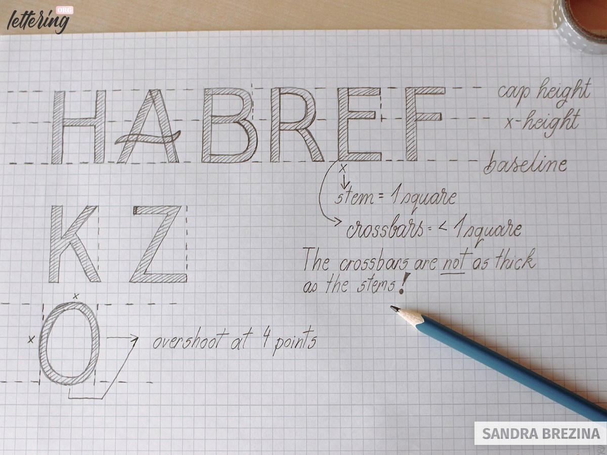
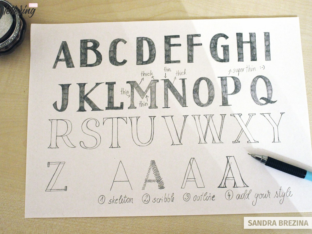
Round (B, C, D, G, J, O, P, Q, R, S, U) and triangle lettes shapes (A, V, W) need an overshoot. This means: Their shapes have to go a tiny bit below the baseline or the cap height or the left/right side of your grid (B, D, O, Q, …).
Our alphabet includes round, rectangle and triangle shapes. Optical adjustments are necessary to make your letters look similar. This has nothing to do with mathematical measurements. You have to measure the appearance with your eyes.
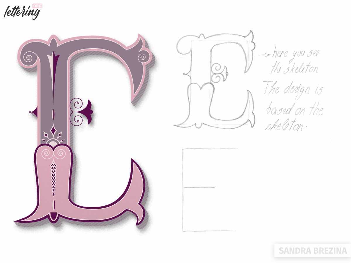
- Take a close look at my letters E, F, L, T. Draw their crossbars shorter than 4 squares wide. Otherwise they would appear a bit out of shape.
- Draw the lower belly part of your B a bit wider than the upper part.
- In my example, the N is a bit wider than 4 squares. This applies to my letters K, M and X as well.
- Draw the upper crossbar of your letter Z shorter than the lower crossbar.
My pro tip: What about the crossbars in general?
- The crossbar of the letter H is centered and sits at the x-height.
- The crossbar of the letter A sits below the x-height.
- The crossbar of your R is below the centered x-height, but above the crossbar of your A.
- The E has a crossbar which sits a bit above the centered x-height.
- Referring to the F, its crossbar is a bit below the one of your E.
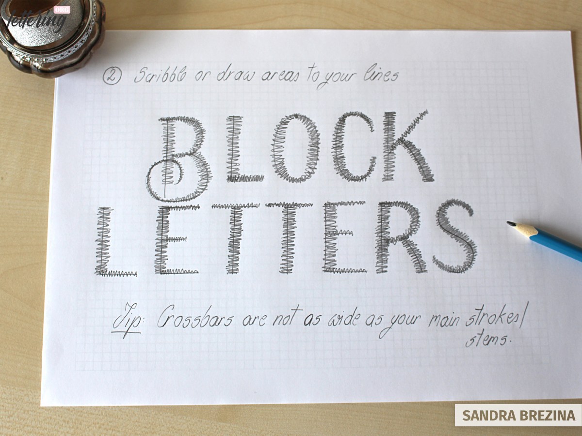
Note: The crossbar is always a bit narrower than the width of your stroke. When you draw your letters with a width of 1 square, your crossbars have to have a width size under 1 square.
Creating a medium contrast block letter
Proceed as follows: Draw your skeleton. Scribble out the widths as you wish. Keep calligraphic principles in mind. When you move your hand upwards, you have to create a thin stem. When you move your hand downwards, you have to draw in a thicker stem.
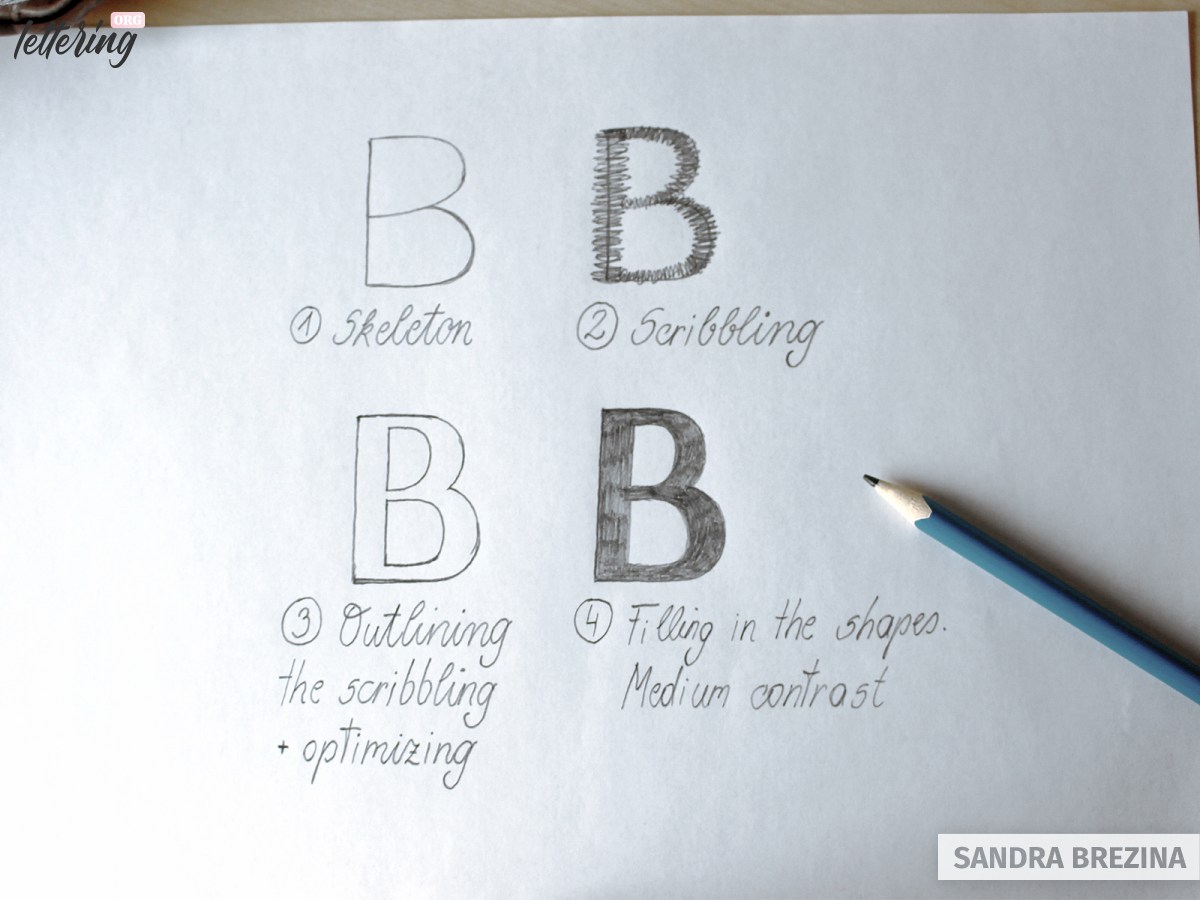
Outline your scribbling and optimize your shape. Once you are satisfied, fill in the body.
If you are unsure about the right placement of thickened strokes, look at Google for high contrast sans serif fonts to analyze the correct structure.
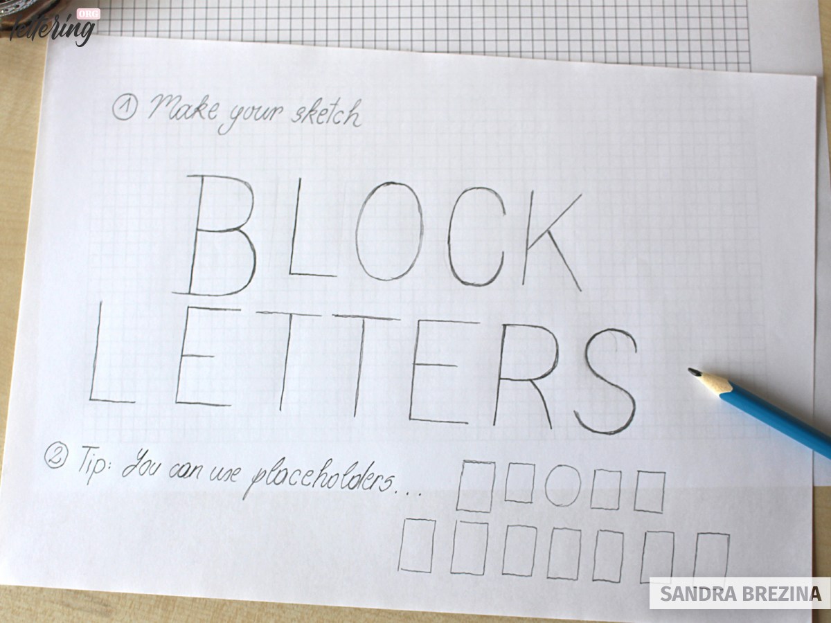
Creating various block letter shapes
Take the skeleton alphabet you created at the beginning of this tutorial. Use it as your starting point to develop further block letter shapes.
- Step 1: Place a sketch paper or squared paper above your skeleton.
- Step 2: Scribble onto your lines and modulate the widths of your stems.
- Step 3: Outline and optimize your scribblings to gain precise block letter shapes. Remember all the optical adjustments that might be necessary.
- Step 4: Add serifs to your block letters if this is the style you have in mind.
Tip: Research Google to be sure about the correct placement of serifs. Make a moodboard and collect various serifs and ornate elements added to stem endings.
Once you know the rules, you can break them by adding your crossbars at quite a high position for example. When you introduce principles to your alphabet, consistency is the key.
- Step 5: Fill in your letters to gain a high black and white contrast. This helps to evaluate the look of your letters.
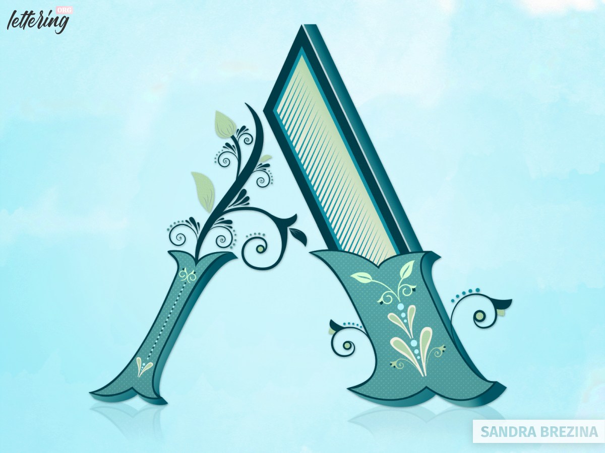
Once you feel comfortable with this technique, you can challenge yourself by drawing artistic block letter shapes.
Applying the scribbling method to a hand lettering project
To provide you with various types of letters, my lettering example includes multifaceted shapes.
Tip: Use a square paper underneath your sketch.
My pro tip: Keep your grid in mind. Another method is to sketch out shapes (identical rectangles, ellipses and triangles) where you place your letters inside. This helps to sketch out homogeneous letter shapes.
The scribbling technique is a quick and rough method to help you evaluate your concept. You get a good impression of how your hand lettering project might look.
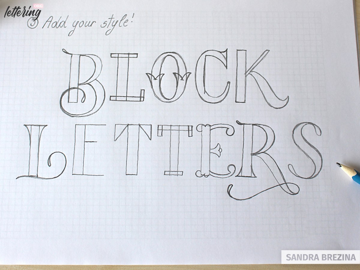
Take a blank sheet of paper and add your style to your block letters. Outline the scribblings, add serifs or rounded corners, swashes, flourishes, decorations. This step is the most time-consuming one. In most cases, you will draw one sketch after the other to get the most out of your basic concept. Use your creativity and give shape to your artwork.
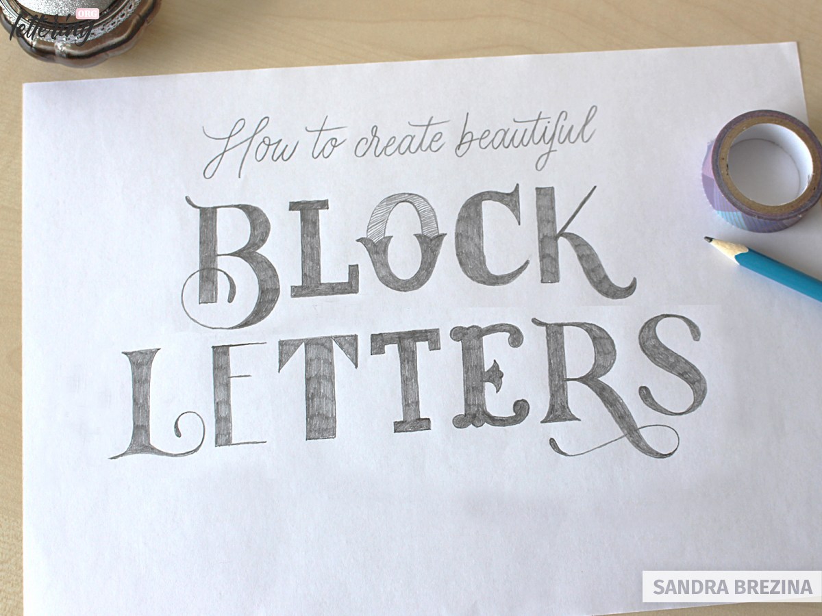
Note: The final step is very relaxing. You have solved all your problems in the meantime. Concentrate on refining your project and redraw your beautiful block letters with a very sharp pencil.
The following steps are up to you. Grab your pens and refine your lettering or scan your artwork and use it as a digital template for further proceedings on the Ipad or computer.
Final words
I hope you enjoyed reading this tutorial and learning my tricks and approaches of creating various block letter styles with ease. Have fun by lettering quotes with amazing block letters. Stay amazing!

This is SO LLLLLLLOOOOOOOOONNNGGGGGGGGGGGGGGGGGG!!!!
I love this ART!!🎨🐹🦋🧡
I know right 😁😁😁🤣💖 but it is beautiful and precise though.
Work on your attention span, or pick something less complicated to learn.
Get over it, b/c it’s worth it.
What a beautiful tutorial. It was perfectly paced with clear explanations and lovely examples. =]
I will excitedly share this with my students when they want to dive deeper into block and bubble letters.
(I am a high school art teacher)
Thank you so much! 🙂
yes, thank you, a lot.
Perfect tutorial, exactly what I was looking for, thank you!
I’m glad to hear that!
So nice please do all the letters from A to Z and display them.
Yes, I agree. Please put A to Z.
Awesome tutorial! I’ve searched & read through quite a few that was of no help to me at all & then I found this one which was just what I was looking for. Thank you so much for a truly great tutorial!
Love to hear that! Thank you so much.
it’s very perfect.
keep it up.
thanks for your help.
to me.
Perfect tutorial! I was trying to find a way to make my lettering standout on my HS Senior Parking Lot Space. Your instructions will help me so much Thanks!!
Thank you to all the kind souls that thanked this kind woman and thank you, Sandra, for taking the time to teach other people helpful lessons.
nice