Another letter that shows a very low frequency in German-language texts is the “Y”. As is so often the case, hand lettering “Y” looks simple. However, when writing or constructing the letter, there are some peculiarities to consider.
In its history, the “Y” has great overlap with the letters “U”, “V”, “W” and “F”. Especially with the former, you can see this in the very similar basic shapes (especially if you look at the cursive variants). The original symbol for the “Y” and its related letters is a kind of hook or club with a round tip.
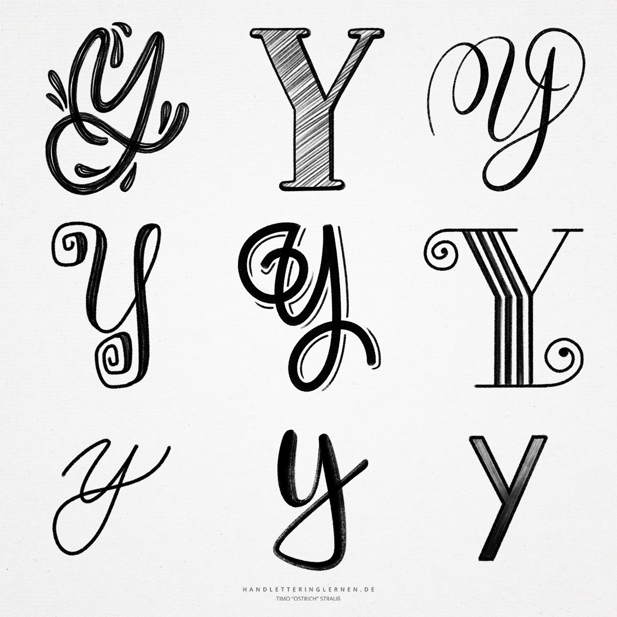
- The print script “Y” is written simply. It practically consists of a stem on which a small “v” sits. Provided that the stroke width remains the same, the “Y” can thus be constructed in exactly this way: You write a small “v” (above the x-height) and then add the stem. For a balanced result, the correct height of the intersection is crucial. It should be neither too high nor too low.
- If the stroke width contrast is higher, the left diagonal and the stem are written with the stronger stroke width. In this case, the second diagonal can also be placed slightly asymmetrically to create a little more space for the inner area. However, this is rather negligible in hand lettering.
- In the case of the lowercase “y”, the letter practically shifts downward. The imaginary “v” then sits on the baseline and the second stroke is completely diagonal.
- If you look at the cursive “y”, you see only already learned individual parts: In principle, it consists of a capital “U”, which is supplemented by a long downstroke with a loop to the next letter (as in the “J”, for example).
- The minuscule follows the same pattern. Here, only a small “u” is used for the first part, so that only the middle length is filled.

Do you need even more styles? Check out our Lettering Generator with hundreds of beautiful lettering fonts. Create custom templates or full designs for any kind of needs!