The “X” is a letter that is used relatively rarely. Accordingly, one does not usually have so many variations in mind for hand lettering “X”. Yet the “X” offers a lot of potential – on the one hand with its symmetrical, stable appearance in print, and on the other hand as an elegantly ornate letter in handwriting.
The original symbol for the “X” could have represented a buttress or a fishbone. Here, opinions are not clear.
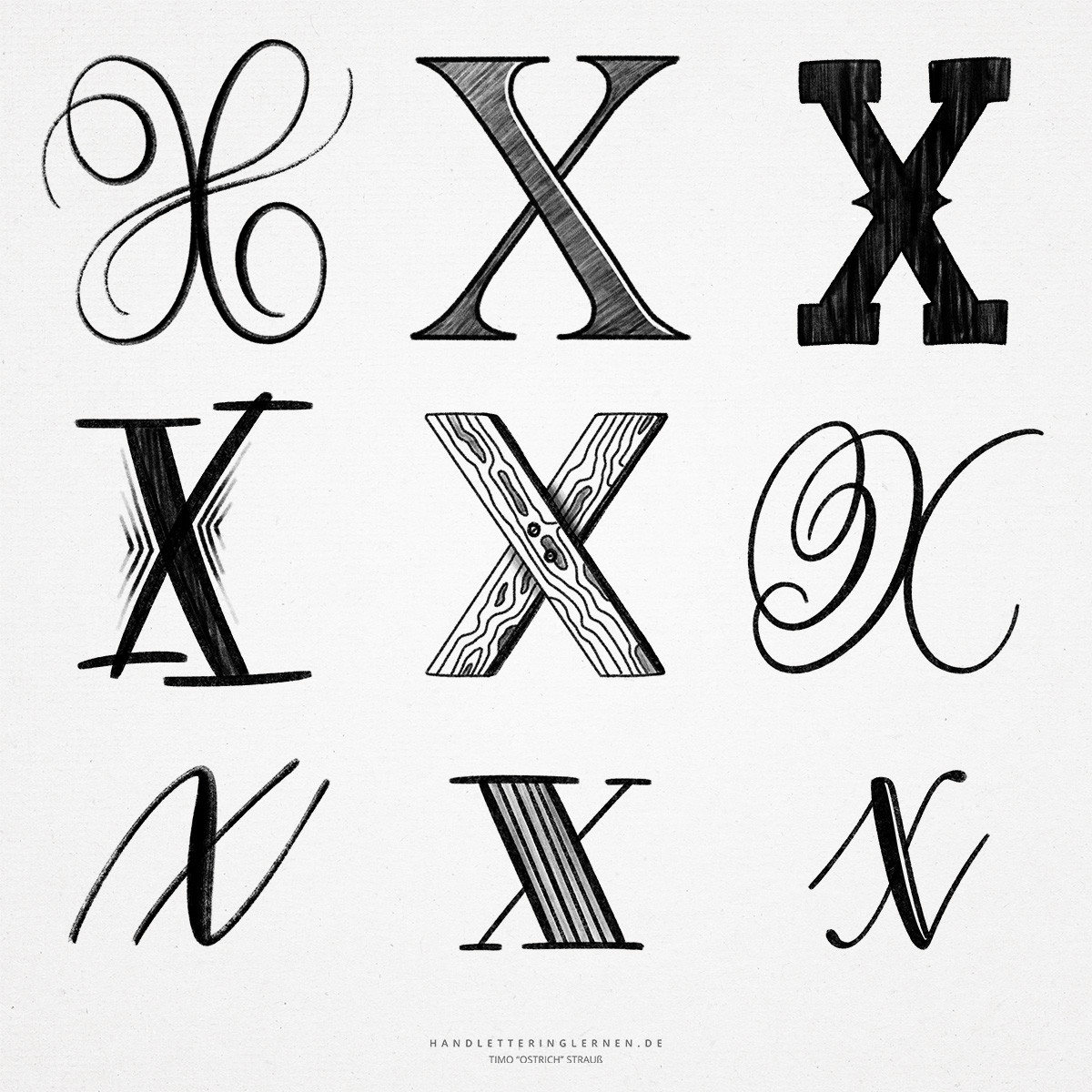
- In principle, the printed letter “X” is a simple, slightly stretched cross (St. Andrew’s cross).
- To avoid top-heaviness, the point of intersection of the two diagonals is chosen to be slightly above the center of the letter. This means that the lower part of a typographically correct “X” is larger than the upper part.
- When high line width contrasts are used, an optical illusion is created: the thinner line appears somewhat offset (despite its geometrically correct position). To resolve the illusion, the upper, narrower line must actually be shifted in the other direction.
- In cursive writing, the “X” can be drawn through with only one line. The use of different stroke widths is thus correspondingly challenging. This is true for the uppercase as well as the lowercase letter.
- There are various variants for the cursive “X” that make use of several individual lines. For example, the capital “X” can consist of two touching lines. The lowercase “x”, on the other hand, can be wonderfully integrated into brush lettering by using the first diagonal as the main line (smear). The second diagonal is set as an unconnected upstroke. All in all, this creates a balanced look.
- When using stroke width contrasts, the first diagonal (from top left to bottom right) is always the stronger one.

Do you need even more styles? Check out our Lettering Generator with hundreds of beautiful lettering fonts. Create custom templates or full designs for any kind of needs!