Surely you know that the letters “V” and “F” sound very similar. This shows again that the “V” is historically related to the “F”. But there are also many similarities with the “U”.
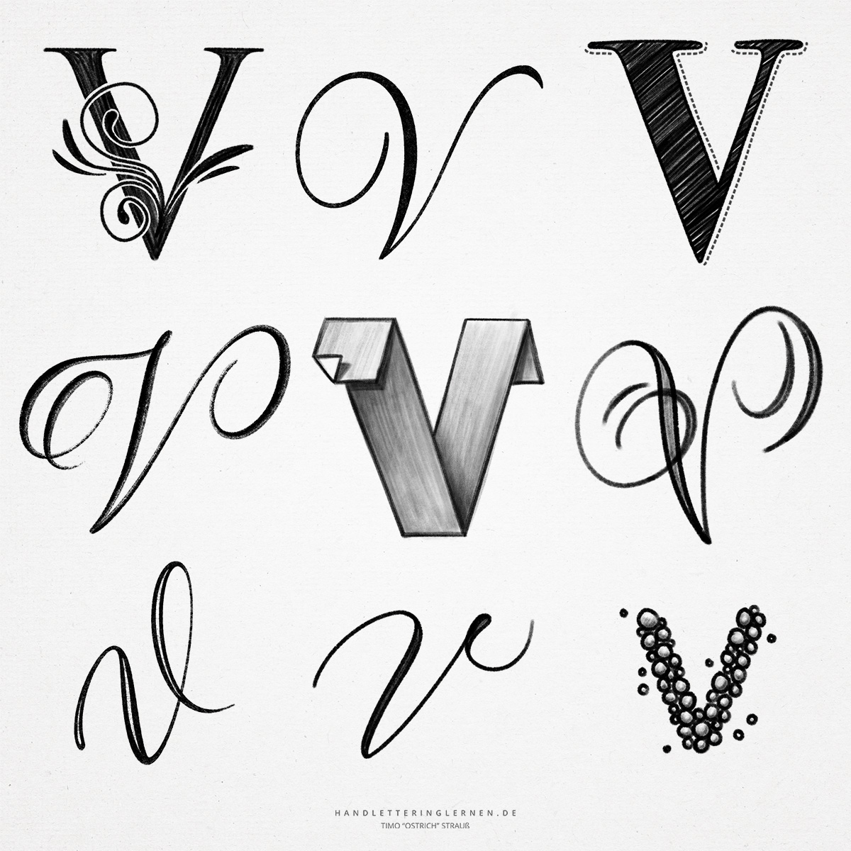
The hand lettering “V” consists only of a downstroke and an upstroke. Therefore, it is also ideal for practicing the use of stroke width contrasts. In the print version, the pen can even be set down between the two lines. In the cursive variant, on the other hand, the two lines are displayed connected.
- In print, the uppercase letter (majuscule) and the lowercase letter (minuscule) look exactly the same anatomically. They differ only in the space they occupy in the line system.
- The cursive “V” resembles the “U” in its basic form. The only clear difference lies in the way it is connected to the next letter. The “V” is connected where the upstroke ends. In the case of the lowercase “v”, this is the x-line. If you were to connect the “v” to the following letter by another stroke, it would look exactly like a “u”.
- The capital letter “V” is usually displayed unconnected. However, with an additional loop, it is also possible to connect it without any risk of confusion with other letters.
- The letter “V” is at the same time the Latin number sign for the “5”. The only similarity, however, is the look – otherwise, there is actually no relationship between the two characters.
- Writing or drawing a cursive hand lettering “V” is not so easy, because the inclination of the axis is not visible on the basis of a letter stem, but affects the diagonal lines.

Do you need even more styles? Check out our Lettering Generator with hundreds of beautiful lettering fonts. Create custom templates or full designs for any kind of needs!