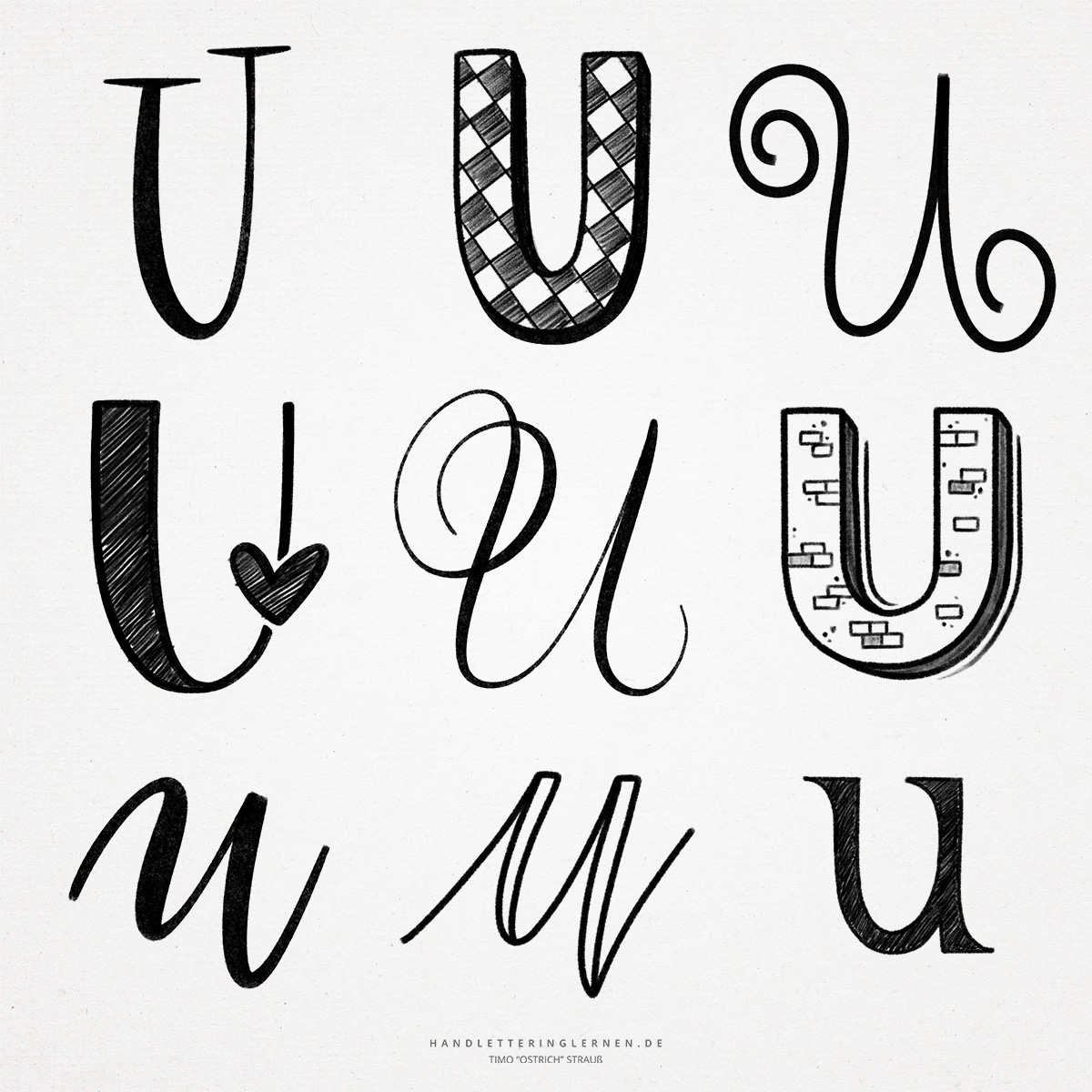
The hand lettering “U” can be designed quite wonderfully. Depending on the variant, the “U” allows a very harmonious, almost rhythmic flow of writing. Upper and lower case letters hardly differ in their basic anatomy.
The original symbol for the “U” was a hook or club with a rounded tip. It shares its past development in some aspects with the letters V, W, Y and F.
- In essence, the “U” consists only of a smear, an upstroke, and an open punch. This applies to both the majuscules and the minuscules.
- In the cursive script, the “U” is connected to the next letter with another smear. This results in a very even movement, especially when followed by similar letters, such as the “m” or “n”.
- The lowercase “u” and the lowercase “n” look quite similar in cursive scripts. In German Kurrentschrift, the two letters actually looked alike, so the lowercase “u” was marked with an additional stroke or hook. This peculiarity still appears today, although the basic shapes of the two letters differ in Latin cursive.
- In brush lettering, the “u” is a letter that is often used to train the stroke width contrasts. In addition to the similarity of the strokes, the simplicity of the “U” also lies in the fact that no strokes have to be drawn against the direction of writing. The brush tip therefore only has to be moved by drawing.
- The capital “U” offers various possibilities to give the letter more elegance with an additional loop. A typical example is the variant of the “U” in English script.
- Another design possibility is offered by the last strokes of the script “u”. It can be placed below the baseline and thus provides additional dynamics. Caution: Do not exaggerate here, otherwise there is a risk of confusion with the lowercase “y”.

Do you need even more styles? Check out our Lettering Generator with hundreds of beautiful lettering fonts. Create custom templates or full designs for any kind of needs!