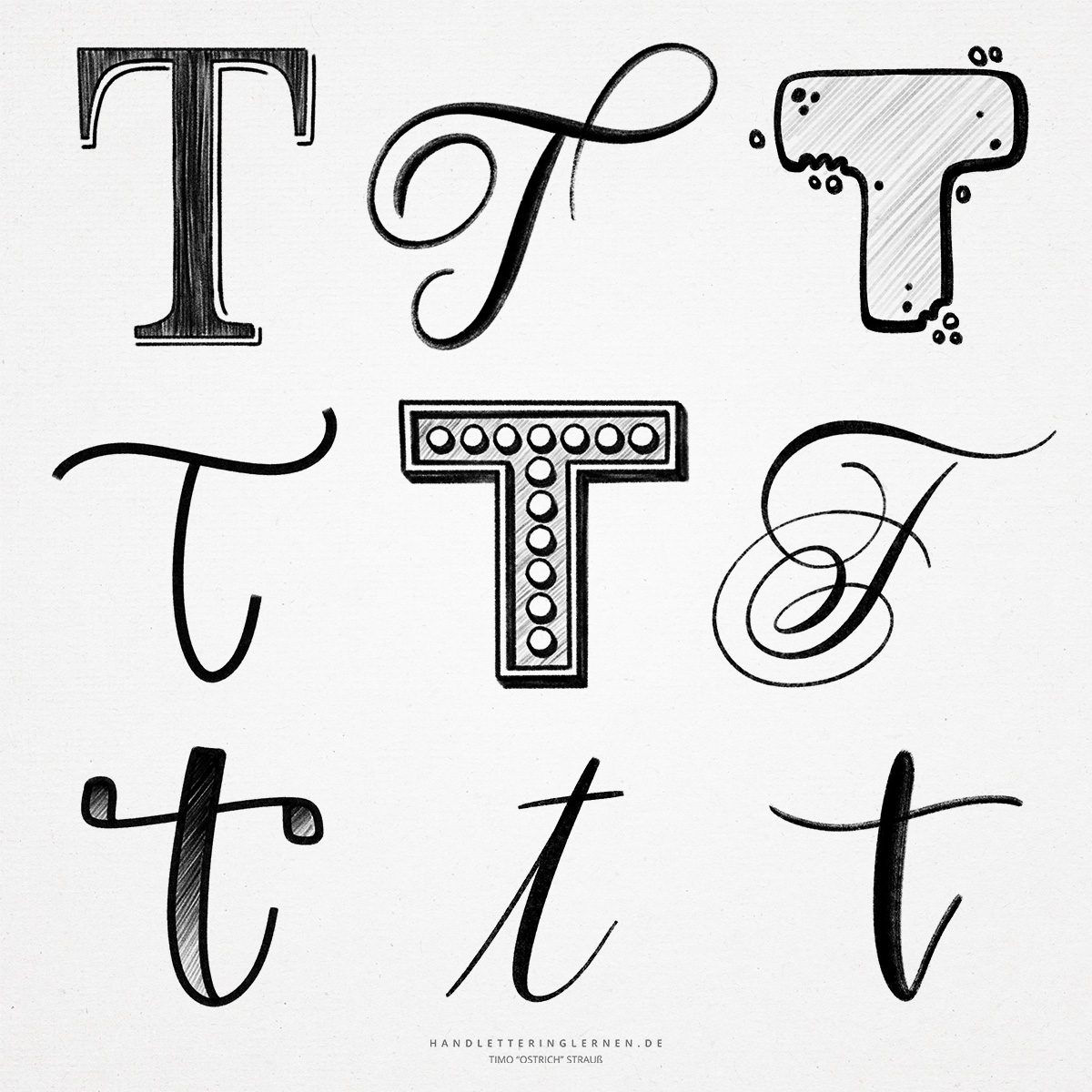
We usually encounter the “T” as a very straight letter. The stem and the cap stroke are at right angles to each other (in print) and the basic anatomy of the letter is very simple. In hand lettering, there is usually an effort to give the “T” more dynamics and a more exciting look.
In its early form, the “T” was a cross. This original symbol evolved into the “T” we know today, which can already be found in this form in the Greek alphabet.
- Especially in print, you should pay attention to appropriate kerning for the “T”. The wider the top stroke, the larger the white space that appears next to the stem. To make your hand lettering look visually balanced, the letter that follows must usually be closer to the “T”.
- In handlettering, there are two variations of the lowercase “t”. In the nowadays rather rarely used variant, the cross stroke is at the lower end (for example in German Kurrentschrift). However, the variant with the transversal stroke at the top is more common. This is usually drawn only after completion of a word (just like the i-dot).
- As a lowercase letter (minuscule), the hand lettering “t” offers many possibilities to add flourishes or form ligatures (or both). A typical letter combination that almost inevitably leads to a ligature is the meeting of “t” and “h”.
- The “t” is relatively similar to the “f”. They differ only by the central cross stroke. This is true for both the print script and the cursive script variants. In the case of the cursive “T”, it is therefore important to ensure that the next letter is not connected with a line in such a way that the “T” suddenly looks like an “F”.

Do you need even more styles? Check out our Lettering Generator with hundreds of beautiful lettering fonts. Create custom templates or full designs for any kind of needs!