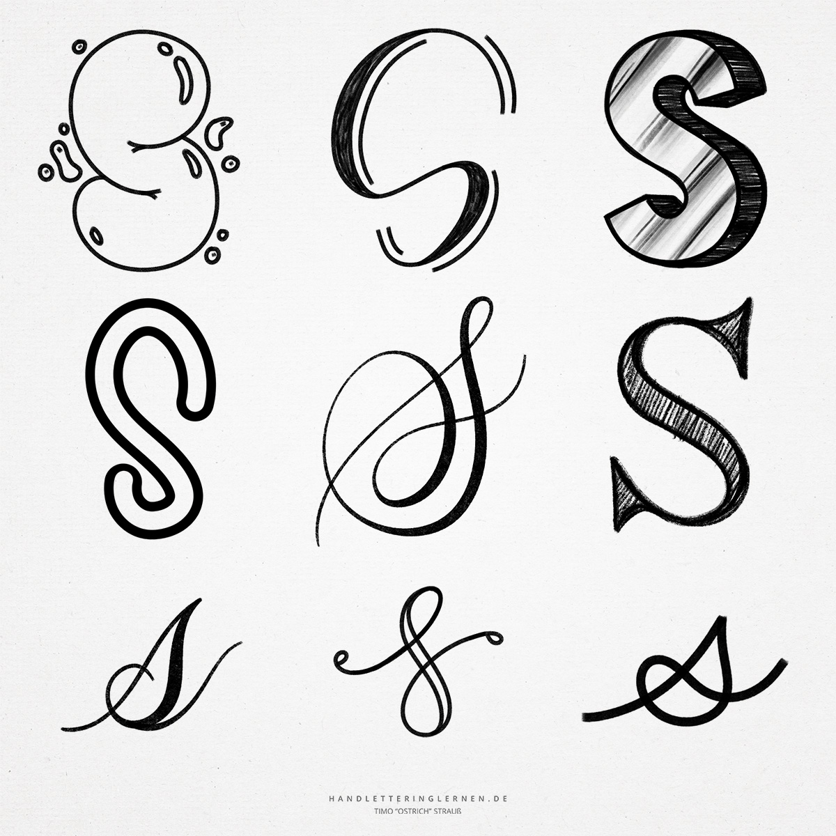
A letter with a lot of possibilities: The hand lettering “S”! Often the “S” consists of only one long stroke, which is drawn without setting off. This is a great challenge, especially with brush lettering, since parallel attention must be paid to the stroke width contrasts. For this, the “S” often looks very noble and dynamic.
The original symbol for the letter “S” was an arc. Through rotation and mirroring, our current curved “S” was created over time.
- The block letter “S” is basically easy to learn and can be used perfectly in hand lettering. It gets exciting when you want to represent the “S” as a block letter (i.e. with a consistently large stroke width). This is because a finely written “S” cannot simply be widened with a second line. Instead, the wider basic shape must be taken into account beforehand. The construction can be simplified with the help of circles.
- In general, there are many variations on the “S” script. On the one hand, the round shapes offer a lot of potential for changes and added flourishes, on the other hand, there are already several variations for the “S” itself.
- The typical, small “s” can be represented in various ways. For example, as a connected, scaled-down variant of the capital “S” or in a version without an upper loop. This “s” is called a round “s” and is common in Antiqua fonts.
- In addition, there is the so-called long “s”, which visually resembles the letter “f”. It is mainly found in broken scripts. It is also part of a ligature that eventually led to the letter “ß”. Nowadays, however, the long “s” is hardly used as a symbol.
- A helpful variant of the lowercase “s” is the version with a loop overlapping the first stroke. It helps to fill the white space between the letters evenly.

Do you need even more styles? Check out our Lettering Generator with hundreds of beautiful lettering fonts. Create custom templates or full designs for any kind of needs!