The letter “R” presents you (once again) with a special challenge. Although the hand lettering “R” is based on a simple “P”, the placement of the leg requires special attention so that the anatomy of the “R” looks harmonious.
The origin of the letter in this case is very interesting – because the “R” evolved from the symbol for a human head (in profile). Think about that the next time you construct an “R” and ponder about the right placement of the lines 😉.
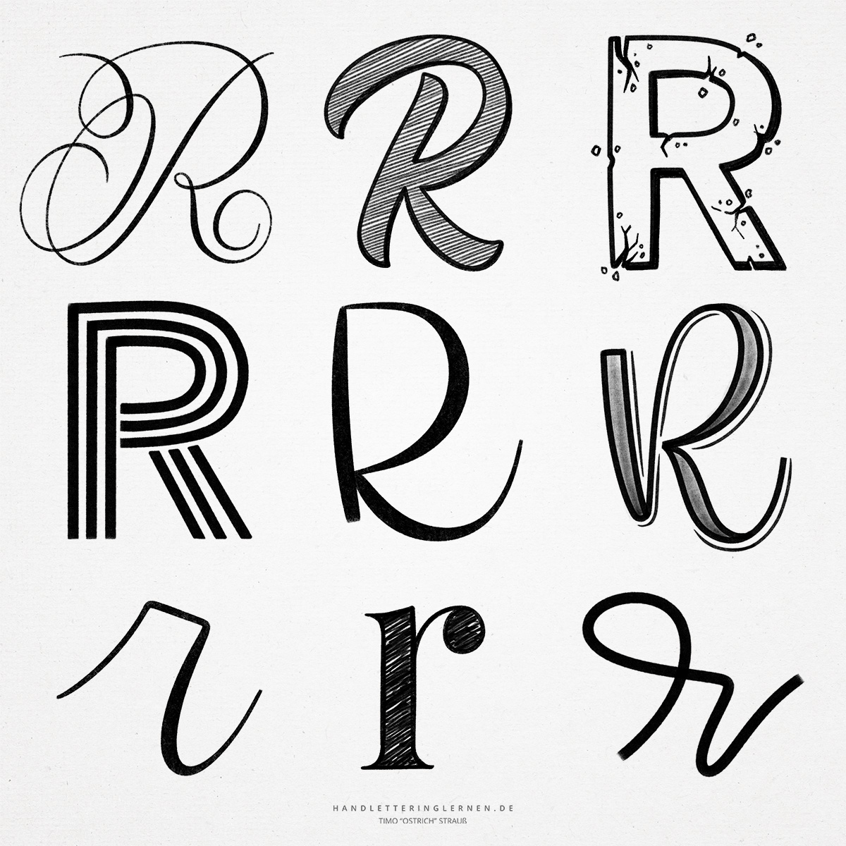
- The hand lettering “R” in particular comes in countless variations. In both print and hand lettering, the complex anatomy of the “R” offers a lot of potential for different line layouts and flourishes.
- In print “R”, whether with or without serifs, the correct placement of the leg is important so that it does not look as if the “R” falls to the right. To do this, the leg sticks out a little further than the upper curve. This is the only way to make the letter look visually balanced. You should keep this in mind when constructing a block letter.
- The leg of the “R” can also start at different positions. Depending on the font, it may start at the intersection of the arch and the stem, or it may be shifted slightly to the right and start at the bottom of the arch.
- The small script “r” offers another special feature. It occurs in completely different anatomies. On the one hand, there is the straight version, as you are used to from screen fonts, on the other hand, there is a round version, which fits even better into the writing flow. In hand lettering, the latter can be subdivided into further variants (for example, by using a loop). Depending on the country and time period, one of the two basic versions was and is taught – sometimes even both. Unfortunately, I do not know of a clear-cut formulation for the respective versions.

Do you need even more styles? Check out our Lettering Generator with hundreds of beautiful lettering fonts. Create custom templates or full designs for any kind of needs!