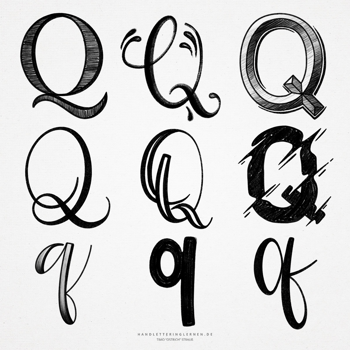
Similar to the “O”, the hand lettering “Q” consists of a large circle or oval. The round shape is a real challenge, especially when it comes to letters constructed with a pencil. The larger the “O” is used, the more practice and confidence is needed to draw an even round line.
With the “Q”, I personally would have expected a clear origin symbol. However, this is not the case. So there are theories that the original symbol for the “Q” represents a monkey in the rear view or a human head with neck.
- In the English language, the “Q” usually occurs together with an “u”. For hand lettering, this means that you should definitely practice the combination of “Q” and “U”.
- For the representation of the capital hand lettering “Q” you can usually fall back on variants of the capital “O”. By adding an additional stroke, you can easily turn the “O” into a “Q”.
- The smear that ultimately makes up the “Q” is called a cauda. The term comes from the Latin and means “tail”.
- While the cursive “O” is usually rendered unconnected because the line ends in the ascender, the cauda allows the cursive “Q” to connect well with the letter that follows it.
- The small hand lettering “q” is practically a mirrored “p”. In print, the letters actually look the same. In handwriting, however, the connection to the next letter changes the look.
- The connection from the lowercase “q” to the following letter is made either by a direct upstroke or with an additional loop in the direction of writing. This loop must not be placed against the direction of writing, otherwise the lowercase “q” will look like a lowercase “g”. It is generally important to avoid such confusion when you change your letters in the course of word creation.

Do you need even more styles? Check out our Lettering Generator with hundreds of beautiful lettering fonts. Create custom templates or full designs for any kind of needs!