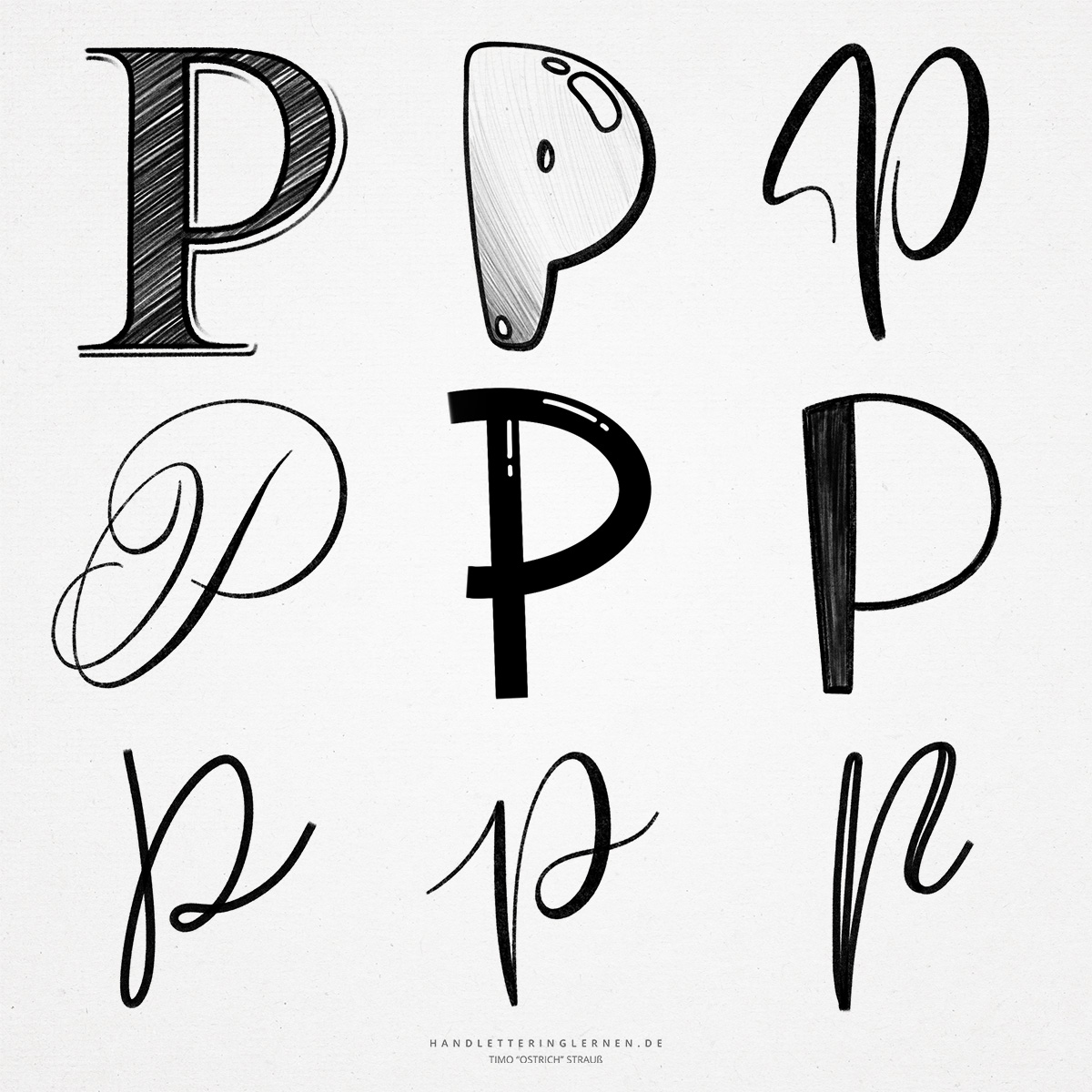
The hand lettering “P” looks relatively simple, but has some challenges. Nevertheless, the basic anatomy is very straightforward. Therefore, for the creative process (as is often the case), a little imagination is required.
It is assumed that the original symbol for the letter “P” is a throwing stick. However, this is not completely proven. For our design, this is not important, but I personally find these origins quite interesting.
- In print, the “P” consists only of a stem and a belly. The appearance of the “P” can be strongly influenced simply by changing the ascender and thus the belly. For example, a large belly and the slight inclination of the stem to the left make the “P” appear loose and almost playful.
- The punch (which is the inner surface) can also be wonderfully adjusted for design purposes, especially with block letters.
- In its school form, the script “P” is hardly different from the block letter variant. For hand and brush lettering, therefore, especially calligraphic versions are used, for example, based on English script.
- The “P” poses a particular challenge to horizontal letter spacing. The belly pushes the following letter forward, creating a gap below the “P”. Sensitivity is required here in the design to achieve a balanced look. The problem arises especially when you want to work with a large ascender.
- The small script “p” usually appears in two different variations. Once with and once without a loop to the next letter. Theoretically, a third variant is also always possible, in which a connection to the following letter is dispensed with. The line then ends inside the punch.

Do you need even more styles? Check out our Lettering Generator with hundreds of beautiful lettering fonts. Create custom templates or full designs for any kind of needs!