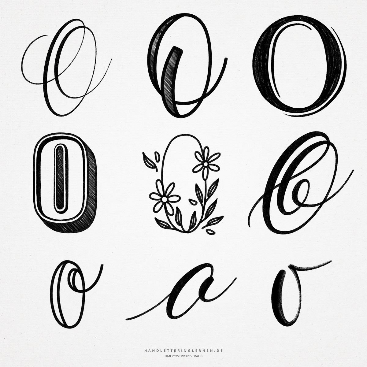
The letter “O”, depending on the style, comes very close to a circle and, accordingly, is much more difficult to create than it often looks. Any deviation from the circular shape is immediately noticeable. Therefore, hand lettering “O” is a letter that requires a lot of practice and sometimes a trick or two.
The original symbol for the letter “O” was an eye (again, an origin that is relatively close once you know it). After the pupil first became a line and finally disappeared, the basic shape of the “O” was virtually created.
- The print font “O” is practically an oval, which goes in the direction of a rectangle with strongly rounded corners. It is usually written with a continuous stroke until the line reaches the starting point again.
- The more rectangular the basic shape of the hand lettering “O” is, the more difficult it is to draw it. This is because you have eight alternations between straight line and rounded corner while drawing the line. Both the hand and the head have to adjust to this and great confidence with the pen is needed.
- If you want to draw the “O” as a block letter, the construction becomes even more challenging, since you now have to draw two of these lines that are also parallel to each other.
- Apart from the round version, the hand lettering “O” offers many more exciting versions. Even the simple handlettering “O” looks boring against the beautiful squiggly variations made possible by changing the anatomy of the letter.
- Normally, the large hand lettering “O” stands unconnected. However, with a matching letter style, a harmonious connection to the next letter becomes possible. Therefore, it is always useful to have some variations of each letter in mind.
- Also the small “o” offers various possibilities of the design and thus the choice of the connection to the next letter.

Do you need even more styles? Check out our Lettering Generator with hundreds of beautiful lettering fonts. Create custom templates or full designs for any kind of needs!