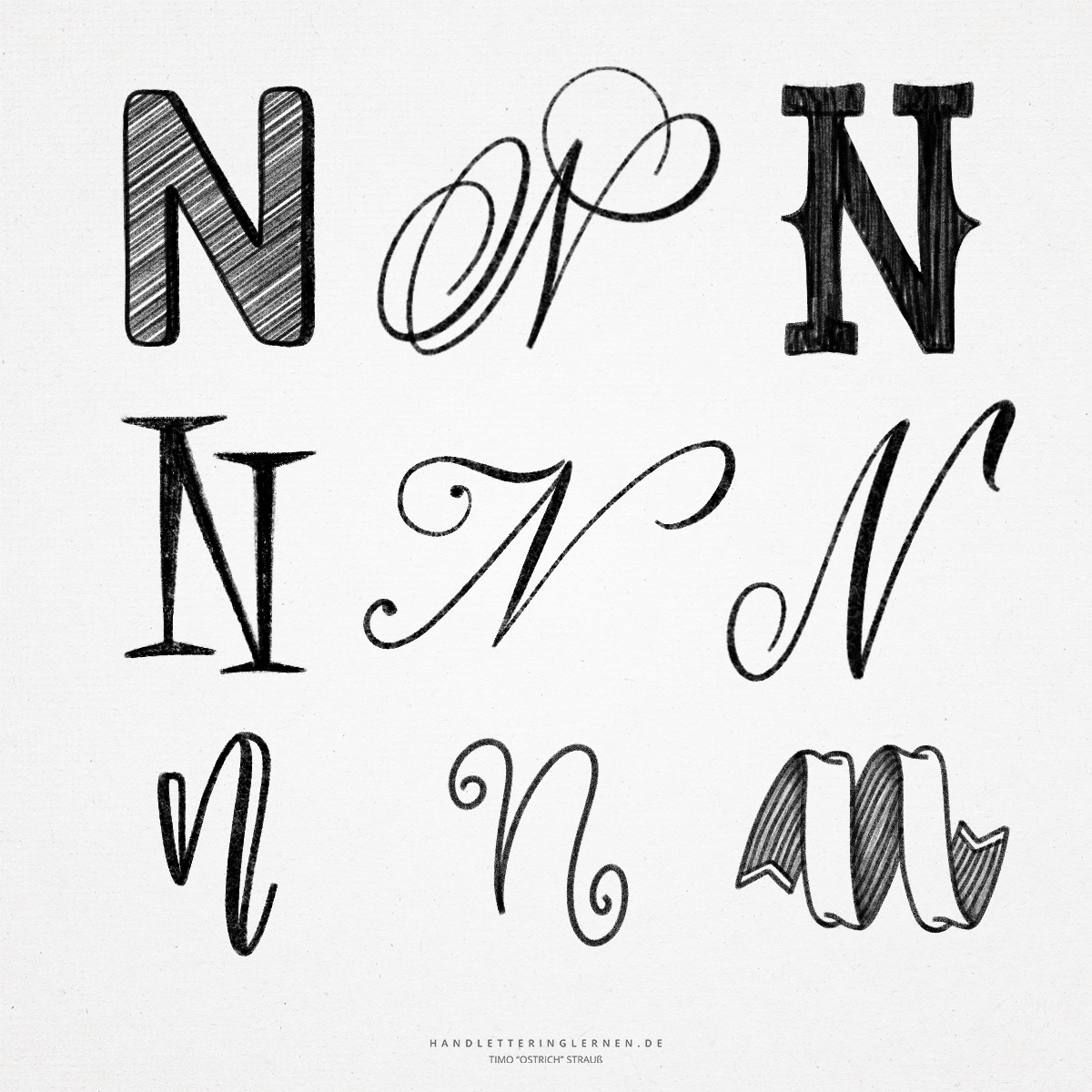
The hand lettering “N” is relatively similar to the “M” in its anatomy and execution. This applies both to the uppercase letter (majuscule) but also especially to the lowercase letter (minuscule).
Our today’s Latin “N” was in its origin a symbol for a snake. Already in the Phoenician alphabet, which developed from the Proto-Sinaitic script, the anatomy of the modern “N” is clearly recognizable.
- In print, the capital “N” consists of only two vertical lines and one diagonal line. It can therefore also be constructed relatively easily with a ruler or a set square.
- In cursive, too, the capital “N” is usually unconnected before the next letter, since the last stroke of the “N” ends on the H line. Of course, there are creative exceptions here – often the lowercase “n” is simply enlarged in this case, so that a connection to the next letter becomes possible.
- The two upstrokes of the large brushlettering “N” can be wonderfully decorated by adding additional flourishes before the first stroke and after the last stroke. Often the upper end of the first upstroke is also used for another tail. This helps fill the white space around the “n” evenly, especially in cursive fonts.
- The lowercase “n” has only one less bow than the “m”. Otherwise, the two letters are identical in structure. This applies to both print lettering and hand lettering.
- In hand lettering or brush lettering, the arc of the lowercase “n” is often drawn slightly above the center line (x-height) to give the letter additional dynamics. Undercutting the baseline with the second stroke is also a popular choice when designing the letter.

Do you need even more styles? Check out our Lettering Generator with hundreds of beautiful lettering fonts. Create custom templates or full designs for any kind of needs!