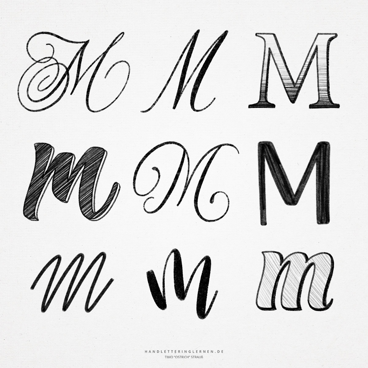
In most proportional fonts, the capital “M” takes up the most space, that is, the highest width. Because of the many individual strokes, there are countless design possibilities for the hand lettering “M”. Depending on the font style and design, the “M” is particularly pleasant to write because it has a very uniform structure.
The letter “M” has its origin in a water symbol (a kind of wavy line). Over time, the two long strokes at the beginning and end of the letter were added, resulting in our current “M”. I always find it exciting how obvious the original symbol is in parts.
- Especially with the “M”, print and script are very similar, as long as we consider a simple script style (without flourishes). The capital “M” consists practically only of a combination of straight, alternating upstrokes and downstrokes. In brush lettering, the lines are merely rounded off a bit and the following letter is directly connected.
- The small brushlettering “m” is a very popular letter, which is super suitable for practice. The similarity of the lines creates a special flow (therefore, the word “minimum” is also a typical practice word in hand lettering and bush lettering). Have you ever noticed how similar the individual parts of the letter are?
- Of course, there are also for the hand lettering “M” decorated variants with additional flourishes or completely different lines. The challenge here is to draw the long lines evenly and confidently. Since the “M” takes up a lot of space, the individual lines are correspondingly long.
- Another exciting aspect of the (small) “m” is that you can draw the vertical lines with different angles of inclination that balance each other out. This creates a balance despite the non-uniformity. This is helpful when it comes to techniques like bounce lettering.
- By the way, the upper arcs of the lowercase “m” are called shoulder(s).

Do you need even more styles? Check out our Lettering Generator with hundreds of beautiful lettering fonts. Create custom templates or full designs for any kind of needs!
so beautiful 😍
i like the letter m! it was in my name so what spells my name? I know! M.A.R.I.N.O! thats how you spell my name!