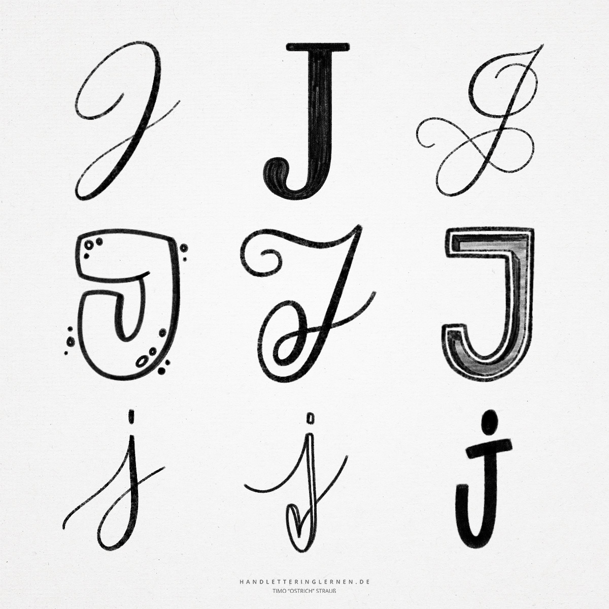
The “J” is a relatively large letter, especially in script. It is one of the few letters that takes up the entire ruling, from ascenders to descenders. The hand lettering “J” offers a lot of potential for flourishes and embellishments. The block letter version of the “J”, on the other hand, is more simple in nature.
Similar to the “I”, the “J” has its origins in a symbol for a hand or arm. The historical overlap also makes it clear why the “J” and the “I” are so similar in their representation.
- The block letter “J” is very easy to write. It consists of a vertical stroke and a rounding. Unlike the cursive “J”, the capital block letter “J” ends on the baseline – not below it.
- The capital cursive “J” is usually connected to the letter that follows it. This is another feature that distinguishes the capital “J” from an “I”.
- Besides the lowercase “i”, the lowercase “j” is the only other letter, aside from umlauts, that has a dot on it.
- The cap stroke of the majuscule “J” is often used in handwriting as an additional upstroke and thus offers a perfect starting point for additional flourishes and loops.
- The basic shape of the small hand lettering “j” can only be changed to a limited extent before confusion arises. Even a loose end in the descenders can alienate the letter accordingly. Nonetheless, this option can be used to make a lettering appear looser.
- The loop also always offers potential for customization. On the one hand, the punch can be made different sizes, on the other hand, the complete stroke can be modified (for example, by integrating a small heart).

Do you need even more styles? Check out our Lettering Generator with hundreds of beautiful lettering fonts. Create custom templates or full designs for any kind of needs!