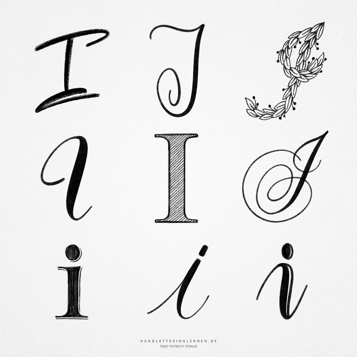
Depending on the font, the hand lettering “I” has a very simple structure. The uppercase letter in block letters consists only of one vertical stroke. There is definitely a risk of confusion with a lowercase “L” here. The cursive “I” offers a bit more potential, especially when it comes to writing the letter in a curved and flourished way.
Originally, the “I” (then called “Yodh”) was represented as an arm with a hand. As is often the case, the symbol was changed and abstracted over time, until in the end all the added details were lost and only the vertical stroke remained.
- In the case of the large block letter “I”, the design possibilities are very limited. It can be represented as a block letter and decorated with hatching, for example. The basic anatomy, however, remains relatively unspectacular.
- More exciting are the possibilities offered by cursive script. In particular, fonts such as the English cursive (Copperplate) are suitable for orientation. For example, the copperplate “I” can be written wonderfully with a brush pen (or, true to the original, with a pointed nib).
- The small hand lettering “i” only stands out because of the i-dot. Otherwise, it also consists of a simple stroke. Even with the small “i”, the design possibilities are very limited. It can be tilted in different directions and can also be drawn slightly below the baseline. Stronger changes, on the other hand, quickly make the letter unrecognizable or have the potential for confusion (for example, with the lowercase “j”).
- On the subject of confusion, it is also interesting to look at the “J”. In cursive writing, the versal “J” and “I” hardly differ in their lines. The biggest difference is that the “J” has an descender, while the “I” is on the baseline. Also, the “I” is often open to the left and the “J” is looped to the next letter.

Do you need even more styles? Check out our Lettering Generator with hundreds of beautiful lettering fonts. Create custom templates or full designs for any kind of needs!