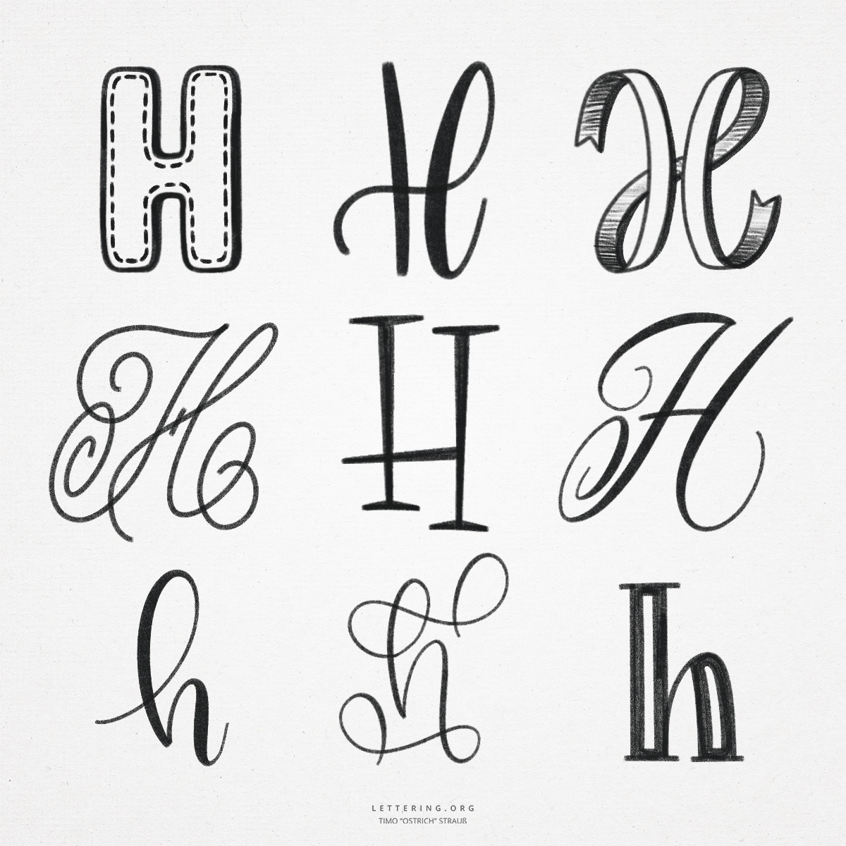
The “H” is very easy to create, especially as a print font. In principle, it consists of only three lines and is thus quickly learned and reproducible. It becomes more difficult when you want to write the hand lettering “H” in block letters. The long, straight lines must be drawn safely and as parallel as possible so that a harmonious block letter is created at the end.
By the way, the “H” has its origin in a symbol for a fence. In the course of time, the “H” we know finally evolved.
- Due to the right-angled lines in the large hand lettering “H”, the letter can also be constructed with tools such as a ruler or a triangle. Even as a 3D variant, the “H” is thus technically easy to draw.
- For a freehand drawn “H” you can help yourself with overlapping blocks. Imagine you have to draw a flat “H” on a squared paper. At the end, color in the blocks (or erase the superfluous lines).
- The cursive “H” can be drawn with a continuous line, as is often the case. It still looks very symmetrical with its double loops and offers a lot of potential for different designs and flourishes.
- A compromise is a variation in which you reposition the pen between the two large downstrokes and do not create a direct connection. The two vertical lines are connected by the cross stroke, so that in the end a dynamic and loose variant of the hand lettering “H” is created.
- There are few problems with the lowercase “h”. Especially in the handwriting version, the lowercase “h” consists of two typical basic shapes and is therefore easy to reproduce.
- With the brush lettering “h” it makes sense to place the brush pen as far to the right as possible after the first downstroke, so that the line to the small arc appears as open as possible.

Do you need even more styles? Check out our Lettering Generator with hundreds of beautiful lettering fonts. Create custom templates or full designs for any kind of needs!