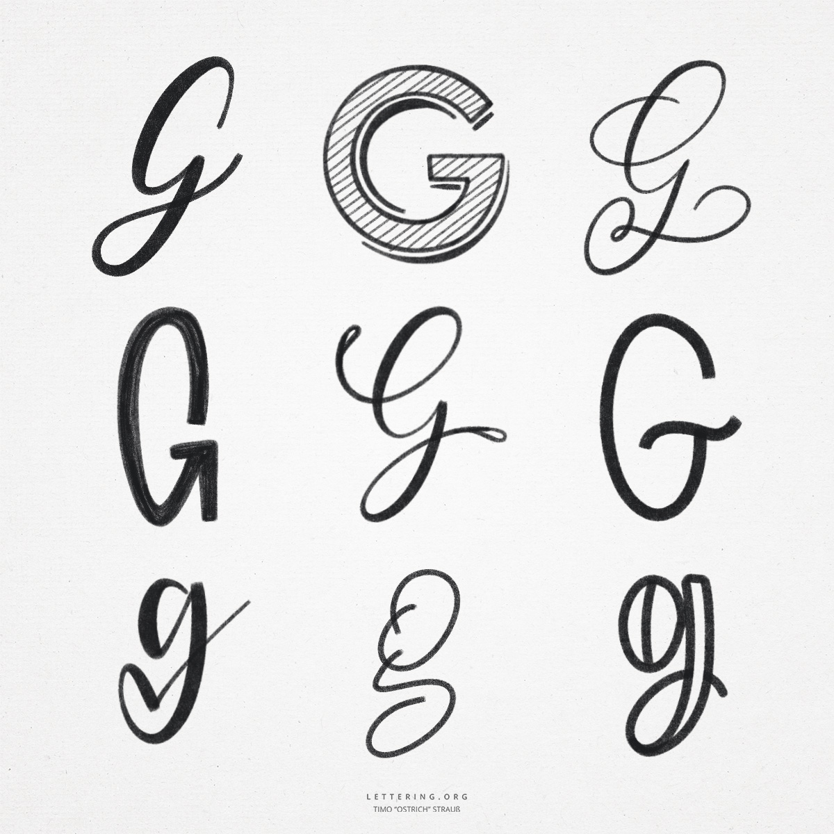
The “G” is a particularly exciting letter for hand lettering and brush lettering. It can be written and decorated in many different ways. This is also due to the fact that the “G” in the course of its existence in the Latin alphabet was designed quite differently – both as an uppercase and lowercase letter.
By the way, the “G” was introduced at that time as a variant of the “C”. This explains the similarity of the two letters, which mainly share the large arc. Especially with the hand lettering “G”, this arc is definitely a challenge, as it requires an even and calm stroke.
- The large hand lettering “G” can be represented in print as a “C” with two additional, small strokes. These look like a small corner and make the “G” look like we know it.
- In script, the majuscule “G” can be drawn with a continuous line. After the big arc it goes, partly with a loop, into the descenders and from there with another loop back up to the next letter.
- The script variant of the “G” can be flourished in countless ways. In some cases, the lines overlap, so care must be taken to distribute the white space exactly.
- The lowercase “g” usually consists of a small oval and a descender attached to the right. Via a loop, depending on the style, the line leads back to the baseline and thus to the next letter.
- A rather unknown alternative, which can be used very nicely especially in hand lettering, places the downstroke in the descenders rather to the left and adds another, usually closed shape.
- The lowercase “g” is also perfect for adding flourishes and embellishments. The downstroke in the descenders can be used to elegantly interrupt the flow of writing when needed.
Do you need even more styles? Check out our Lettering Generator with hundreds of beautiful lettering fonts. Create custom templates or full designs for any kind of needs!

