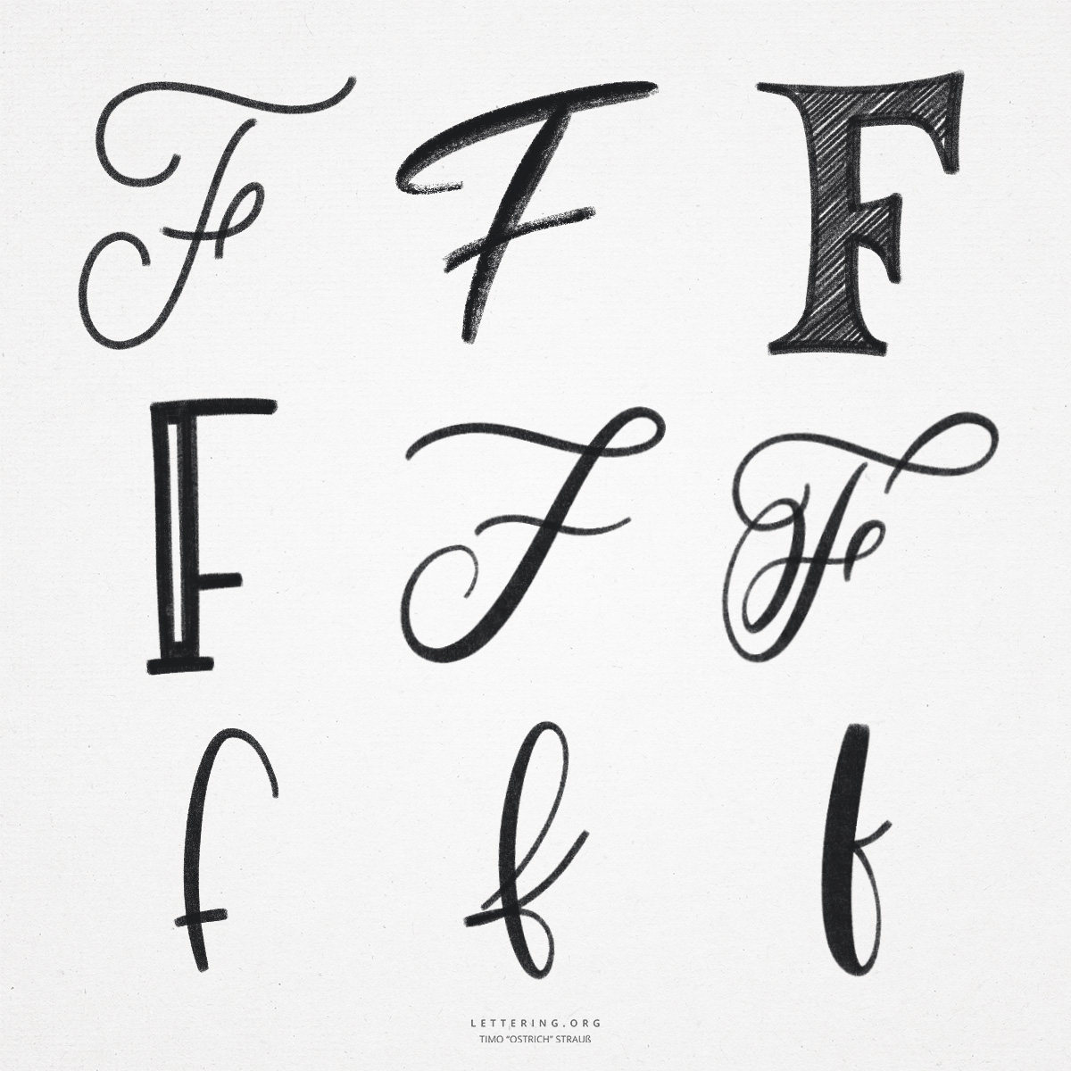
The hand lettering “F” is again a very special letter. Because of its many variants and the sometimes difficult execution, it is hated – or loved – by many. Especially in hand lettering, the “F” offers many possibilities for design. Both in the basic anatomy and through additional flourishes and large arches.
On its way into the modern latin alphabet, the “F” took on various forms and was used for different sounds.
- The classic printed “F” is very simply written or painted. It is straight and consists of only three strokes. The middle cross stroke can be moved up or down to change the style (for example, to create a font with a very small x-height).
- The right-angled lines of the print font “F” are technically easy to construct, so a ruler can be used. The “F” can also be represented by overlapping blocks.
- If the hand lettering “F” is implemented as a script or brush lettering, there are some factors to consider. For one thing, it is not easy to draw the long strokes safely. Secondly, the connection to the next letter is often a problem. Here, care must be taken to ensure that the “F” often remains unconnected, as otherwise there could be confusion in combination with the second letter.
- The small script “f” has a special feature: In some variants, it takes up the entire space in the line grid, from the ascenders to the descenders. Thus, it consists of a very long smear that requires a certain amount of sweep. From the descenders, the line is led back to the baseline with a loop (as with the lowercase “q”).

Do you need even more styles? Check out our Lettering Generator with hundreds of beautiful lettering fonts. Create custom templates or full designs for any kind of needs!