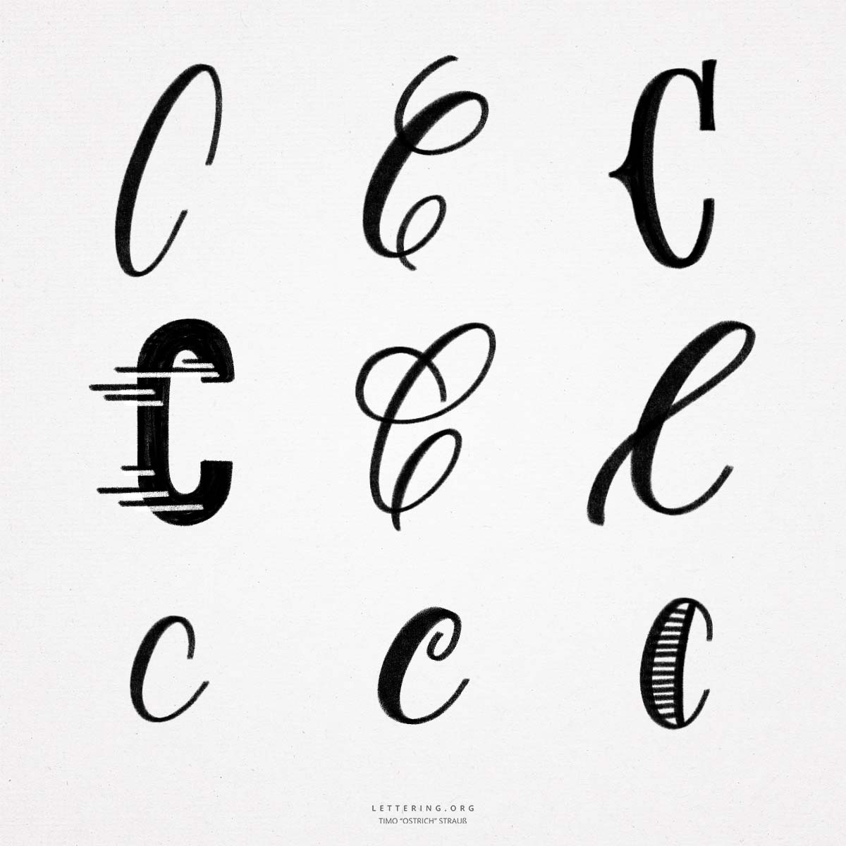
The hand lettering “C” is very simple in its basic form. It consists only of an even arc that opens to the right. If you want to implement the “C” as brush lettering, you only need three different stroke widths for the simplest version.
- Because of the simple shape of the hand lettering “C”, it is not so easy to create different variations. Especially when it comes to flourished versions. Wrong strokes can quickly end up in unrecognizable letters. So when designing, always make sure that the letter remains as recognizable as possible.
- The design of the lowercase “C” is even more challenging, since the classic options for decorating the initial letter are not applicable. Other than that, the minuscule (lowercase) letter is relatively easy to write.
- If the lowercase “C” is in combination with other letters, the end of the line must extend a little further in the direction of writing to allow an even connection to the next letter.

Do you need even more styles? Check out our Lettering Generator with hundreds of beautiful lettering fonts. Create custom templates or full designs for any kind of needs!
this is Riley cool