Hello! Flourishes (and the art of flourishing) have always fascinated me. They make every lettering way more elegant and outstanding.
That’s why I’m very exited to show you how to add wonderful flourishes to your letterings in this tutorial.
Contents
What you need
- Pencil
- Paper
- Eraser
- A steady hand ????
The first sketch
At the beginning is the word or words you want to decorate with curvy flourishes. I always write down the word in a normal font to see where the possibilities for curvy decorations are.
So take a pencil and write your word (start with a simple and short word) on a piece of paper. Since flourishes can be combined better with italic fonts, you can write the chosen word slightly italic.
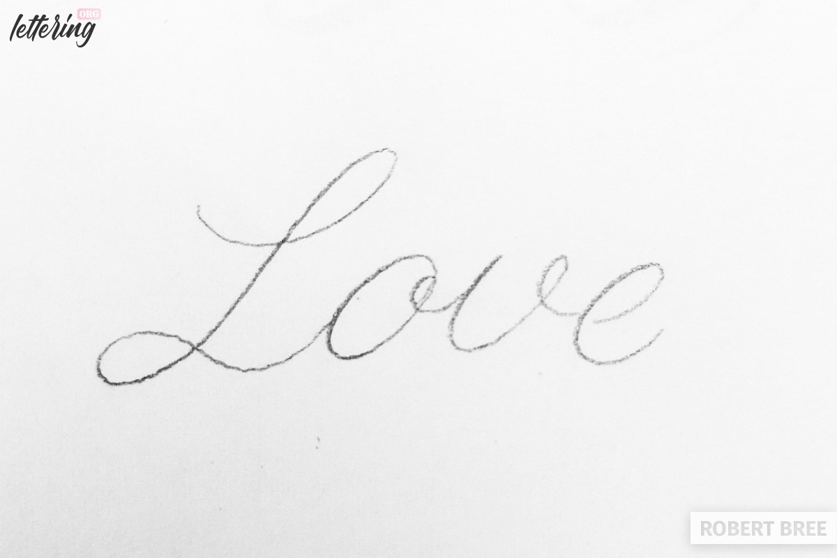
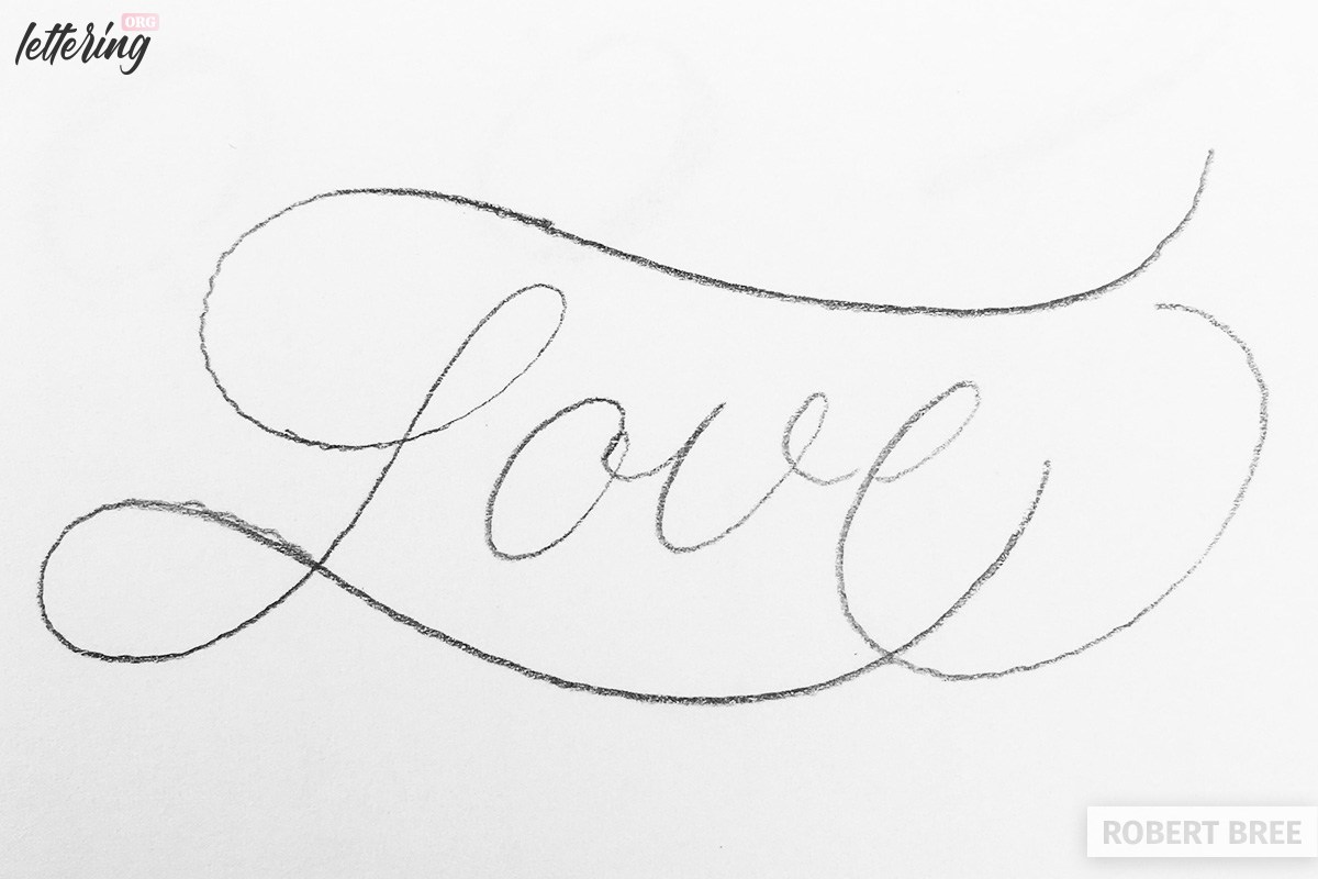
As you can see in my first sketch I chose the word “love”.
Adding a first flourish
Now you see where there are possibilities to make a flourish. It is always good if the flourish comes out of one of the existing letters.
The “L” as a capital letter is a classic opportunity to not let the lower loop run to the next letter (o), but to pull it generously under the complete word.
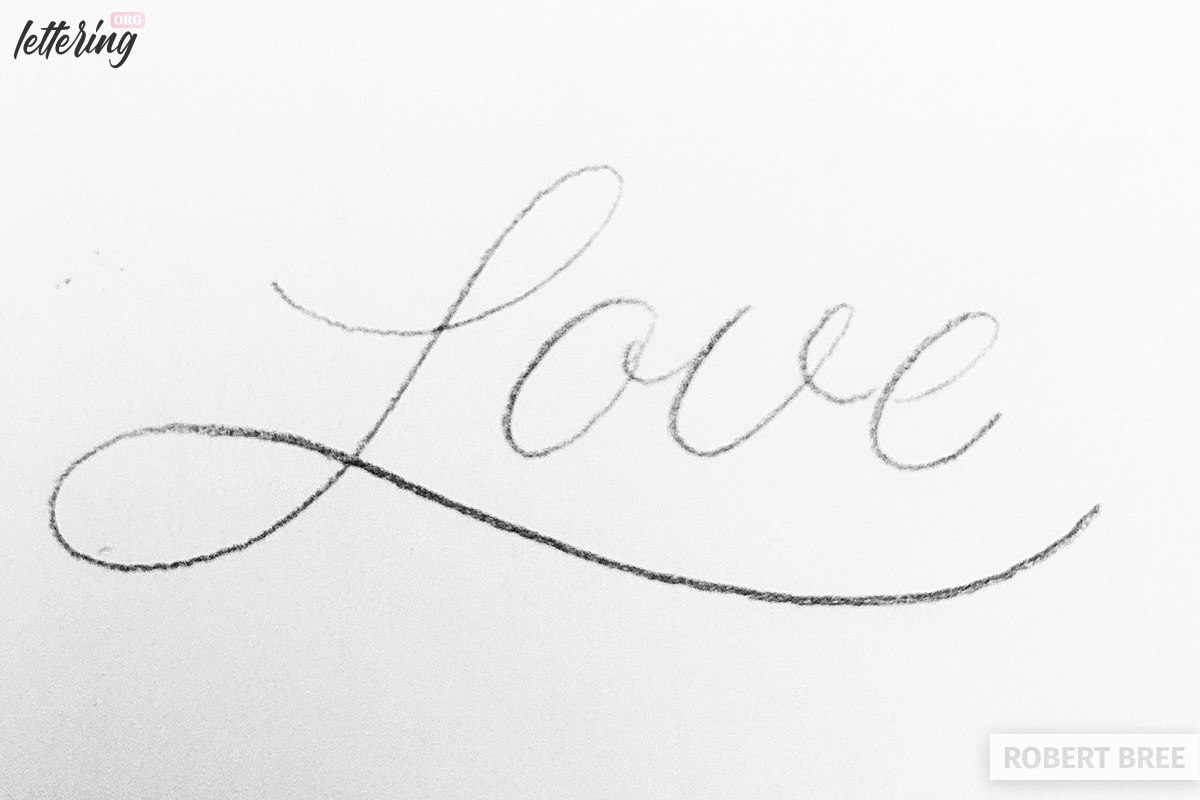
Now I could actually already be finished with my work, because it is already harmonic and has a nice accentuation by the extension of the “L” below “Love”.
But let’s have a look at some more flourishes! That’s why you are here, right?
Balancing
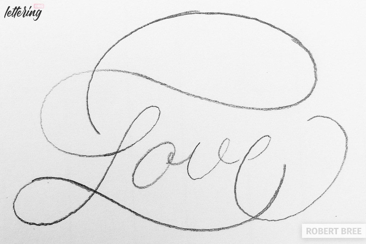
Since we want to create a more complex structure, I look at the current situation and look for empty areas where further flourishes can be made.
If I extend the upper part of the “L”, I could get a similar curve above “Love” as I did below the word. This would create a good balance.
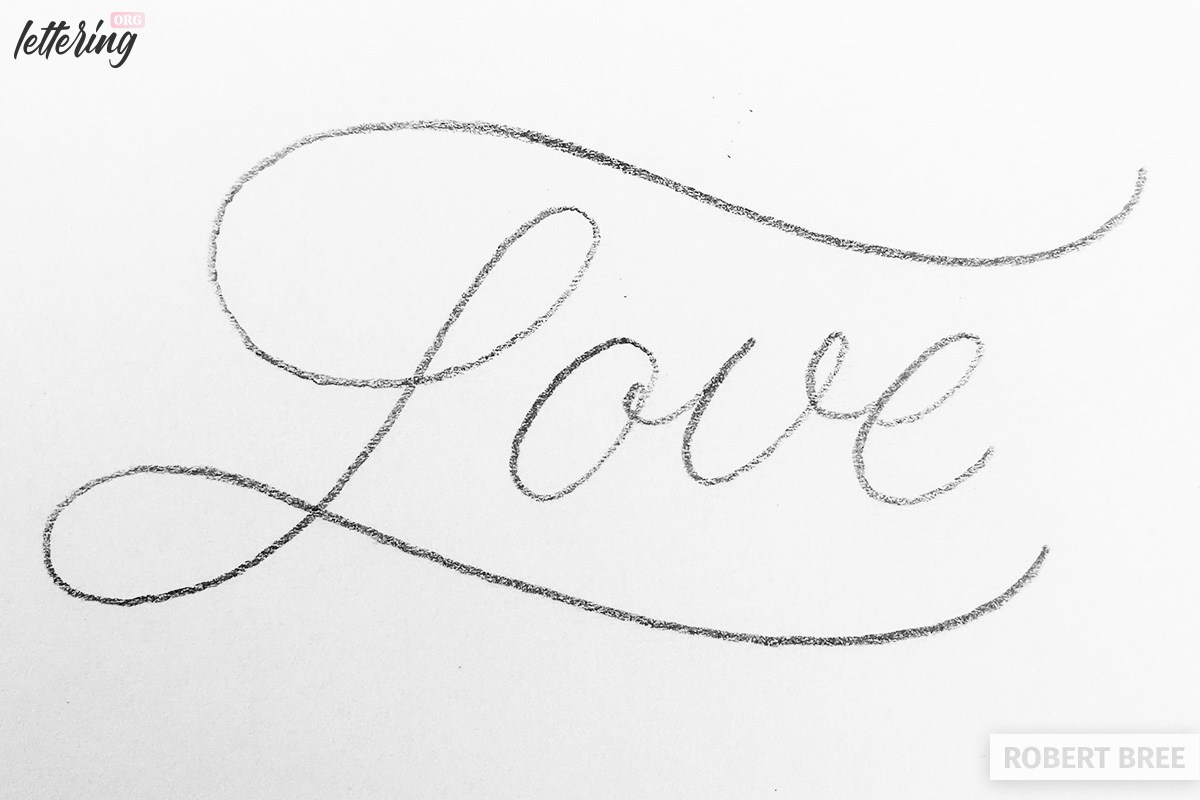
Even more balance
I am quite happy with the result, but I would like to close more empty areas and use the last letter (e) to do so.
With an extension and a big curve I fill the empty space behind the word and get a counterweight to the dominant “L”.
Extending the flourishes
Despite the upper flourish it seems very empty there, which may be due to the downward inclination of the curve.
To avoid this, I simply extended the end of the flourish pointing upwards and drew this line back to the beginning in direction of the “L”.
Now the upper part is not too empty. It even gets a little overweight compared to the lower part.
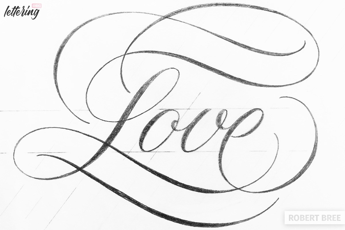
Final details
Because the upper area offers a large white area, I added a curved line. I repeated the same below to get the balance right again.
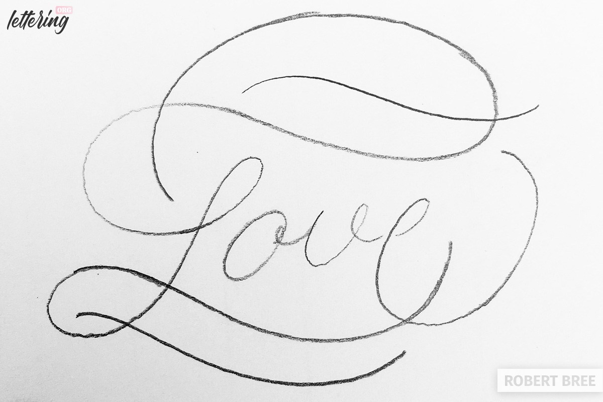
Now the drawing with the corresponding flourishes is actually complete. The division of the additional curves for the word “Love” is completed with this step.
This part, even if not in a clean drawing, is the most important part. Now the lettering can be drawn more accurately and more beautifully.
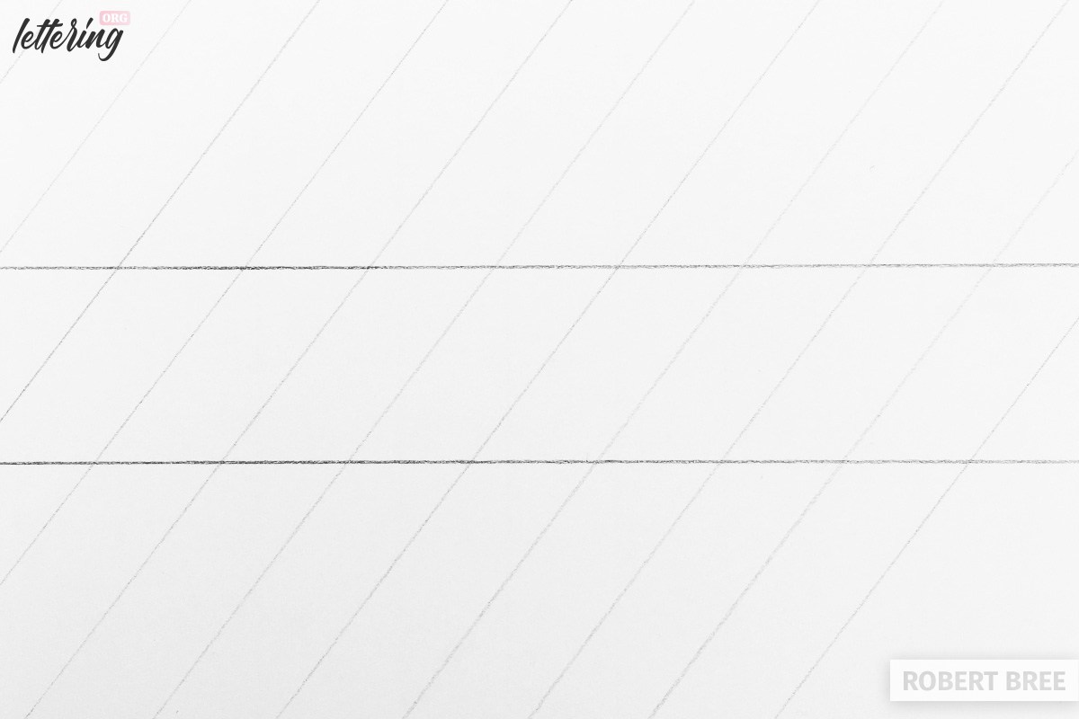
Using guidelines
If I now want to draw the lettering more precisely with working flourishes, I draw two lines for the size of the lowercase letters according to my imagination.
I can also draw diagonal lines as an orientation for the uniform inclination of the letters.
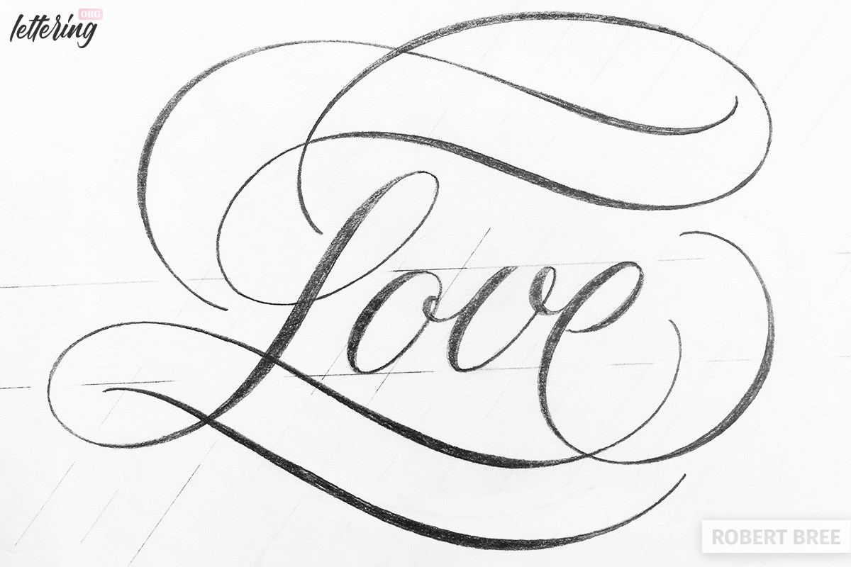
The final lettering
Now I will draw the lettering a little bit bigger. In my example the small letter has e.g. a height of 2 cm and in the sketches before it was about 1 cm.
After that I add the wider line widths. The forms are similar in their appearance to the english cursive script.
The lettering can also work wonderfully without thick and thin strokes, because this part can become quite complicated if you do not have enough practice with the “faux calligraphy”.
The final solution can be seen in step 8, where the upper flourish behaves slightly different than originally planned. Since there was a little more weight missing on the left side, I extended this flourish there.
Such changes always happen during the process. And there is no real solution.
Try the steps with the same word from picture 1-6 and see how it works. Repeat the steps as often as you like, because this way you learn consciously how the flourishes are drawn so that they fit harmoniously into the lettering.
Have fun trying it by yourself. I hope you enjoyed this exercise and maybe it will awaken your passion for flourishes!
exellent
Very informative and useful
enjoyed !!
Do you have a guide book? I try to write like you no comparising. I took advance penmanship I college back in 1960. Always had an interest but had set it aside
I had a great teacher. We did Old English too
I tried to keep all my lines connected. I see that’s not the way.
You can find Robert’s guide here: https://www.the-flourish-club.com/
Beautifully done.. always loved this style now time to learn.. thank you for this tutorial.
Very lovely style and looks easier than most. I want to learn to letter and then the calligraphy as soon possible.
I really enjoyed your website and intend to visit more often.