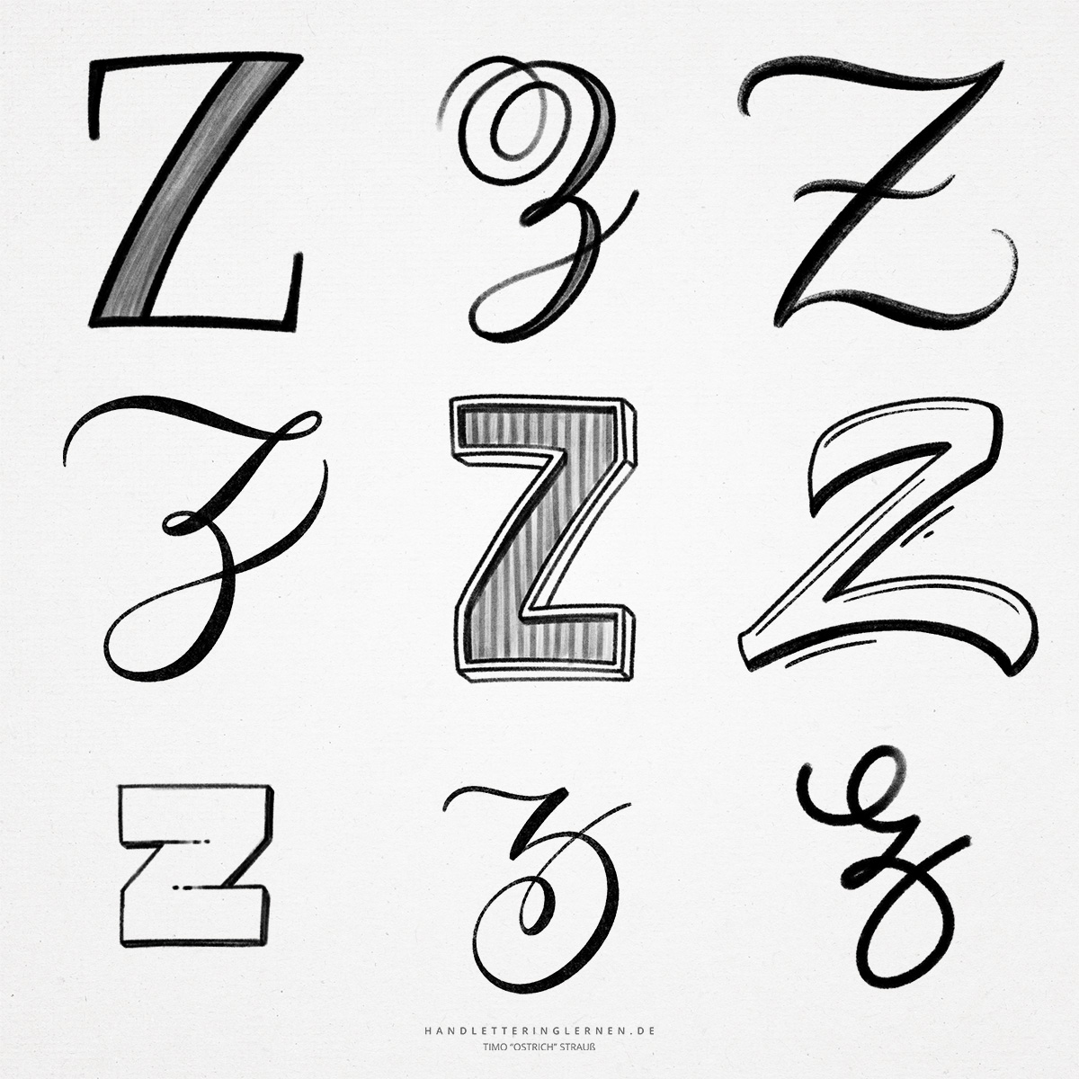
From simple to complex, the hand lettering “Z” offers very different variations. Because of the many possible ways to build the “Z” anatomically, it can be used very flexibly in letterings. In the simplest version, the “Z” consists of only three simple, straight lines.
The original symbol for the letter “Z” was a kind of stabbing weapon. The corresponding symbol consisted of two short, parallel lines. In principle, all that was missing was a diagonal line and the “Z” would be complete. The original “Z” is therefore also the variant without descender.
- In print, the capital and lowercase “Z” look anatomically the same. Two parallel lines are connected by a diagonal line.
- If stroke width contrasts are used, the diagonal line is usually the stronger one. Although this does not correspond to the look that would be created using a ribbon nib, it makes more sense typographically. Otherwise, the fine diagonal line would be “crushed” by two strong cross strokes.
- The simple variant of the “Z” also exists in script. The only difference is that the horizontal lines are slightly curved. Sometimes, the capital “Z” is also supplemented by an additional cross stroke at the level of the X line.
- The “Z” with a loop in the descender is known as an alternate script version. It can be found in this form, for example, in the Simplified Original. This variant in turn offers a lot of potential for further differences in the details.
- Especially for hand- and brushlettering, the variant with loop is often used, because it does not look as simple as the “Z” of the school script. The additional descender helps to make continuous text look more even. In addition, the line can be wonderfully squiggled, similar to the “g” or “y”.
Do you need even more styles? Check out our Lettering Generator with hundreds of beautiful lettering fonts. Create custom templates or full designs for any kind of needs!

