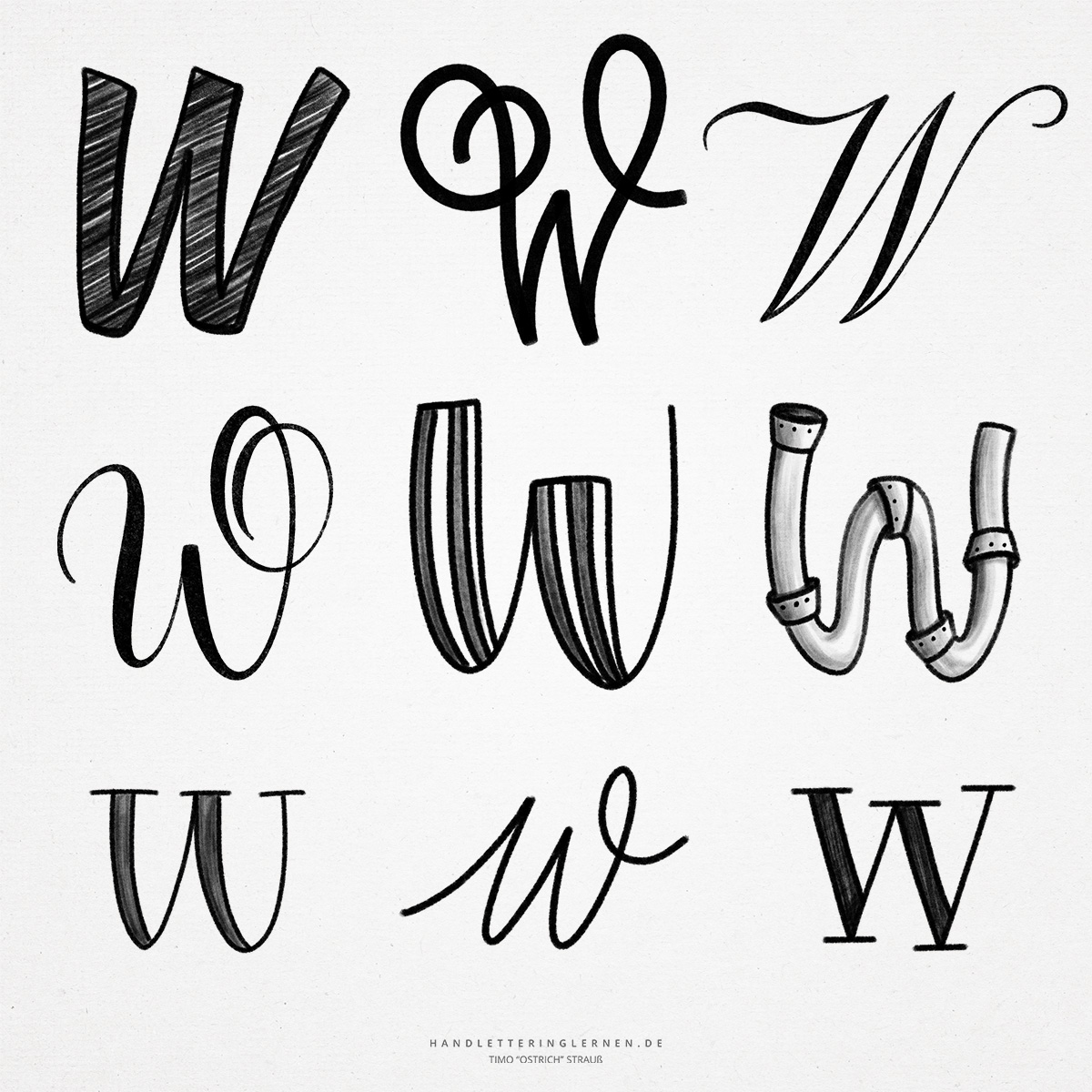
The hand lettering “W” is a very wide letter and therefore takes up a lot of space. This is also due to the fact that the “W” is basically a ligature of two “v” or “u”. This development can be clearly seen in the anatomy of the letter.
Historically, the “W” is also close to the letters “U” and “V”, but also “Y” and “F”. The original symbol was a kind of club with a round head.
- Creating the “W” from two “V “s is not difficult at first glance. Simply two “V” are strung together. In hand lettering, this is usually also purposeful, and an exact look at the details is secondary. In detail typography, however, for example when creating fonts, a closer look is necessary.
- For example, it is possible (or necessary) to make the two “V “s a little narrower, to let the middle diagonals overlap, or to trim the left diagonal (the upstroke of the first “V”) by the right diagonal (the downstroke of the second “V”).
- In addition, the angles of the outer diagonals can be adjusted to reduce the overall width of the “W”.
- The cursive “W” can be beautifully represented as a combination of two “U “s. By lowering the vertex, the “W” even gets a more unique look and no longer looks exactly like two “U “s strung together.
- The rules for connecting the lowercase “W” to the next letter are the same as for the “V”. The lowercase letter is always connected at the x-height, the uppercase letter is usually displayed unconnected.
- When using serifs, the middle serif can be set on the apex or omitted – there are different approaches here, depending on the font.
Do you need even more styles? Check out our Lettering Generator with hundreds of beautiful lettering fonts. Create custom templates or full designs for any kind of needs!

