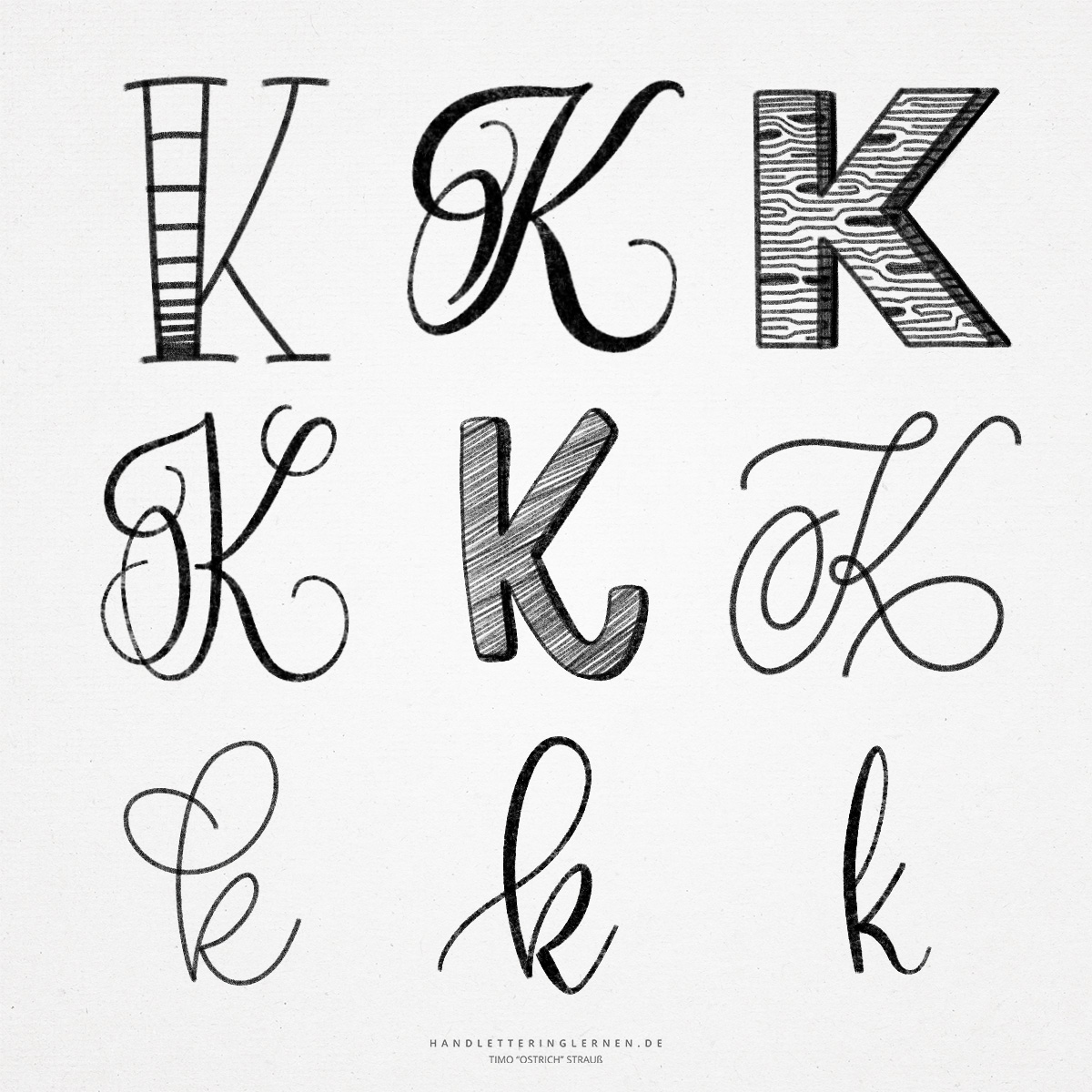
The hand lettering “K” offers many possibilities for design. The capital “K” takes up a relatively large amount of space with the shaft (the bold downstroke), arm (the upstroke to the right), and leg (the downstroke to the right), especially when additional flourishes are added.
The original symbol for the “K” was a palm (with fingers). If one turns the “K” to the left side, this origin can still be traced with a little imagination.
- What is exciting about the “K” is that already in the block letter there are three principles how it can be constructed. Depending on the variant, the arm, leg and shaft may or may not meet in a knot. There is also the possibility of connecting the leg to the arm further up or using a rounded leg and placing the arm slightly offset to the right.
- Especially with the brush lettering “K” you should make sure that the letter is not too strong. Theoretically, the “K” consists of three downstrokes, which would result in a one-sided appearance (without stroke width contrasts). Therefore, when the lines of the arm and leg meet (at the node), you should take out some pressure. It is also possible to draw the arm with almost no pressure, thus providing appropriate contrasts.
- The lowercase “k” consists of an additional loop and a shrunken version of the uppercase “K”.
- In the script, the lower part of the lowercase “k” also consists of an additional loop, rather than unconnected lines. The resulting punch can be shaped in a variety of ways in brush lettering, changing the look of the letter.
- A nice way to create the hand lettering “K” is to bounce it slightly. The last downstroke (the leg) is very easy to run under the baseline before connecting to the next letter. Since the leg continues to sit on the baseline, the “K” practically balances itself.
Do you need even more styles? Check out our Lettering Generator with hundreds of beautiful lettering fonts. Create custom templates or full designs for any kind of needs!

