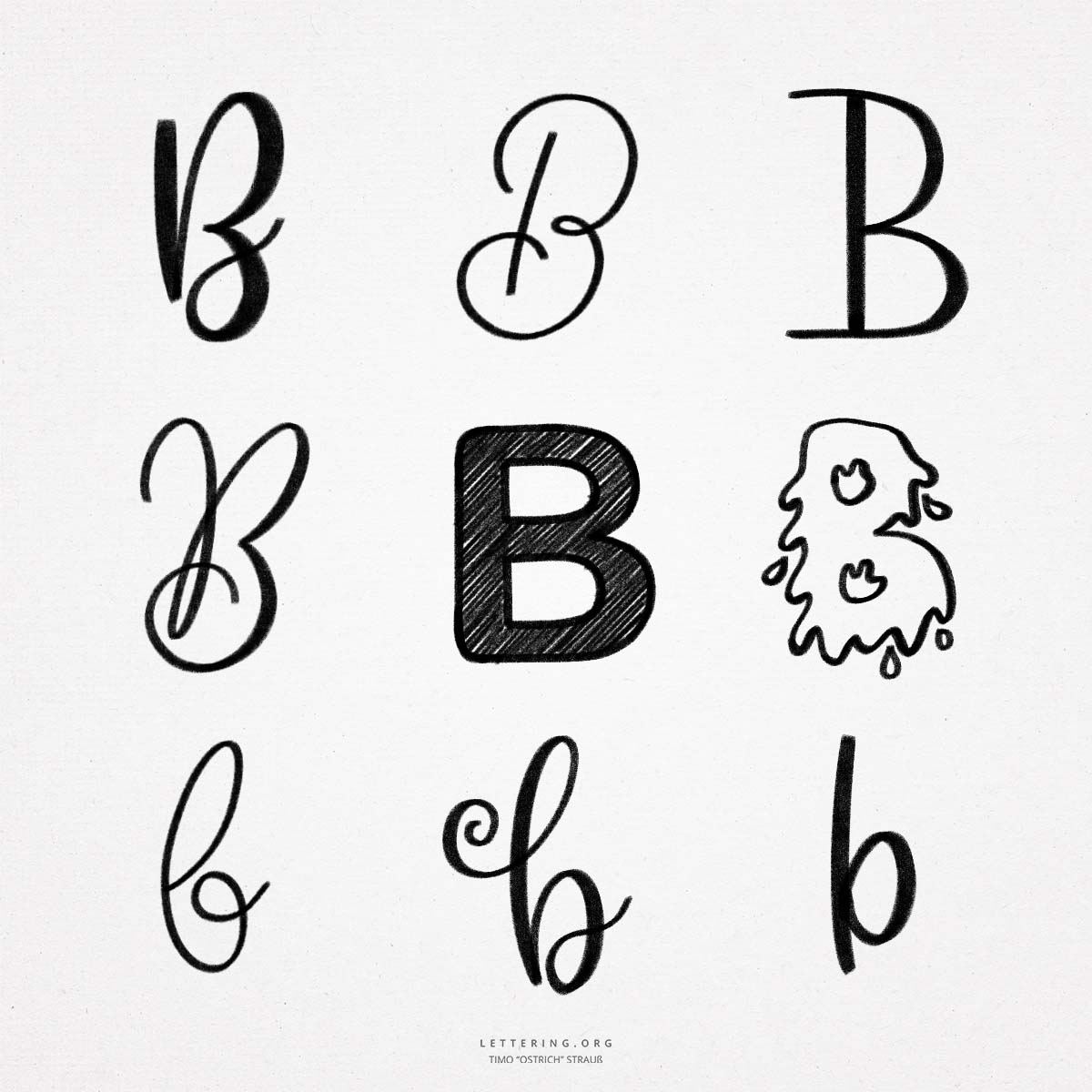
With its two curves the hand lettering “B” is not so easy to write. Especially as a capital letter and in the script version. If the stroke width contrasts are added (for example, by a brush pen or a nib), the movement of the “B” becomes quite complex. Regular practice is a must here!
- Due to the many lines, the hand lettering “B” can be designed in many ways. The two counters also offer a particularly large number of design options.
Do you need even more styles? Check out our Lettering Generator with hundreds of beautiful lettering fonts. Create custom templates or full designs for any kind of needs!

