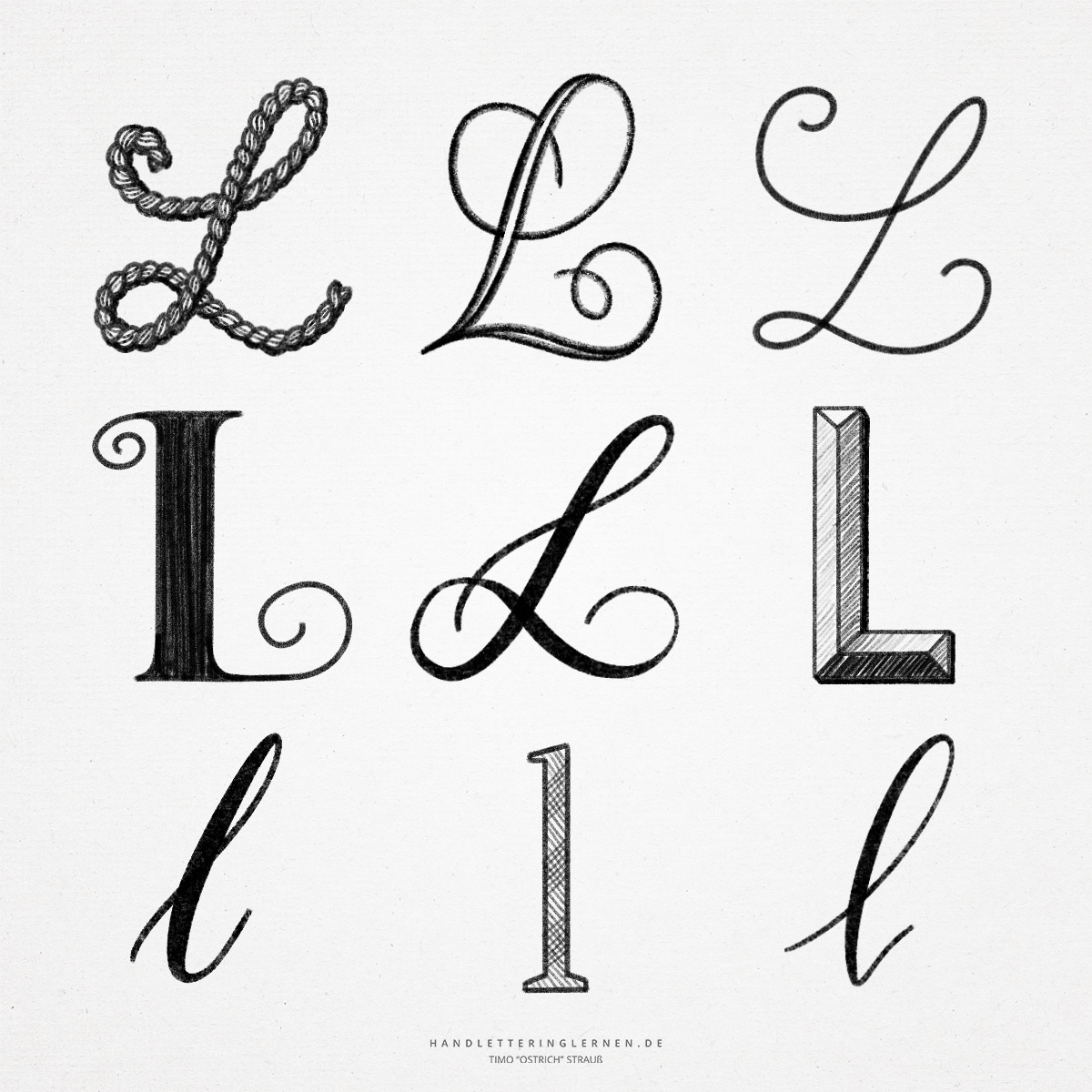
Time for the hand lettering “L”! The “L” is a letter that is basically very easy to write, both in script and in block letter. However, there are some variations (especially in script) that require some practice. Mainly when a brush pen or a nib is used and stroke width contrasts have to be used.
Symbolically, the “L” goes back to a so-called “Ochsenknittel”. This was a kind of stick that was spiked to drive the bulls. In my opinion, a rather barbaric tool … Therefore, we prefer to focus on our letter again.
- The large block letter “L” consists of two simple lines arranged at right angles to each other. A special design can be achieved here almost only by additional details (serifs, hatching, shadows).
- In the case of the small “l”, which often consists of only one vertical stroke, there is a risk of confusion with the large block letter “i”. In some typefaces, the two letters cannot be distinguished without context.
- The script font offers a lot of potential to create a versal hand lettering “L”. A nice curved “L” can be written with a sort of double loop. Usually, the “L” is drawn with a continuous line without setting the pen off in between. This requires practice (and sometimes even holding your breath for a moment, even if that doesn’t really help)!
- The small script “l”, on the other hand, is relatively simple and consists only of an elongated loop. Here, the challenge is rather to keep the angle of inclination and to write all “l” as uniformly as possible, so that a consistent typeface is ensured.
Do you need even more styles? Check out our Lettering Generator with hundreds of beautiful lettering fonts. Create custom templates or full designs for any kind of needs!


Nice one
a r i letter style